Challenge – Chart This Data in Excel – My Answer
A few Fridays ago, I posted this challenge:
Link here: friday-challenge-chart-this-data-in-excel
Where I asked you to send in your sample charts for this data set:
Data and Request
| Courier | Dis (mi) | Pkg (#) | Price ($) | Pkg (#) | Price ($) |
| FedEx | 5 | 1 | 16.00 | 5 | 80.00 |
| UberRUSH | 5 | 1 | 21.00 | 5 | 105.00 |
| biolab | 5 | 1 | 5.00 | 5 | 25.00 |
| FEDEX | 20 | 1 | 38.00 | 5 | 190.00 |
| UberRUSH | 20 | 1 | 66.00 | 5 | 330.00 |
| biolab | 20 | 1 | 5.00 | 5 | 25.00 |
| FEDEX | 45 | 1 | 60.00 | 5 | 300.00 |
| UberRUSH | 45 | 1 | 141.00 | 5 | 705.00 |
| biolab | 45 | 1 | 5.00 | 5 | 25.00 |
And we wanted to know how you would graph this data in Excel.
My Chart
Here is how I would chart the data. It is an Excel Column Chart that is using the data from a Pivot Table. So I guess technically it is a Pivot Chart :). You can download this sample chart and play around with the Slicers and Pivot Table below.
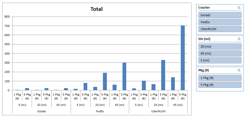
Here are a few notes about this chart.
- It has dynamic characteristics because I added Slicers so that the user can choose what to compare/view in the graph.
- It is using Multi Level Category Labels on the X (Horizontal) Axis
- It is a Pivot Chart that is based off of a pivot table
Additional Chart Resources
Here are additional links that will help you learn how to replicate this chart:
Slicers
How-to Insert Slicers into an Excel Pivot Table
How-to Create a Dynamic Excel Pivot Table Dashboard Chart
Friday Challenge Answer – Using Excel Slicers to Create Dynamic Charts
Petes Stumped Chart Challenge Answer – Pivot Chart with Slicers
Multi-Level Labels for Horizontal Access
Fixing Your Excel Chart When the Multi-Level Category Label Option is Missing.
Friday Challenge Answers: Year over Year Chart Comparisons
Presenting Metrics Data – How would you create a chart for this data?
Pivot Chart
Class Exam Grade Excel Chart Using Slicers and a Pivot Table
How-to Easily Make a Dynamic PivotTable Pie Chart for the Top X Values
Stopping Excel Pivot Chart Columns from Overlapping When Moving Data Series to the Second Axis
How-to Create a Combo Line and Column Pivot Chart
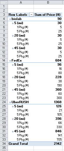
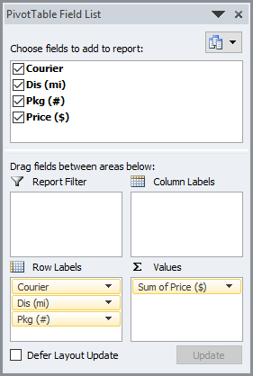
Pivot Table Details
As you replicate this chart, here is how your final Pivot Table and Field List will look for your Pivot Chart:
Sample File Download
You can download the free sample file here: Friday-Challenge-Answers-Chart-this-Data-in-Excel.xlsx
Hopefully this will help you create your next Excel Dashboard Chart.
Steve=True


