I am so happy to help my fans, and I saw a recent comment on an older posting of mine and I thought I could help. The Excel user was having problem getting the chart solution to work with their data. You can check it out here:
Case-study-solution-mom-needing-help-on-science-fair-graphscharts
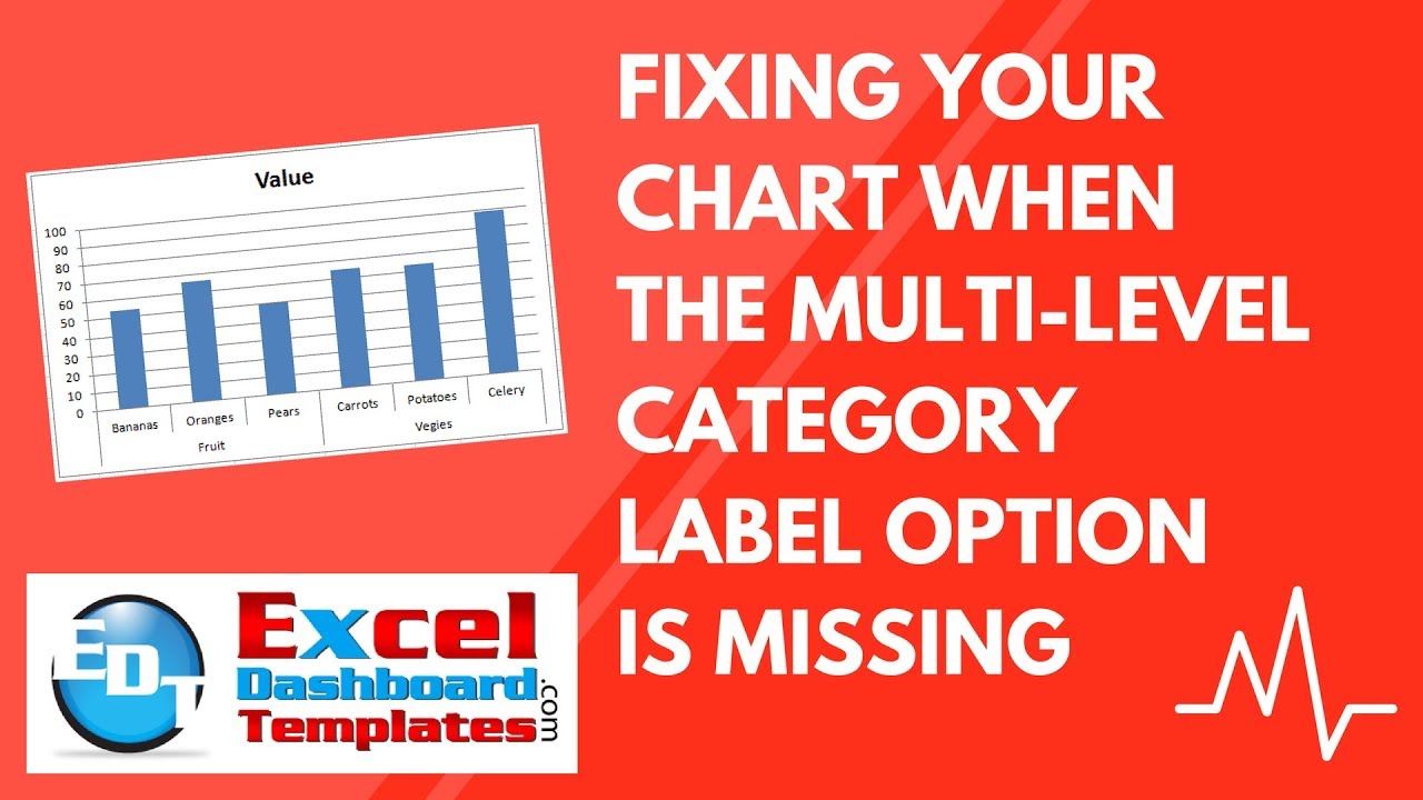
Essentially, the chart that the user was looking for is to create graph that has both a main category label and sub-category labels. Like this:
This is a special feature in Excel Charts, but ONLY if you set up your data in a certain way. Here is what the user was said:
“Hi, I would like to know whether the Multi-Level Category Labels are available for the Mac 2011 version of Excel.
I’ve been trying to do something similar to the second option you showed in this video: http://www.youtube.com/watch?v=FuSI0XDJynY
But I can’t get the Multi-level category option to show up; it just reverts provides the regular max/min/interval axis options.
Do you know whether it’s possible to get Multi-Level category labels on Excel for Mac? How would I do that/How is it different?
Thank you so much for your tutorials! They are so helpful.” –MacUser
So he was having a problem with the getting the Multi-level Category Labels to work. When he right clicked on the horizontal axis and selected Format Axis, he was seeing this:
instead of this:
Notice that the Multi-level Category Label check box was no longer an option. Based on his description, I determined that the problem was that he wasn’t using text for both the Main Category and Sub-Categories. But as you will see in the video and the tutorial below, you won’t have to use just text. Check it out below.
The Problem
I created a chart in Excel and can’t find the Multi-Level Category Label Option. Why is it Missing and how do I get it back?
Testing the Solution
I believe that the issue is that the user had numbers in their sub-category. But lets test out each combination and see what we get.
1) Text in Main Category and Text in Sub-Category
If we put text in both the main and sub-categories, it works perfectly.

2) Text in Main Category and Number in Sub-Category
If we put text in the main category, but put any kind of number (numbers and dates) in the sub-category, then it doesn’t work ![]() .
.
What Excel is doing is that it thinks the sub-category is just another series. This is not a deal killer as you can stub in text instead of the numbers and then after you make your chart, just copy and paste the number data back into the chart and problem easily solved.
3) Number in Main Category and Number in Sub-Category
Number Number doesn’t work either as Excel thinks all three columns are data series and not category labels.

Like above, this is not a deal killer if you stub in text data instead of the numbers, then create your chart and then copy/paste the original dates or numbers back into your data series. As you can see here, I am creating a chart with text in the main and sub-categories.
then if I copy and paste the date and numbers from the chart series range that didn’t work 
to the one that did work, it will work fine as an easy fix as you see here:
4) Number in Main Category and Number in Sub-Category
This is the REAL KEY to using Multi-Level Category Labels in Excel Charts. The trick is to always make sure that the column of data next to the first data series should be text. If you do that, then when you highlight the data series and insert a chart, Excel will do it all for you.

5) Bonus time – An alternate way yet again!
So if you don’t want to fake your data and copy/paste like I describe above, here is the better way to make your chart using your original data set. It is almost like the Excel 2003 wizard.
a) Highlight only your data series (C1:C7)

b) Insert 2-D Column, Line or Area Chart. It will look like this:
c) Select the Chart and go to the Design Ribbon and press the Select Data button. And from the Select Data Source dialog box, press the Horizontal (Category) Axis Labels “Edit” button.


Then highlight Main Category and and Sub-Category labels, like this.

Don’t let Excel do everything for you ![]() sometimes you have to take the reigns.
sometimes you have to take the reigns.
Check out the quick video tutorial here:
You can download a Sample File here:
Excel-Chart-Multi-Level-Category-Label-Options-Missing-Sample.xlsx
Steve=True


