A big thanks to Don for submitting the first response to last week’s Friday Challenge.
You can check out the challenge here:
Friday Challenge – Excel Mutli-year Graph by Month
Don submitted this dynamic chart where a user can select their chart filter’s using slicers.
Here is a sample of what the charts look like:
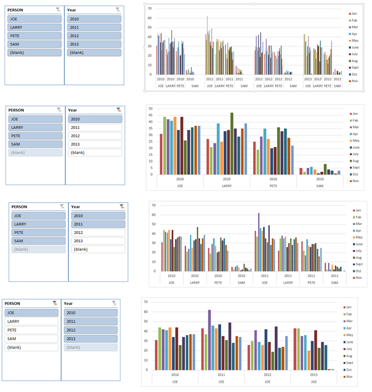
Here is how Don added slicers to his charts:
1) Made the Data a Table from the Insert ribbon
2) Created Column Chart from the Data Table
3) Inserted Slicers from the Insert Menu after highlighting the data table.
Here is a quick video showing you how Don added slicers to his charts:
This embedded resource is unavailable in the restored edition.
You can download Don’s final spreadsheet here:
Dons-Challenge-Answer-Mutli-year-Graph-by-Month-Data-Set.xlsx
Thanks Don. I think this will really help the user Slice and Dice their data 
Steve=True


Reader discussion
Comments preserved from the original page. New comments are closed.
Reader
June 12, 2014 At 10:18 am
Don sent me an updated file that has line format instead of columns. You can check it out here:
https://www.exceldashboardtemplates.com/Updated-Don-Step-Chart-Friday-Challenge-Data-with-Line-Chart.xlsx