A fan of the blog asked a question about this post:
Stop Excel From Overlapping the Columns When Moving a Data Series to the Second Axis
They wanted to know how to do it with a Pivot Chart in Excel.
Below I describe the steps, but the user also wanted to know if there is any way to do this without adding columns in the Pivot Table or manipulating the data.
I couldn’t think of a way to do it other than what you see below. Do you know of any way? Let me know if you have a solution that is different in the comments below.
The Breakdown
1) Create Chart Data Series
2) Add 2 Gap Column Names to the end of the Pivot Table Data Range
3) Highlight Data Range and Create Pivot Table
4) Create Pivot Chart
5) Move Gap2 and Coffee Data Series to the Secondary Axis
6) Delete Pad Tea and Pad Coffee Legend Entries
7) Rename or Remove Value Field Buttons
Step-by-Step
1) Create Chart Data Series
First we need to create our Excel Pivot Table Data. In our example, we have the Month in Column A, Tea values in Column B and Coffee Values in Column C: 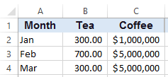
2) Add 2 Gap Column Names to the end of the Pivot Table Data Range
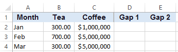
Now before we create our Pivot Table, we should add 2 additional columns to the original data. We will call them Gap1 and Gap2 and put them in Columns D and E, respectively, as you see here:
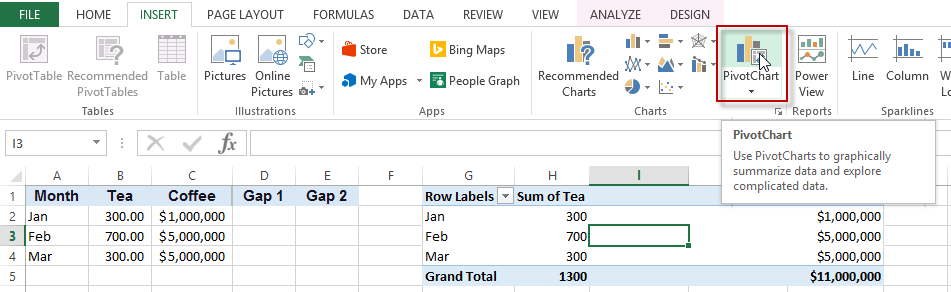
3) Create Pivot Table
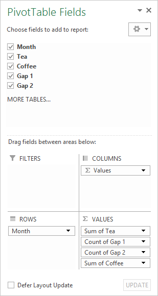
You are now ready to create your Pivot Table. To do this, select the range from A1:E4 and press ALT+D and then press “P”. This will bring up the Pivot Table wizard. Alternately you can do this from the Insert Ribbon. I decided to put my pivot table in cell G1 of the same worksheet.
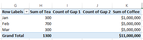
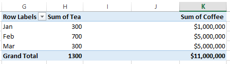
Your pivot table should look like this in the end. Note that in the Values, I have placed the series in the following order:
1) Tea
2) Gap1
3) Gap2
4) Coffee
4) Create Pivot Chart
Now that our pivot table has been created, we can create a Pivot Chart.
Your can do this selecting any cell in your pivot table and then go to your Insert Ribbon and press the PivotChart button as you see here:
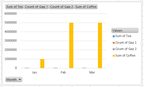
And pick a Clustered Column Chart. Your chart will now look like this:
5) Move Gap2 and Coffee Data Series to the Secondary Axis
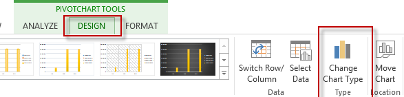
Now we need to move 2 series from our Pivot Chart to the secondary axis. This is easily accomplished by selecting the chart, then press the Change Chart Type button from the Design Ribbon:
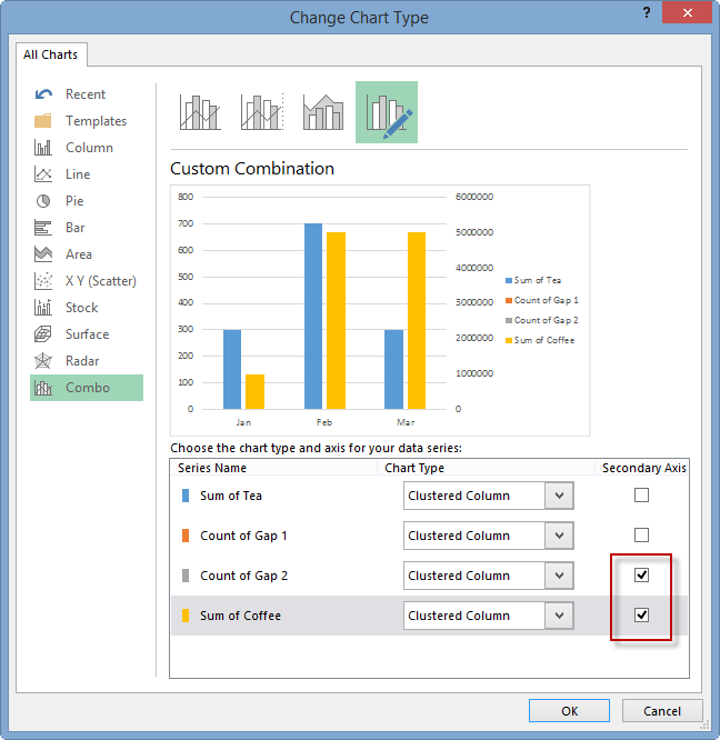
You will then see this dialog box. First Choose the Combo menu on the left and then you want to select the Secondary Axis check boxes for the Count of Gap2 and Sum of Coffee data series:
Then press OK and your chart will now look like this:
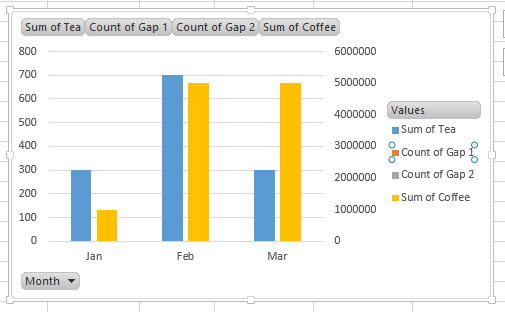
6) Delete Pad Tea and Pad Coffee Legend Entries
We are almost done. I recommend deleting the Gap1 and Gap2 legend entries. To do this, select the Chart, then select the Legend, then select “Count of Gap1” and press the delete key. Repeat this step for “Count of Gap2” legend entry.
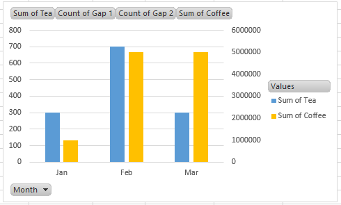
You chart will now look like this:
7) Rename or Remove Value Field Buttons
The final step is also recommended. It is to change the Value Field Buttons.
You can remove/hide them in one of 2 ways:
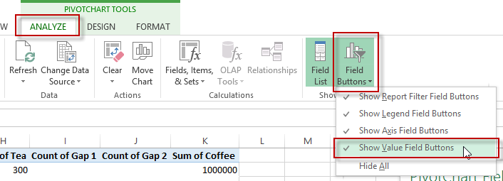
a) You can remove them by selecting the chart and then select the Analyze Ribbon and then select the Field Buttons and Uncheck “Show Value Field Buttons”
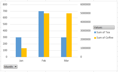
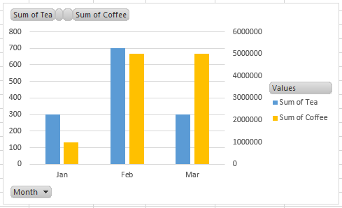
Here is what your final chart will look like:
b) Alternately, you can go to the Pivot Table and change the labels from “Gap1” to a Space and change “Gap2” to two spaces. This will effectively hide those values from the Pivot Chart.
Here is what your final chart will look like:
Video Demonstration
You can watch this tutorial in a video here:

File Download
Here is a free sample Excel file:
Stopping-a-Column-Chart-Overlap-within-an-Excel-Pivot-Table.xlsx
I don’t think that it is too difficult to add 2 additional data series to the right of a Pivot Data to create the gaps. Do you? Let me know your thoughts in the comment below.
Steve=True


