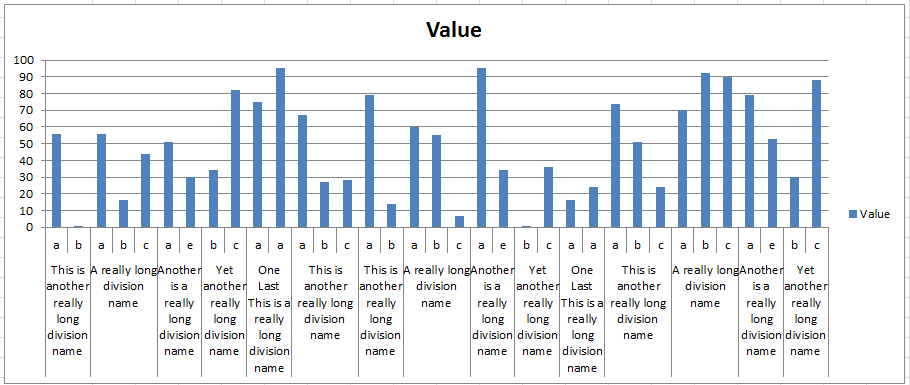
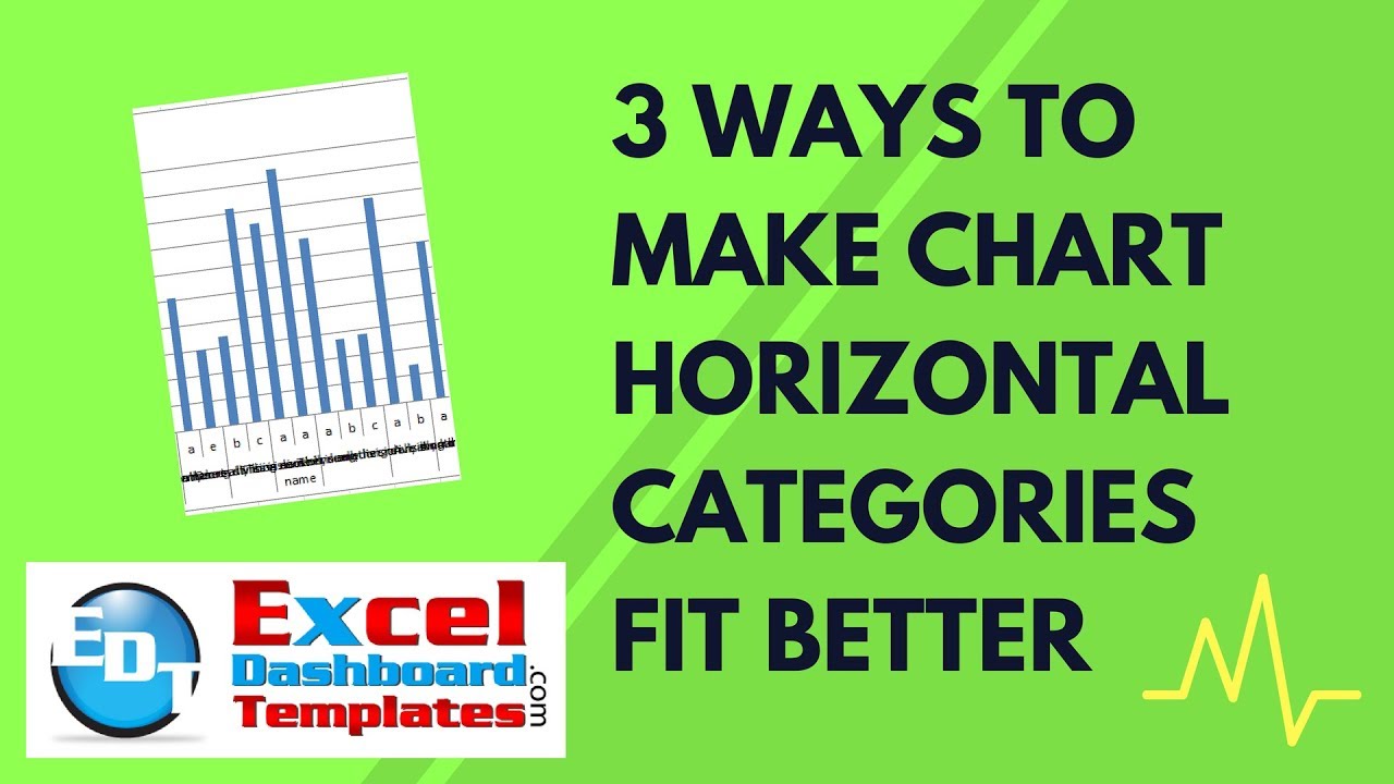
Have you ever had a chart where your Horizontal Category Labels overlap each other and they are unreadable?
Check out this chart to see what I mean:

If you run into this problem, there are a few ways that you can fix it.
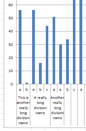
1) If you are NOT using the Multi-Level Category Labels, then you can right click on the horizontal axis and choose format axis. Then change the Alignment to 270 degrees and the categories should fit better.

However, if you are using Multi-Level Category Labels, then this won’t work for you as the alignment will only change the upper level and not the lower level as you see above.
2) Another option is that you can always increase the size of the chart until the labels start to wrap in the Horizontal Axis of the chart.
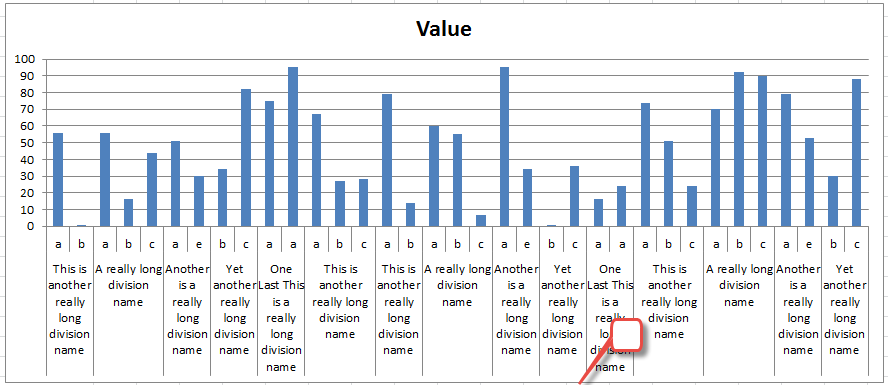
Simply deleting the legend or making it overlap the chart form the Layout Ribbon may also work quickly for you as it will give your chart area more room. If it is enough space, then Excel will automatically wrap the horizontal labels for you as you see here:
3) Finally, if none of the above options work, you can also try to add hard returns into your legend entries and force Excel to wrap the text at every hard return.
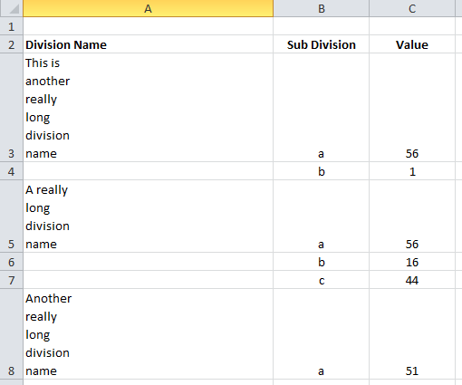
You can add a hard return in your Category text by clicking in a spot in the text and press ALT+Enter. You can create breaks/hard returns where ever you like. As you add the hard returns, your chart will expand to show you the categories in a wrapped fashion as you see here:
Video Demonstration
You can check out these techniques in this very short video tutorial here:
I guess a fourth option is to shrink the font size, but that can make a chart very unreadable. Do you think that it is a Bug that Excel doesn’t change the alignment of all the levels for Multi-Level Category Labels? Let me know in the comments below.
Steve=True


