How to Make a Clustered Stacked and Multiple Unstacked Chart in Excel
On my post How-to Create a Stacked and Unstacked Column Chart I received a comment on how can we do this for a Clustered Stacked and Multiple Unstacked Chart in Excel? Here is the question from Ciara:
“Is there a way to do this where you have 1 stacked bar and 2 non-stacked bars (instead of just 1) for each month? For example a single bar for Sales Quota, another single bar for Stretch Goal, and then the actual coffee/tea stacked bar sales?” – Ciara
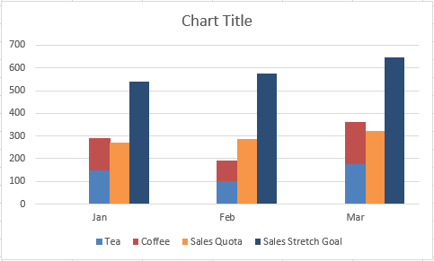
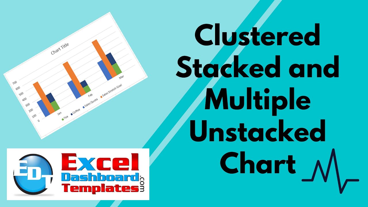
Here is the Original chart:

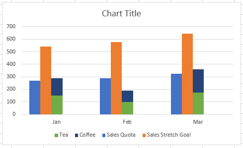
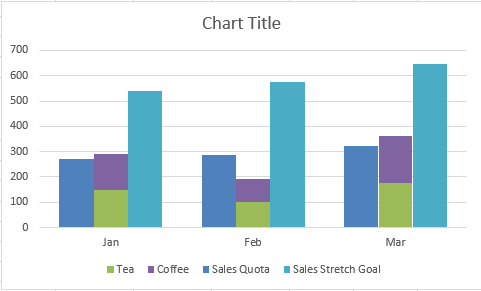
Here is the Sample Chart I made with Ciara’s question:
This can be done, by modifying our data series that we will use in the chart to create more space for the extra columns. Here is how you can do it.
The Breakdown
Here are the basic steps to create a Clustered Stacked and Multiple Unstacked Chart.
1) Add Filler Series to the Data Set
2) Create Stacked Column Chart
3) Switch Row/Column Chart Data Setting
4) Move Sales Goals and Filler Series 2nd Axis and Change Chart Type to Clustered Column
5) Change Gap Width on Stacked Series to 500%
6) Delete Filler Legend Entries
7) Delete Secondary Vertical axis
Step-by-Step
Here are the detailed steps to create the Clustered Stacked and Multiple Unstacked Chart
1) Add Filler Series to the Data Set
If we have our Excel data set as such where we want the Stretch Sales Goal and the Sales Quota as single clustered columns and the have the Tea and Coffee as a Stacked column.
| A | B | C | D | E | |
|---|---|---|---|---|---|
| 1 | Sales Quota | Sales Stretch Goal | Tea | Coffee | |
| 2 | Jan | 270 | 540 | 150 | 140 |
| 3 | Feb | 288 | 576 | 100 | 90 |
| 4 | Mar | 323 | 646 | 175 | 185 |
NOTE: If you want to try it yourself along with me, you can either copy and paste the data above to an Excel sheet or download the sample data and chart at the end of the post.
Now that we have our data set, we need to modify this data set to add 1 or more data series that will fill in column space to move the Clustered Columns on the side of the stacked Series. As the stacked column will always be in the center, you need to either push your data to one side or the other or split around the centered stacked column as you see in these three samples.
a) Clustered Columns to the Left
We need 3 series to push the clustered columns far enough off center left to not overlap the stacked columns. This is the one I will use for the rest of this tutorial.
| A | B | C | D | E | F | G | H | |
|---|---|---|---|---|---|---|---|---|
| 1 | Sales Quota | Sales Stretch Goal | Filler Series 1 | Filler Series 2 | Filler Series 3 | Tea | Coffee | |
| 2 | Jan | 270 | 540 | 150 | 140 | |||
| 3 | Feb | 288 | 576 | 100 | 90 | |||
| 4 | Mar | 323 | 646 | 175 | 185 |
b) Clustered Columns Surrounding
We don’t need as many filler series as the others with this setup as the Filler series fits over the 1 stacked column that will be in the center.
| A | B | C | D | E | F | |
|---|---|---|---|---|---|---|
| 1 | Sales Quota | Filler Series 1 | Tea | Coffee | Sales Stretch Goal | |
| 2 | Jan | 270 | 150 | 140 | 540 | |
| 3 | Feb | 288 | 100 | 90 | 576 | |
| 4 | Mar | 323 | 175 | 185 | 646 |
c) Clustered Columns to the Right
We need 3 series to push the clustered columns far enough off center right to not overlap the stacked columns.
| A | B | C | D | E | F | G | H | |
|---|---|---|---|---|---|---|---|---|
| 1 | Tea | Coffee | Filler Series 1 | Filler Series 2 | Filler Series 3 | Sales Quota | Sales Stretch Goal | |
| 2 | Jan | 150 | 140 | 270 | 540 | |||
| 3 | Feb | 100 | 90 | 288 | 576 | |||
| 4 | Mar | 175 | 185 | 323 | 646 |
2) Create Stacked Column Chart
Now that we have all of our data setup, we can create our chart. To do this, select your data range from Cell A1 to the bottom right of your data. In our case where we will be plotting our clustered columns to the left of the stacked column, so our data ends in cell H4. So select cells A1:H4 and then select the Insert ribbon and pick a stacked column chart as you see here:
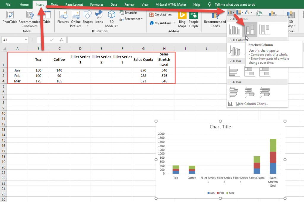
Your initial Excel Stacked Column Chart you have created will look like this:
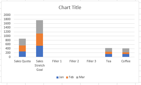
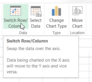
3) Switch Row/Column Chart Data Setting
After you have created your initial chart, you may have noticed that it is not how you thought it would look. If that is the case, always Switch Row/Column setting for your chart and see how it looks. To do this, select the chart and then go to the Design ribbon and click on the Switch Row/Column in the Data Group.
Your chart should now look like this:
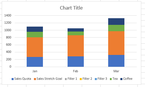
4) Move Sales Goals and Filler Series 2nd Axis and Change Chart Type to Clustered Column
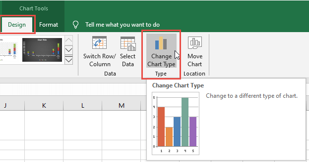
We now have our chart setup and ready to create the Clustered Stacked and Multiple Unstacked Chart by moving the series to the secondary axis that we want to be Clustered Column versus a Stacked Column as well as change the chart type. Let’s show you how to do that. First, select the chart, then select any one of the series.
After selecting a series, go to the Design ribbon and then click on the Change Chart Type button in the Type group as you see here:
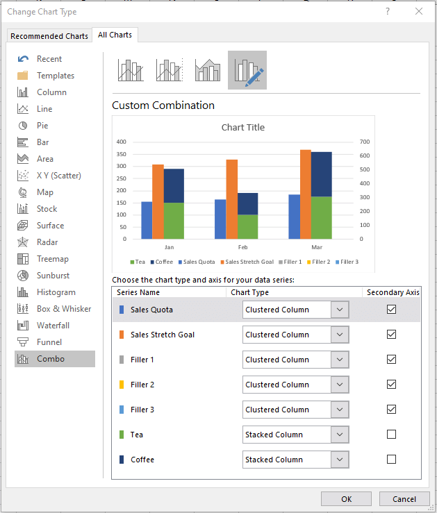
If you are using Excel 2016 or later, then you will see this dialog box pop up. Because we had a series selected when we hit the Change Chart Type, it will bring us right to the Combo chart type. If you are not on the Combo Chart Type, then select that from the All Charts Tab.
From this dialog box, select the Secondary Axis checkbox for the Sales Quota , Sales Stretch Goal and Filler Series 1 through 3. After selecting the Secondary Axis checkbox, you can then change the Chart Type to Clustered Column. Note that you must do it in that order or you will affect your Tea/Coffee stacked column chart. Your dialog box should look like this.
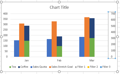
After you press the OK button, your chart will now look like this:
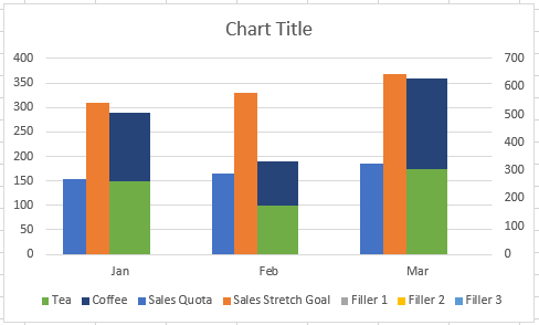
5) Change Gap Width on Stacked Series to 500%
As you can see the chart is now a Clustered Stacked and Multiple Unstacked Chart. But it needs some tweaks. First, we need to make the stacked column look smaller like the other columns. This is an optional step as you see fit.
To make your Stacked Column Chart series look similar to the clustered columns, first select the chart, then select a Stacked Column series like tea or coffee, then press CTRL+F1 to bring up the Format Series dialog box.
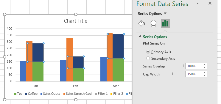
Then change the Gap Width till it looks good. For our example, 500% seems to work well so that the column is no longer hidden or overlapping the clustered columns.
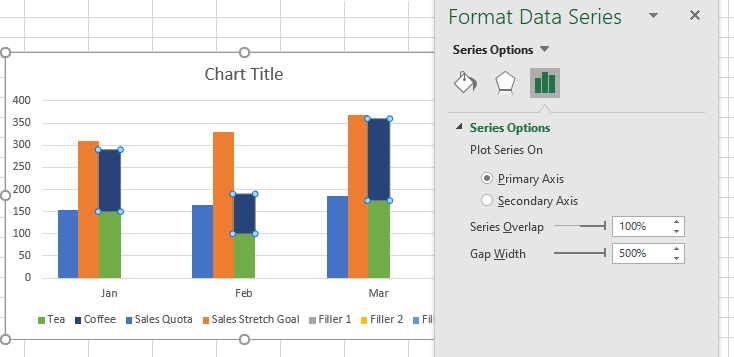
Your chart should now look like this:
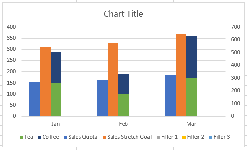
6) Delete Filler Legend Entries
The Filler Series do not show up in the chart, but the Legend Entries do show up in the Legend. I recommend deleting these legend entries as to not confuse your reader.
To do this, select the Chart, then select the Legend, then select the Legend Entry for one of the 3 Filler Series. Finally, press your delete Key.
7) Delete Secondary Vertical axis
Lastly, the only other thing to do is to to delete the Secondary Vertical Axis so that the Clustered Stacked and Multiple Unstacked Chart is aligned.
To do this, select your chart, then select the Secondary Vertical Axis and then press your Delete Key.
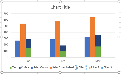
Your final chart should now look like this:
Here is what the chart would look like if you moved the Clustered Columns to the Right or Split on both sides:
So why do we have to do this?
When you create a Stacked Column Chart in Excel, it will only allow you to have ALL data series on the same axis with the Stacked Column Chart Type. So to create a Clustered Stacked and Multiple Unstacked Chart you first have to move all Clustered Columns to one axis.
Second issue is that Excel ALWAYS centers the Stacked Column Chart Type. There is no moving it. It will always be in the center. Clustered Columns are also centered, so they will overlap if we have a combo chart with these 2 types of charts. Since we can’t move the stacked column chart, we therefore need to move the Clustered Columns to one side or another around the Stacked Column.
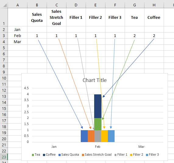
Here is a graphical representation of what I mean that we are shifting the Clustered Columns using filler columns.
Video Demonstration
Check out this Video tutorial on the techniques presented above.
Sample File Download
Click here to Download the Free Sample Excel Template File:
Clustered-Stacked-and-Multi-Unstacked-Chart.xlsx
All in all a pretty cool technique. You can make Excel do a lot of things as lon as you play in the rules, but it is very flexible. Let me know of other charts you want on this type of variation to see if it is possible.
Steve=True


