Chart of Last 3 Months
If you wanted to create a dynamic Excel chart of last 3 months of your data but didn’t know how to use or didn’t want to use the Excel Offset Function, then check out this alternate technique. Maybe it is because you don’t want to use Excel Volatile functions or just don’t get how the Offset function works. Please note that this technique will require you to press a button but that isn’t too difficult.
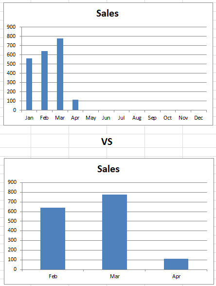
If you are interested in how this trick is different than an Offset function, then check out this link:
Create a Dynamic Chart Using the Offset Function
Breakdown
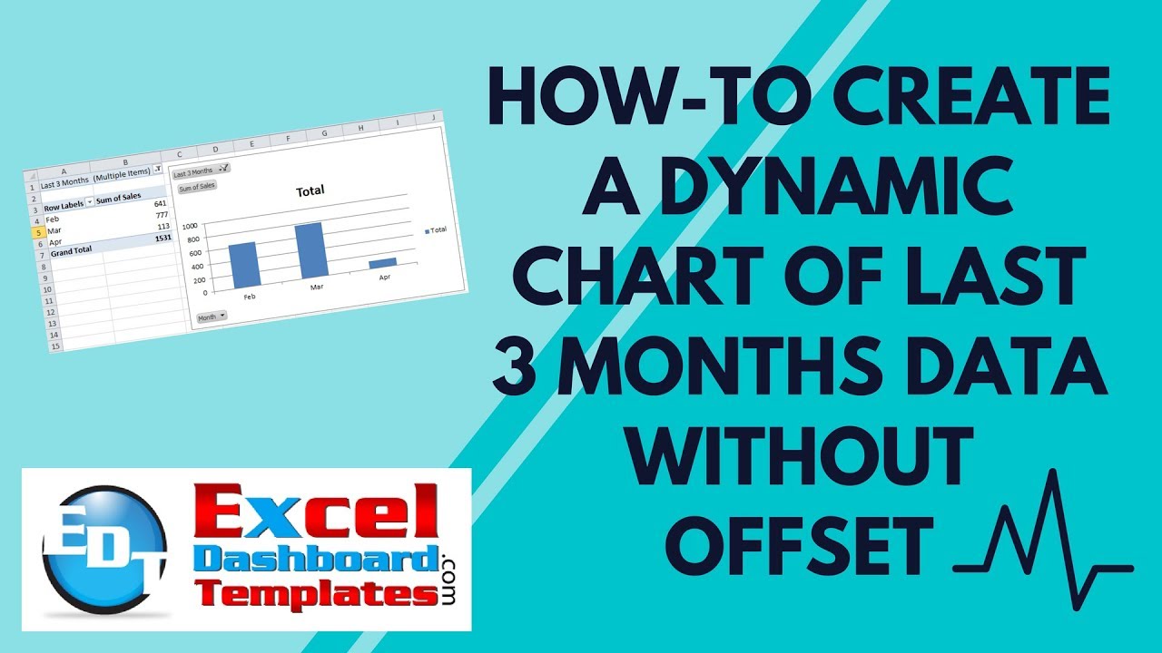
The basic’s of this technique is to build a table of chart values with corresponding formulas that identify the last 3 months. Then create a Pivot table and resulting Pivot chart out of the data table with a filter on the last 3 months that were identified.
1) Add Column In Data Set
2) Create Last 3 IF Formula and Across All Data Points
3) Create Pivot Table of New Data Set
4) Create Pivot Chart
5) Refresh Pivot Data to Refresh Pivot Chart
Step-by-Step Tutorial
1) Add Column In Data Set
If we start with our data in a typical monthly sales format of the month name and sales amount in the adjacent column:
| A | B | |
|---|---|---|
| 1 | Month | Sales |
| 2 | Jan | 560 |
| 3 | Feb | 641 |
| 4 | Mar | 777 |
| 5 | Apr | 113 |
| 6 | May | |
| 7 | Jun | |
| 8 | Jul | |
| 9 | Aug | |
| 10 | Sep | |
| 11 | Oct | |
| 12 | Nov | |
| 13 | Dec |
Next you will want to add a column where we will put our calculation. It doesn’t matter where, so I put mine in Column C as you see here:
| A | B | C | |
|---|---|---|---|
| 1 | Month | Sales | Last 3 Months |
| 2 | Jan | 560 | |
| 3 | Feb | 641 | |
| 4 | Mar | 777 | |
| 5 | Apr | 113 | |
| 6 | May | ||
| 7 | Jun | ||
| 8 | Jul | ||
| 9 | Aug | ||
| 10 | Sep | ||
| 11 | Oct | ||
| 12 | Nov | ||
| 13 | Dec |
2) Create Last 3 IF Formula and Across All Data Points
In the newly created “Last 3 Months” column, we will create a fairly straight forward IF formula. If your new column is in column C, then you can use this formula in Cell C2 and copy it down to C13:
=IF(AND(B2>0,ISBLANK(B3)),1,IF(C3=1,2,IF(C3=2,3,””)))
This formula checks to see if there is a values in the sales column.
Formula Breakdown
IF Sales Column cell adjacent to the current cell is greater than zero and the Sales Column cell one row down to the current cell is blank, then this is the last entry of the current year. So we put a “1” as the result. IF that is not the case, then we check to see if the value 1 row down from the current cell in the Last 3 Months Column equals a 1 then this cell is the 2nd most recent and we put a 2 in the cell. Finally, if that is not the case, then we check to see if the value 1 row down from the current cell in the Last 3 Months Column equals a 2 then this cell is the 3rd most recent and we put a 3 in the cell or else we leave it as blank.
Here are the formulas by cell and what your data table will look like:
| A | B | C | |
|---|---|---|---|
| 1 | Month | Sales | Last 3 Months |
| 2 | Jan | 560 | |
| 3 | Feb | 641 | 3 |
| 4 | Mar | 777 | 2 |
| 5 | Apr | 113 | 1 |
| 6 | May | ||
| 7 | Jun | ||
| 8 | Jul | ||
| 9 | Aug | ||
| 10 | Sep | ||
| 11 | Oct | ||
| 12 | Nov | ||
| 13 | Dec |
Worksheet Formulas
|
3) Create Pivot Table of New Data Set
Your data set is not completed for this tip/trick. But to only show the data for the last 3 months, we need to filter out all the blanks in the “Last 3 Months” column. You can do that in one of 2 ways. Either add a filter to your columns in the original data set or to create an Excel pivot table. I choose the pivot table route as it does not hide your rows so that you don’t have to unhide them next month to add your next data point.

To create a pivot chart, highlight the data range of A1:C13 and then go to the Insert Ribbon and choose the Pivot Table button
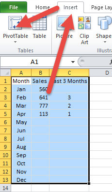
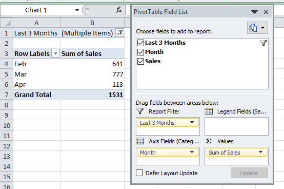
Then create your pivot table with the following settings:
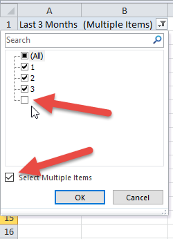
Then change the Report Filter of “Last 3 Months” and de-select the Blanks.
Your resulting pivot table will look like the image you see above titled: “Pivot Table Field List Non-Offset Tip”.
4) Create Pivot Chart
Now that your pivot table is completed, all you need to do is create a pivot chart. To do that, simply click anywhere in your pivot table and then go to the Insert Ribbon and choose any chart that you want to create.

Here is what your final chart will look like. You may want to clean up the chart by Hiding All Field Buttons on the chart (right click to do that).
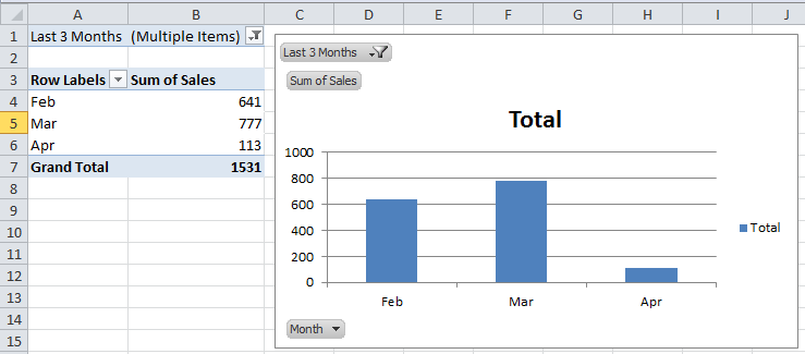
5) Refresh Pivot Data to Refresh Pivot Chart
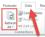
The trick to make the pivot chart dynamically change is to Refresh the Pivot Table after you add new data to the original data range. As you add data, your “Last 3 Months” column of data will adjust and also in your pivot table data as you press the Refresh All button on the Data Ribbon
Video Demonstration
So if you need to create a non-volatile ‘mostly dynamic’ chart, you can use a simple IF formula along with a Pivot Table or Worksheet Filter to help you chart the most recent data points and save you time adjusting your Excel Charts.

