Thanks for the submissions for the Friday Challenge.
You can get the sample data and chart request here: friday-challenge-help-new-to-excel-yoy-comparisons
Here are some other submissions:
A) In the comments on the Challenge Post, Miguel described a Dot Plot chart for the data. Sounds real interesting. I will have to investigate.
B) Pete had this submission:
“Here is a quick and dirty chart that easy to filter with slicers. You need PowerQuery to access the data model, as I used it to unpivot the original data and make it easy to work with.” -Pete
In my opinion, reordering the data is key as well.
You may ask yourself: “What is Power Query?”
If you have 2010 or 2013, Microsoft Power Query is an Excel add-in that enhances Excel by simplifying data discovery, access and collaboration.
I believe that it is included in Excel 2016.
From Microsoft website:
“With Power Query you can:
- Identify the data you care about from the sources you work with (e.g. relational databases, Excel, text and XML files, OData feeds, web pages, Hadoop HDFS, etc.).
- Discover relevant data from inside(*) and outside your organization using the search capabilities within Excel.
- Combine data from multiple, disparate data sources and shape it in order to prepare the data for further analysis in tools like Excel and Power Pivot, or visualization in tools like Power View and Power Map.
- Share the queries that you created with others within your organization, so they can be easily found via Search. (*)
(*) This capability requires Power BI for Office 365. You can learn more at Power BI for Office 365. “
You can download the Power Query add-in here: Download Microsoft Power Query
C) Here is the way that I thought it would be best to display the data:
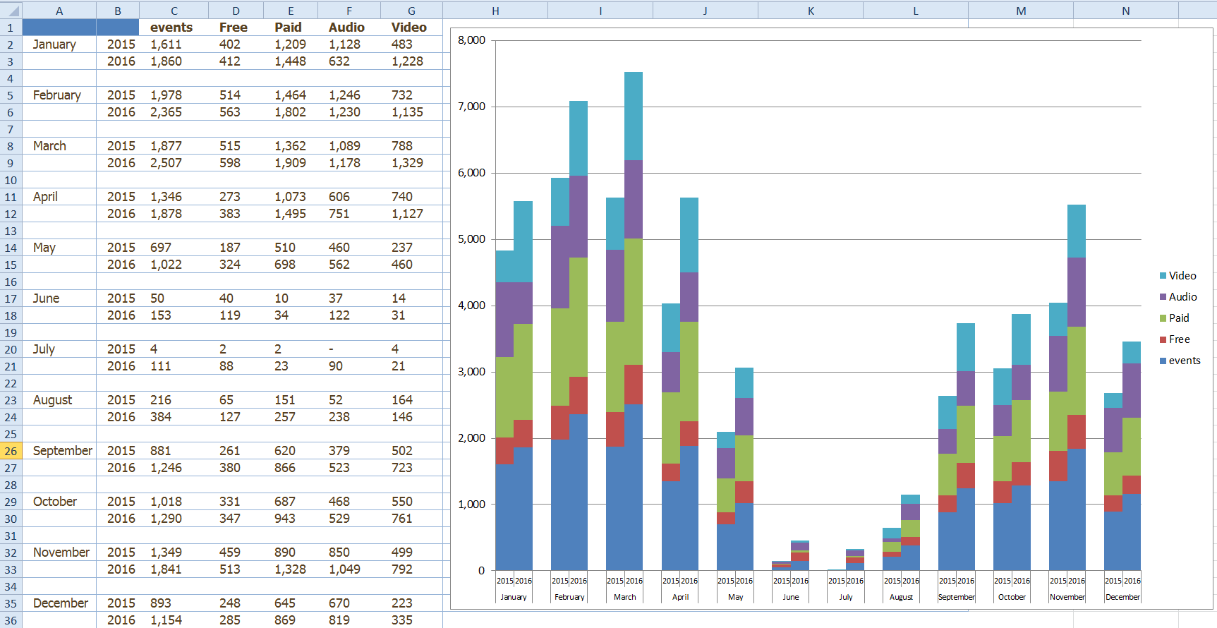
If you look at the original data versus my solution, you will notice that I also had to rearrange the data to fit the final chart. I will show you how to easily do this in following posts.
I heard the following feedback from the user, so seems like it was a good solution:
“Thanks so much; this is exactly what I needed. You rock! ” -gstevens
You can download my free Excel Chart sample file here: Excel-YOY-Challenge.xlsx
Do you think that the solutions above show the data to the users in a very good or bad way? Are there any other ways to present the data? Let me know in the comments below.
Steve=True


