Yesterday I presented a case study on assisting a mom in creating a chart for a science fair.
You can read more about it here:
Case Study – Mom Needing Help on Science Fair Graphs/Charts
So here is what I did.
First we need to see what the data should look like in Excel. I have deduced that the data that the mom has posted in the forum would have looked like this in a spreadsheet:
Excel 2010
| A | B | C | D | E | F | G | H | |
|---|---|---|---|---|---|---|---|---|
| 1 | Subject A | |||||||
| 2 | Wii Sports | Real Sports | ||||||
| 3 | Tennis | Pulse Before | Pulse After | Steps Taken | Pulse Before | Pulse After | Steps Taken | |
| 4 | Trial 1 | 80 | 88 | 10 | 80 | 120 | 1119 | |
| 5 | Trial 2 | 80 | 84 | 11 | 88 | 128 | 1242 | |
| 6 | Trial 3 | 84 | 88 | 10 | 84 | 124 | 1181 | |
| 7 | Bowling | |||||||
| 8 | Trial 1 | 84 | 88 | 5 | 84 | 88 | 246 | |
| 9 | Trial 2 | 80 | 84 | 6 | 80 | 88 | 263 | |
| 10 | Trial 3 | 80 | 80 | 7 | 82 | 88 | 255 | |
| 11 | Baseball | |||||||
| 12 | Trial 1 | 80 | 84 | 19 | 96 | 112 | 887 | |
| 13 | Trial 2 | 80 | 88 | 20 | 80 | 96 | 961 | |
| 14 | Trial 3 | 84 | 88 | 20 | 88 | 104 | 924 | |
| 15 | ||||||||
| 16 | Subject B | |||||||
| 17 | Wii Sports | Real Sports | ||||||
| 18 | Tennis | Pulse Before | Pulse After | Steps Taken | Pulse Before | Pulse After | Steps Taken | |
| 19 | Trial 1 | 64 | 96 | 14 | 68 | 72 | 1028 | |
| 20 | Trial 2 | 68 | 96 | 46 | 68 | 88 | 2316 | |
| 21 | Trial 3 | 72 | 100 | 50 | 64 | 88 | 1678 | |
| 22 | Bowling | |||||||
| 23 | Trial 1 | 76 | 120 | 26 | 60 | 64 | 199 | |
| 24 | Trial 2 | 68 | 100 | 37 | 62 | 84 | 350 | |
| 25 | Trial 3 | 72 | 128 | 29 | 66 | 88 | 225 | |
| 26 | Baseball | |||||||
| 27 | Trial 1 | 76 | 96 | 22 | 64 | 104 | 825 | |
| 28 | Trial 2 | 72 | 112 | 26 | 64 | 108 | 1058 | |
| 29 | Trial 3 | 72 | 124 | 17 | 68 | 112 | 987 |
Sheet1
Looking at the data, it appears that there are several groupings or comparisons that need to be made.
We need to group the Data for the 3 Trials (Wii Sports vs Real Sports) for each sport (Tennis, Bowling and Baseball) for each subject.
This sounds like a perfect solution for an Excel Multi-Level Category Labels.
What is that you ask?
It is just the best, easiest way ever in Excel to create groupings in Excel Charts and Graphs.
To do this, we first need to re-arrange the data. You may need to do this as well with the data you have for your Company Dashboard Charts.
So this is how we need to rearrange the same data:
Excel 2010
| A | B | C | D | E | F | G | |
|---|---|---|---|---|---|---|---|
| 1 | Pulse Before | PulseAfter | Steps Taken | ||||
| 2 | Subject A | Tennis | Trial 1 | Wii Sports | 80 | 88 | 10 |
| 3 | Real Sports | 80 | 120 | 1119 | |||
| 4 | Trial 2 | Wii Sports | 80 | 84 | 11 | ||
| 5 | Real Sports | 88 | 128 | 1242 | |||
| 6 | Trial 3 | Wii Sports | 84 | 88 | 10 | ||
| 7 | Real Sports | 84 | 124 | 1181 | |||
| 8 | Bowling | Trial 1 | Wii Sports | 84 | 88 | 5 | |
| 9 | Real Sports | 84 | 88 | 246 | |||
| 10 | Trial 2 | Wii Sports | 80 | 84 | 6 | ||
| 11 | Real Sports | 80 | 88 | 263 | |||
| 12 | Trial 3 | Wii Sports | 80 | 80 | 7 | ||
| 13 | Real Sports | 82 | 88 | 255 | |||
| 14 | Baseball | Trial 1 | Wii Sports | 80 | 84 | 19 | |
| 15 | Real Sports | 96 | 112 | 887 | |||
| 16 | Trial 2 | Wii Sports | 80 | 88 | 20 | ||
| 17 | Real Sports | 80 | 96 | 961 | |||
| 18 | Trial 3 | Wii Sports | 84 | 88 | 20 | ||
| 19 | Real Sports | 88 | 104 | 924 | |||
| 20 | Subject B | Tennis | Trial 1 | Wii Sports | 64 | 96 | 14 |
| 21 | Real Sports | 68 | 72 | 1028 | |||
| 22 | Trial 2 | Wii Sports | 68 | 96 | 46 | ||
| 23 | Real Sports | 68 | 88 | 2316 | |||
| 24 | Trial 3 | Wii Sports | 72 | 100 | 50 | ||
| 25 | Real Sports | 64 | 88 | 1678 | |||
| 26 | Bowling | Trial 1 | Wii Sports | 76 | 120 | 26 | |
| 27 | Real Sports | 60 | 64 | 199 | |||
| 28 | Trial 2 | Wii Sports | 68 | 100 | 37 | ||
| 29 | Real Sports | 62 | 84 | 350 | |||
| 30 | Trial 3 | Wii Sports | 72 | 128 | 29 | ||
| 31 | Real Sports | 66 | 88 | 225 | |||
| 32 | Baseball | Trial 1 | Wii Sports | 76 | 96 | 22 | |
| 33 | Real Sports | 64 | 104 | 825 | |||
| 34 | Trial 2 | Wii Sports | 72 | 112 | 26 | ||
| 35 | Real Sports | 64 | 108 | 1058 | |||
| 36 | Trial 3 | Wii Sports | 72 | 124 | 17 | ||
| 37 | Real Sports | 68 | 112 | 987 |
Sheet3
Now that we have the data rearranged, we just need to chart it.
Simply highlight the range and create a 2-D Clustered Column Chart. It will look like this:
Check out how the Horizontal Axis groups the data. Lets look closer just at the data from Subject A:
If you right click on the Horizontal Axis and then click on Format Axis… from the pop-up menu. You will then see the Axis Options dialog box:
Notice that Multi-level Category Labels is checked. If you uncheck the Multi-level Category Labels check box from the Axis Options in the Format Axis dialog box, you chart will be changed to this:
Now it is back to a normal column chart in that the Horizontal Category Axis Labels are only showing the first column next to your data. Not cool.
Here is a simpler chart using Multi-level Category Labels:
Excel 2010
| A | B | C | |
|---|---|---|---|
| 1 | Birds | Canaries | 6 |
| 2 | Parrots | 7 | |
| 3 | Amphibians | Frogs | 5 |
| 4 | Turtles | 8 | |
| 5 | Mammals | Dogs | 4 |
| 6 | Cats | 6 |
Sheet2
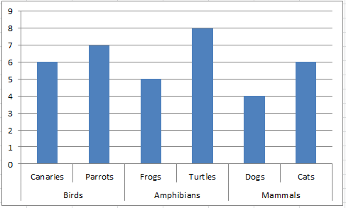
So how it makes things so much easier to read?
Try it for yourself.
Back to our story, what did Mom think of my solution?
Here is what MomNeedingHelp wrote back:
Re: Help with Science Fair Graphs/Charts
OMG!!! I am in awe! You did it FOR me??? Silly me, I am so emotional over it. I have sat in front of the pc, searching and searching and searching. I actually found your website today, from here, and was going to try and copy some of the things on your website.
I just can’t express enough appreciation. I have been an at home mom for 15 years, now going back to middle school for the 3rd time with my kids, 4th time for me in total.
Thank you, thank you, thank you.
Now, how do I learn to do stuff like that so I can teach my kids?
You are the best!!!!
Did I say Thank you? Thank you!!!!
Video Tutorial: http://youtu.be/2CxyyPvegjk
HOW COOL – But I wonder if I won the science fair? Well, I didn’t do the test, I just helped the kid make a really cool chart out of his data. Check it all out in this video tutorial:
Do you think you can use this technique in your next Executive Company Dashboard?
Let me know in the comments.
Steve=True


