In the last Friday Challenge, we were going to see if we could help a user create a chart from this data set. They were confused on what type of chart to make and how to do it. To the user, they thought they needed a 3rd axis because of the sub-categories.
friday-challenge-stumped-on-how-to-display-data-in-an-excel-chart
So let’s see a few solutions below.
Here was my solution:
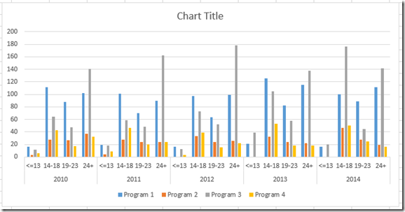
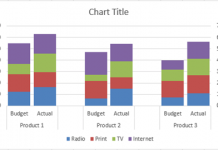
I came up with a quick and easy clustered column chart:
The main issue in my mind was how the user had his original data. So I turned it on its side by copying the original range then Paste Special>Transpose & Values and the new data looks like this: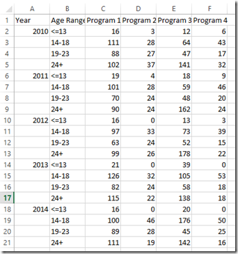 Then you can simply chart the new data range as an Excel Clustered Column Chart.
Now let’s check out a real masterpiece.
Pete’s Solution
Pete got all the extra credit by creating a similar chart to mine, but went above and beyond by creating a dynamic Excel Pivot Chart with Slicers. Here is how he did it:
I first made a copy of the original data set so that I had something to experiment on. I took a look at the data and noticed that it was essentially 4 categories of information: Program, Year, Age Range, and Values. This meant that if I organized the data correctly by category, that it would be easily pivot-able.
The first thing that I did was unmerge the year row and add the individual year to each cell.
From this:
To this:
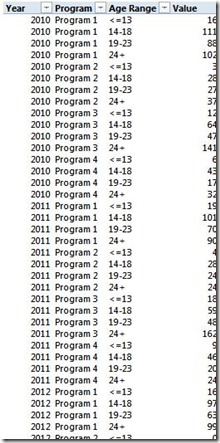
Next, I made my new data table with the Program, Year, and Age Range columns with the data arranged like this: 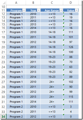
Then I had to find a simple method to bring in all of the values. I added a row above my original data set to concatenate the year and age group to make a unique field.
Then I added a Value column to my data set. I broke this into 4 steps, one for each program. The only difference in the formula used in the 4 steps is the array that was indexed. I used an index match formula to retrieve the values based on the newly concatenated row on my original data set. The formula for Program 1 is: =INDEX($B$4:$U$4,MATCH(B12&C12,$B$1:$U$1,0))
I copied this formula down to the last row in my data set for Program 1 and the first row in Program 2. I then modified the formula in the Program 2 area to change the row that was indexed in my original data set and copied it down. I repeated this process 2 more times until I had all of the values in my data set.
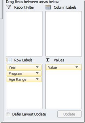
Next, I created a pivot table from my data set.
Which looks like this:
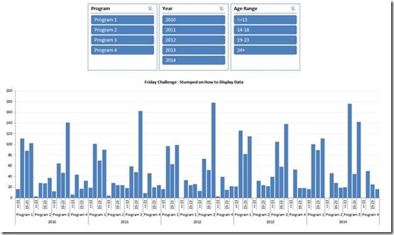
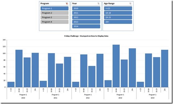
Then I added slicers for Program, Year, and Age Range. Next I created a column pivot chart based on my pivot table. When nothing is filtered it looks like this:
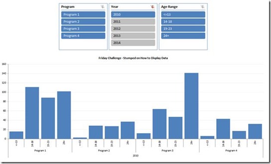
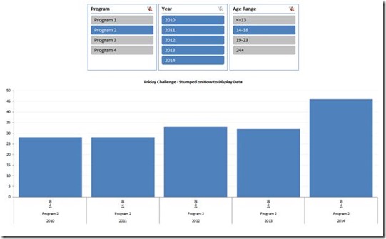
The slicers give the ability to filter for various views. Such as:
A single Program…
A single Year for all Programs…
A single Age Range for a single Program over time…
And any other combination of the slicer filters as desired by holding your CTRL key down as you select the options with your mouse.
You can download the free sample file here:
Petes-Stumped-Chart-Data-Challenge-Slicer-Pivot-Chart.xlsx
Thanks Pete! You get an A+ with Extra Credit. Great job and thanks for helping us all with your write up. I think the way you transformed the data was really great and we can all learn from it. Thanks again.
Steve=True


