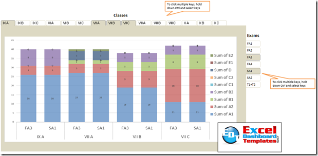
Here is Don’s amazing reply to the recent Friday challenge.
In this example, Don has elevated his Excel Slicer Pivot Charting to a whole new level. Way to go Don!
Don created a highly dynamic dashboard allowing users to create their own Grade count by Class and Exam using a Pivot Table, Slicers and a Pivot Chart.
You can see a quick demonstration here:
You can download the sample file here:
Dons-Challenge-which-chart-is-suitable-pivot-table.xlsx
Don gives a lot of credit to his slicer capabilities to this blog:
http://datapigtechnologies.com/blog/index.php/getting-fancy-with-your-excel-slicers/
Data Pig is a great blog on Excel and you should check it out.
Thanks again Don!
Steve=True


