In my last 2 posts:
I showed you how to setup your data in preparation for creating a dynamic dashboard chart
Part 1: think-like-a-database-designer-before-creating-an-excel-dashboard-chart
And then I showed you how to create an Excel Pivot Table or Data Table and Insert Slicers
Part 2: how-to-insert-slicers-into-an-excel-pivot-table
In this tutorial, I will show you some of the tips and tricks to the final part of creating a dynamic dashboard chart.
Dynamic Charts For Excel Tables
1) Arrange your data so that the right most column of your Excel Table represents the value for your chart.
You can re-arrange your data in an Excel Table by dragging and dropping the column header of the table from where it is now to where you want it.
In our case, we want the Year and Month to be to the left of Group so that the chart will create a multi-category horizontal axis. NOTE: You cannot move the Excel Table Columns unless you have cleared the filters or slicers.
In our case, we want the Year as the biggest grouping followed by month and then Group and Category.
2) Create your Excel Chart
When you have your data setup in the right order in the Excel Table, then highlight the data you want to chart and then select the Insert Ribbon and then select the 2-D Clustered Column Chart in the Chart Group. You have now created a Dynamic chart using an Excel Table.
3) Update Chart Options
However, one of the short comings of an Excel Table is that when use a filter or use a slicer to filter the table, it hides the rows. This may cause your chart to grow, shrink and move with the Excel Rows. I recommend turning this option off when you make an Excel Table Chart. To remove this option, right click on the chart and select Format Chart Area. Then select the Chart Options and choose “Don’t move or size with cells” 
You are all set. Your users can now use the Slicers to filter the data the data dynamically to the values they want to see. Also, if you add new rows of data for the next month’s data, Excel will automatically add the new data to your chart.
Here is another tutorial on this topic but without the slicer option if you don’t have Excel 2013:
how-to-make-dynamic-excel-dashboard-charts-using-tables
Pivot Tables
1) Create Pivot Chart
Select anywhere in the Pivot Table you created in the previous tutorial and then click on the Insert Ribbon and then select the 2-D Clustered Column Chart in the Chart Group.

2) Update Pivot Fields
We create our Pivot Table with all of the groupings in the Rows as you see here.

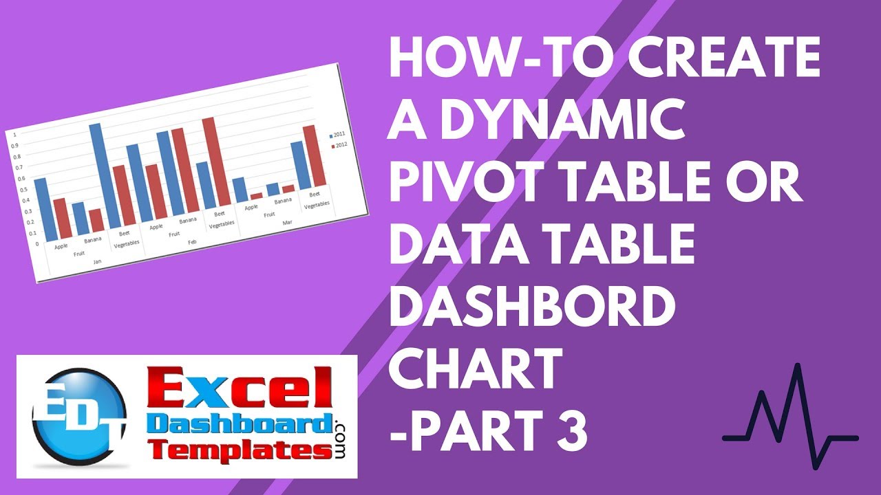
This will result in a chart that looks like the chart we create with our Excel Table like this:
 However, you may want to consider changing your PivotTable Fields to create new series by moving a grouping to the Columns section as you see here:
 By moving the Year to the Columns, you will create a new series in your Pivot Chart as you see here:
 Regardless of how you want to choose to display your data, the Dynamic Pivot Chart for your Excel Dashboard is now completed and your users can use the Slicers to see the data they are most interested in viewing.
Video Demonstration
Sample File Download
How-to_Create_a_Dynamic_Excel_Pivot_Table_Dashboard_Chart.xls
What Pivot Table or Excel Table settings did I miss or do you prefer to use when creating Pivot Chart or Dynamic Excel Table Chart? Let me know in the comments below.
Steve=True


