Okay, I got an email from a SUPER FAN of my sight. She even donated some money to help cover the costs of that we incur to bring you these Excel tutorials. Kathy, thank you very very much.
Well Kathy had a question about some data and a chart she was trying to make.
Here is the gist of what she is trying to do:
1) There are about 20 data points for various locations and how many sick leave hours they are using.
2) There is a a baseline of the sick leave hours by location for comparison.
3) The chart would also need to compare the most current pay period with the baseline.
4) Since less sick hours are better, you may want to think of this in a reverse way, where less is good and more is bad.
So there you have it. Here is how Kathy’s data looks: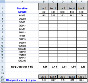
And here is the full data set: This is a common problem that you will run into as a business analyst. So how would you make a chart that will take all this into account? Leave me a comment or send me an email with how you would make a chart for this problem with this data.
Here is what I created and how I saw the data. Now it didn’t come right to my mind and I had to try several different graphs and charts, so make sure you don’t give up.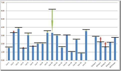
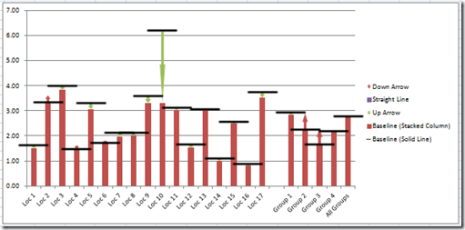
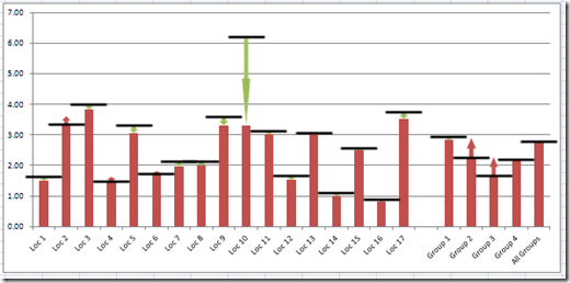
Here is what the graph represents. The black line is the baseline and the blue column if it is below the baseline, then you will see a green arrow. If you see a red arrow above the baseline, then the location has not done well and is above the baseline to the top of the red arrow.
As you can see by the graphic above, which location is doing the best? With the dashboard chart, you can quickly see that location 10 is doing AWESOME. This isn’t something that you could see in the data. That is why dashboard graphs and charts are so powerful. You get lost in the data, but you can quickly focus on the top and bottom performers.
And which locations are doing the worst? It looks like most are doing well, but I see quickly in the Excel dashboard chart that there are 5 locations that aren’t doing so well. But I can also see that the biggest problems are in Group 2 and group 3.
So if you like this chart, let me walk you through all of the steps required to make this data set and chart in Excel.
The Breakdown
1) Create your Data Range and Chart Range
2) Create a Stacked Column Chart
3) Create Custom Markers
4) Change the Baseline (Solid Line) Chart Type
5) Change Baseline (Solid Line) Line Color
6) Change Standard Excel Markers to Custom Markers
7) Remove Legend
8) Sit back and wait for praise from your director as they are total shocked at this awesome chart.
Step-by-Step
1) Create your Data Range and Chart Range
Okay, this is the most challenging step. It involves using the Offset Function in Excel. So if you haven’t seen these posts and videos, you should check them out as they will help you understand how to use the Excel Offset Function.
This is the Bomb: or How I came to love the Offset function
A) So first we need to create our data range. It is simple, in that we have the pay periods on the left going down a column and we have the locations going across the top in a single row. Your data will now look like this: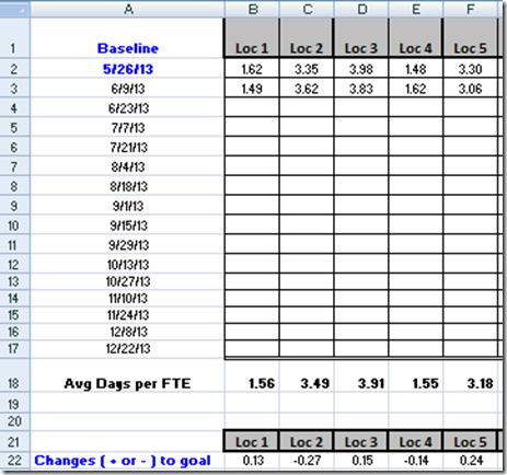
Now in Row 22, I have put in a special formula that will look at the most current sick leave numbers and compare it to the baseline in Row 2. Here is what the formula looks like in row 22:
=B$2-OFFSET(B$2,COUNT(B$2:B$17)-1,0,1,1)
Check out this post if you want to learn more about how to use the Offset formula:
Case Study – Creating a Dynamic Chart in Excel Using Offset Formula
Create a Dynamic Excel Pie Chart
B) Now we need to create a Chart Range. This will group our data and use formulas that will make our data show in the way that we want. Here is what my data range looked like:
So lets dive into the formulas in each row.
Row 27: has the following formula: =B$2 – If you put this in cell B27 and copy across your data range, it will keep your data safe as we are using a combination of Relative and Absolute reference. This is how we create solid black horizontal line.
Row 29: =IF(B22>0,B22,NA()) – This formula looks at the change and if it is positive, then it copies that value to the this chart series range. If it is not positive, then it puts in a NA() function. This is how we create the upward red arrow.If you want to learn more about the Excel NA() function, then check out this post:
How-to Make a Conditional Column Chart in Excel – REDO
How-to Show Decades and Highlight a Year in the Horizontal Axis
How-to Plot Building Wall UR Value in an Excel XY Scatter Chart
Row 30: =IF(B22=0,0.0001,NA()) – This formula just puts in a really small number in case the data hasn’t changed. We use this as a place holder in case there is no better or worse result.
Row 31: =IF(B22<0,ABS(B22),NA()) – This formula looks at the change and if it is negative, then it copies that value to the this chart series range and changes the sign of the number to positive. If it is positive, then it puts in a NA() function. This is how we create the downward green arrow.
Row 28: =B$2-IF(ISNUMBER(B29),IF(B29>0,B29,0)+IF(ISNUMBER(B31),IF(B31>0,B31,0))) – This formula is taking our baseline and then subtracting any value in Row 29 and also adding any value in Row 31. This is how we create the Blue column.
I think that the offset function is the hard part of this Excel Tutorial. Now that we have our data set up, we are ready to make our Excel chart. Also check out this posting that shows you how to find the last value in your list in Excel:
How-to Hide a Zero Pie Chart Slice or Stacked Column Chart Section
Find the Last Row or Last Column for Dynamic Excel Dashboards
2) Create a Stacked Column Chart
Now highlight the chart data range of A26:X31 and click on the Stacked Column Chart button from the Insert Ribbon:
Your chart will now look like this: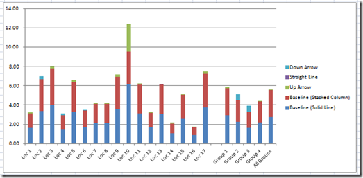
Now we need to create the arrows and black baseline bar images to insert into the chart.
3) Create Custom Markers
Now to make the red arrows, green arrows and black bar/line in the chart, we first need to create them in your spreadsheet. To do this, go to your Insert Ribbon and create them from the Shapes button: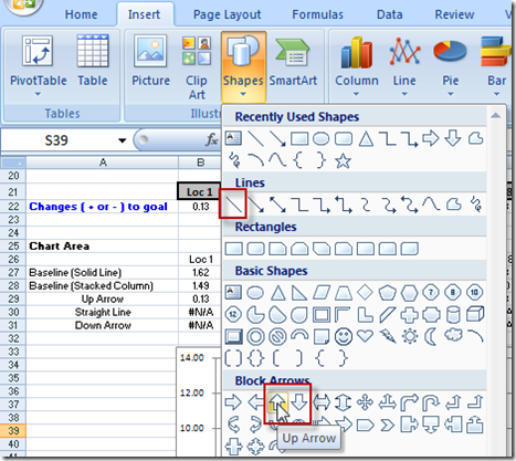
Just create these shapes anywhere in your spreadsheet and we will use them in step 6 of this Excel Tutorial. Here is what my shapes looked like in my spreadsheet: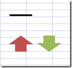
4) Change the Baseline (Solid Line) Chart Type
The next step we need to do is to change the Chart Type of the 4”Baseline (Solid Line)” series to a Line with Markers. To do this, right click on the Baseline (Solid Line) series (the blue one) in the chart and then select “Change Series Chart Type” from the pop-up menu: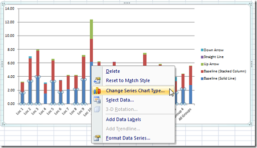
And then choose the Line with Markers choice from the Change Chart Type dialog box: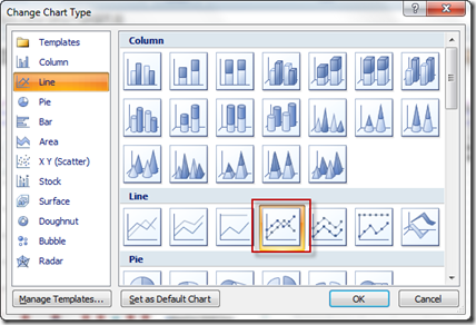
Your chart should now look like this: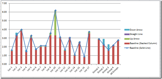
5) Change Baseline (Solid Line) Line Color
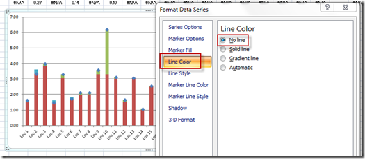
Now we don’t need to actually show the line as it is not a valid line. To do this, click on the blue line for the Baseline (Solid Line) series and press CTRL+1. This will bring up the Format Data Series dialog box in Excel. From here, choose the Line Color on the left selectors and then choose No Line:
6) Change Standard Excel Markers to Custom Markers
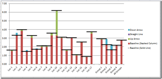
Okay, here is where we start to put the chart together by putting in the shapes we created earlier into the chart as custom markers. To do this, first select the Black Bar you created earlier. Then press CTRL+C to copy it. Then select the chart and then select the blue markers that were part of the line with markers in the Baseline (Solid Line) series. Once you have the series selected, press CTRL+V to paste the black bars into the chart. Your chart should now look like this:
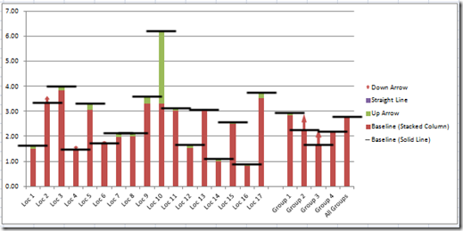
Now do the same for the Red Arrows:
and then repeat for the Green Arrows:
If you want to learn more about custom markers, check out this post:
How-to Make and Add Custom Markers in Excel Dashboard Charts
7) Remove Legend
That is pretty much it. Your chart is almost completed. All you need to do is to delete the legend as it doesn’t add that much value to the chart. Select the legend and press your delete key. Your final chart will look like this:
Video Tutorial
See all these Excel techniques in action in this detailed video demonstration:
So what do you think? Let me know in the comments and also send me your ideas on how we can improve this chart. Also thanks again to Kathy for sending in this request.
Steve=True

