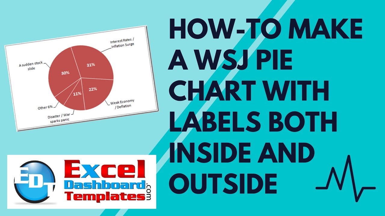
I thought it was a in last week’s USA Today, but looking at the picture I took more closely, it may have been produced by the Wall Street Journal. Either way, when I saw this chart, I wondered how to do this same chart with standard Excel pie charts.
There are a few things that make this chart unique.
1) Labels on the inside of the slice and on the outside of the slices.
2) Leader lines to the labels outside of the slices.
3) One slice color with white borders.
This type of chart poses a problem in Excel because of the 2 different labels. So lets take a look at the standard label options.
Notice that there is not a pie chart option for label position to be both on the inside and the outside.
But don’t worry, you can add labels on the inside of a pie chart and on the outside of a pie chart at the same time. Check out this sample chart: If you learn this technique in Excel, it will make your Dashboard shine! Here is a sample:
So if you want to learn how to do this trick, please make sure and read the rest of the post and watch the video that you can find at the bottom of this article. After you follow all the steps, you final chart will look like this:
The Breakdown
1) Create Pie Chart Data and Pie Chart
2) Create Labels – Outside End
3) Delete Pie Chart Legend
4) Move Labels to Show Leader Lines
5) Rotate Pie Chart to 350 Degrees
6) Copy and Paste Series 27) Move Series Up8) Add Center Labels and Delete “Other” Percentage Label
9) Move Second Series to the Secondary Axis
10) Rotate Pie Chart to 350 Degrees
11) Change the Chart Fill and Border Color
12) Change Label Font Color, Style and Size
The Step-by-Step Tutorial
1) Create Pie Chart Data and Pie Chart
First we need to create our pie chart data. It is not too complicated, just enter the following into your Excel spreadsheet:
Once you have created your chart data, select the data range from A2:B6 and then click on the Pie Chart button from the Insert Ribbon:
Here is what your chart should look like now:
2) Create Labels – Outside End
Now click on any slice of the pie chart and then go to the Layout Ribbon. From there, click on the Data Labels button and then click on the “Outside End” choice from the drop down menu:
Then right click on any one of the labels and select “Format Data Labels…”
Then from the Format Labels dialog box, choose the following options:
Your chart should now look like this:
3) Delete Pie Chart Legend
It looks like the chart legend is getting in our way. And, we don’t need it as we have created labels outside the pie chart that will represent the same information as you currently see in the legend. So simply select the legend in your chart and press the delete key. Your chart will now look like this:
4) Rotate Pie Chart to 350 Degrees
Now the sample chart that we have is tilted slightly to the left. So the Excel pie chart slice of “Interest Rates / Inflation Surge” spans from 11:30 (on the clock dial) to 3:15. To do this, right click on the chart and then select “Format Data Series” from the pop-up menu:
Then, from the “Format Data Series” dialog box, change the “Angle of first slice” to 350:
Your chart will now look like this:
5) Move Labels to Show Leader Lines
In the original USA Today chart, you see “Leader Lines” going to each of the “Outside Labels”. So to do that in Microsoft Excel, we are close because the labels are already on the outside of the pie chart. But to create the lines, you need to move the labels slightly. 
So on each one of the labels, select it once and then move it slightly to the left or right and you will then see the leader lines from the pie slice to the outside label appear. After doing that on each slice, your chart should now look like this:
6) Copy and Paste Series 2
Okay, now you have created a nice chart, but it needs to have the percentages also appear in the center of each slice. To do that , you need to do the following steps.
a) Select and Copy your original chart data series A2:B6 
b) Then right click on your pie chart and then select Paste:
You will now have a second series added to the pie chart, but you can’t see it because it looks exactly like the first pie chart your created. Also, excel will only show one pie chart up front, so you are not sure which one you are seeing. So since your chart won’t look any different, you can see that your chart has a new series (series 2):
7) Move Series Up
So now to get our desired chart effect, and show two labels (one inside and one outside the pie chart, we need to do the following.
First Right click on the pie chart and select “Select Data…” from the pop-up menu:
Then you need to select the “Series 2” in the “Legend Entries (series)” area on the left and move it up to the top (the first series).
From this:
to this:
When you do this step, your chart will now look like this:
Notice that your chart now is missing all your edits to the outside labels, but don’t worry, we will get them back in a few steps.
8) Add Center Labels and Delete “Other” Percentage Label
Now click on the visible pie chart. Then go to the Layout Ribbon and choose the Data Labels button and then choose center:
Your chart will now look like this:
Now to replicate the chart, we need to delete the 6% label from the pie chart as we already put it in the outside labels. Simply click on the 6% label TWO times and then press the delete key. Then your chart will look like this:
9) Move Second Series to the Secondary Axis
Now to get the outside labels with leader lines, we need to move this new series to the secondary axis. So right click on any pie chart slice and then press CTRL+1 to bring up the Format Series Dialog box. Then move the series to the Secondary Axis:
Now you have created you’re a pie chart with both Outside and Center labels. Here is what it looks like:
10) Rotate Pie Chart to 350 Degrees
Now you may have noticed that the pie chart and the leader lines don’t match up. So we need to get the 2nd pie chart series rotated like we already did with the previous pie chart. To do this, click on any pie chart slice and then press CTRL+1 to bring up the “Format Data Series” dialog box. Then change the “Angle of the first slice to “350”
Your leader lines and your chart should now be aligned and it will look like this:
11) Change the Chart Fill and Border Color
So to complete the chart and make it look like the USA Today chart that we were recreating, we need to do a few last steps. One of those is to make all the chart slices the same color of a light red. To do this, click on any pie chart slice and then press CTRL+1 to bring up the Format Data Series dialog box. Then Click on the Fill menu on the left and choose a “Solid Fill” with a color of Red:
Then choose the Border Color menu on the left and then choose a Solid Line and a Color of White:
Your chart will now look like this:
12) Change Label Font Color, Style and Size
Now the last thing we need to do is to make the percentage labels white, bold and a larger font. Click on any percentage label and then do the following from the Home Ribbon:
a) Click on a Style of Bold
b) Increase the font size
c) Change the Font Color to White 
Your final chart should now look like this:
The Video
Check out a video tutorial where you can see step-by-step how to make this chart in Excel:
Thanks for checking out my blog. If you liked this post, make sure and leave a comment or give me a like on the YouTube video. Also, let me know if you have a chart that you want to know how to recreate in Excel.
Steve=True


