In an Excel Help Forum, an engineer wanted to know how to chart the following data:
The data would need to be plotted like on the X and Y data points on the graph, however, there was a twist. The data needed to be colored Red or Green based on the UR value. If the UR Value is greater than one, then it needed to be colored red and if it was less than or equal to 1, then it would need to be colored Green.
The engineer wanted the resulting Excel Chart to look like this:

I then asked the engineer what the the context of the chart.
He said the chart is “It’s a plot of various node points on a wall within a building. For each point I have other calculations determining whether the building structure is strong enough at that point, which is represented by the UR value. If UR <1, the structure is OK at that point, if UR >1, the structure is not OK at that point.”
HOW COOL, I am helping determining if a structure will be safe and sound with Excel. This is really neat.
The Breakdown
1) Add formulas to determine if the data point is green or red using the NA() Function in Excel.
2) Create an XY Scatter Chart with Markers Only
3) Increase the Size of the Markers
4) Adjust the Gridlines.
Step-by-Step Tutorial
1) With your data in this format:
Create formulas using the NA() in the formula to determine if the series will be red or green.

Your formulas will look as follows:
D2: =IF($C2<=1,A2,NA())
E2: =IF($C2<=1,B2,NA())
F2: =IF($C2>1,A2,NA())
G2: =IF($C2>1,B2,NA())
Then copy the formulas down from D2:G2 to D10:G10
If you want to learn more about the NA() function and how it is used in Excel Charts and Graphs, please check out this tutorial:
https://www.exceldashboardtemplates.com/?p=1036
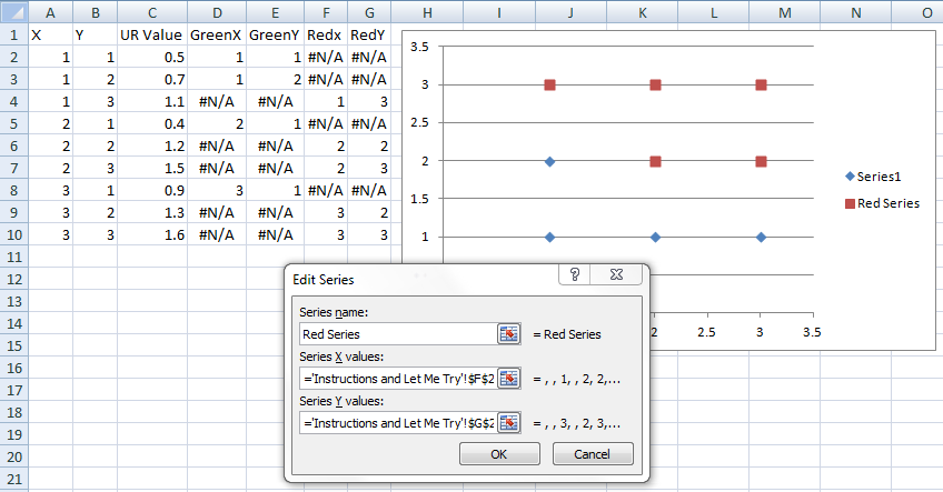
2) Highlight cells D2:E10 ONLY and then create a XY Scatter with ONLY Markers. Your chart will look like this:
Now select the chart and then from the Design Ribbon choose the Select Data Button:

Then choose to ADD a data series:

Then add a data series for the Red series as such:
X Values= F2:F10
Y Values = G2:G10
Your chart will now look like this:
3) Now we just need to do a quick excel trick and make the markers boxes and then also increase the size of the markers very large. I also changed the color of the Green series fill to Green.

Do the same for the red marker series:

4) Now final thing to do to make the chart a little more presentable.
a) Change the Vertical and Horizontal Major Units equal to 1
b) Add Vertical Major Gridlines
c) Delete the Legend
Here is what you final chart looks like:
Video Tutorial:
I was really excited to work on this Excel Project. I think this can even be used in Excel Dashboards, so I will keep this type of chart in my portfolio so that it can be used on future projects.
What do you think the possible uses of this type of chart could be in your Excel Dashboard?
Let me know in the comments.
Also, consider subscribing to the newsletter so that you get an email in your inbox on the next post.
Steve=True
UPDATE:
From Luke (the engineer)
Turns out the real data points aren’t quite so regularly arranged as my imaginary sample data, so I swapped to diamonds to reduce overlapping. But this is great, it shows a good visual representation of the wall and highlights the area of concern at the bottom right really clearly. Much better than searching through 900+ lines of data for the URs >1.
Here is the graphic he posted:

HOW COOL!!!
Then Luke even took it a bit further and made various colours for different ranges of UR for a different wall. Here blue describes the range 0 < x < 0.25, green up to 0.5, yellow up to 0.75, orange up to 1, and red for x > 1.

This gives a better idea of the stressed areas in the wall (more stress = higher UR) and gives something meaningful to examine for other walls where no UR is greater than 1. This is an awesome use for an Excel XY Scatter Chart.


