A YouTube video subscriber Mili, wanted to know more about creating a Dynamic Excel Column Chart using Offset function. So Mili sent me the data that was to be used in the charts, and I thought I would post this case study and video of creating a dynamic chart in Excel using the Offset Function.
I had previously posted a blog posting and a video that describes this technique.
You can check it out here:
How-to Make a Dynamic Chart Using Offset Formula
This posting was not meant to show you the workings of the Offset formula and some did not like that. It was only meant to show you the ins and outs of using an offset formula in a chart (with all the tips and tricks that I know about.)
In fact, that video really combined several topics on this blog that make up the Dynamic Offset Chart.
Namely, how to find the last row and also how to use the offset formula. You can check out these posts and videos here:
Find the Last Row or Last Column for Dynamic Excel Dashboards
This is the Bomb: or How I came to love the Offset function
However, Mili and a few other of the video viewers wanted to see how to use the Offset Function to create the dynamic graph for their Excel Dashboard in the same video.
Case Study – Create a Dynamic Chart in Excel using the Offset Function:
Mili asked for the following help:
“I’m creating a social media benchmark tool using Excel, and I need to create a pre set graph which will update itself as I add/remove/edit data. I have added some dummy data to create a graph but I’m not very familiar with the offset function itself. I had joined an excel forum and one of the members just did it for me but I have no idea how he did it so was struggling with it.”
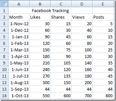
So Mili sent me the data for the chart. Here is what it looks like:
After looking at the data, it didn’t seem too complicated. In fact, I would offer up an alternate and MUCH MUCH EASIER solution then using the Offset formula in Excel to create a Dynamic Chart. If you are using Excel 2007, Excel 2010 or the New Excel 2013 you can use this technique. It may not work as easily for Excel 2003, so you may want to stick with the Offset technique for that Excel Version.
This easier solutions involves using Excel Tables. You can read all about it on this post and it also has a video as well.
How-to Make Dynamic Excel Dashboard Charts Using Tables
(You can also see this technique demonstrated in the Video below)
Oh well, if we must use the offset function in our Excel graph, then lets get to it.
Step 1: Learn to love the offset function:
This is the Bomb: or How I came to love the Offset function
Step 2: Learn to create a formula that will find the last row of your data:
Find the Last Row or Last Column for Dynamic Excel Dashboards
Step 3: Create your Named Ranges with your Offset Functions:
How-to Make a Dynamic Chart Using Offset Formula
1) Define Named Ranges using the Offset Function that uses dynamic techniques for each data series and the X axis categories.
2) Create a chart adding the Named Ranges as the series and axis using the Excel Select Data dialog box.
Very Important – This step MUST be done to the chart series not the chart data range as excel will translate the Offset named range to an actual range that will not remain dynamic.
Just as Important – When adding the named range to the chart series, you MUST reference both the file name as well as the named range…i.e. FileName!NamedRange.
Video Tutorial:
You can check out the New Combined Offset Function and Dynamic Chart creation video here:
Please let me know if this post and the video has helped you to understand how to create your very own Dynamic Excel Dashboard Component.
Steve=True


