So I saw this chart in an Excel forum and a user was asking this:
“chart – not sure about this one
I’ve created a few different types of charts in Excel over the years, but I’m trying to recreate a certain chart (with different values of course). The only thing I can think of is perhaps some type of area chart?? I don’t know. Any suggestions?”
Here is the picture that Brian posted. So take a look and think how you could make this Chart in Excel and also give some thought on how you can use this type of chart in your next executive presentation or company dashboard:

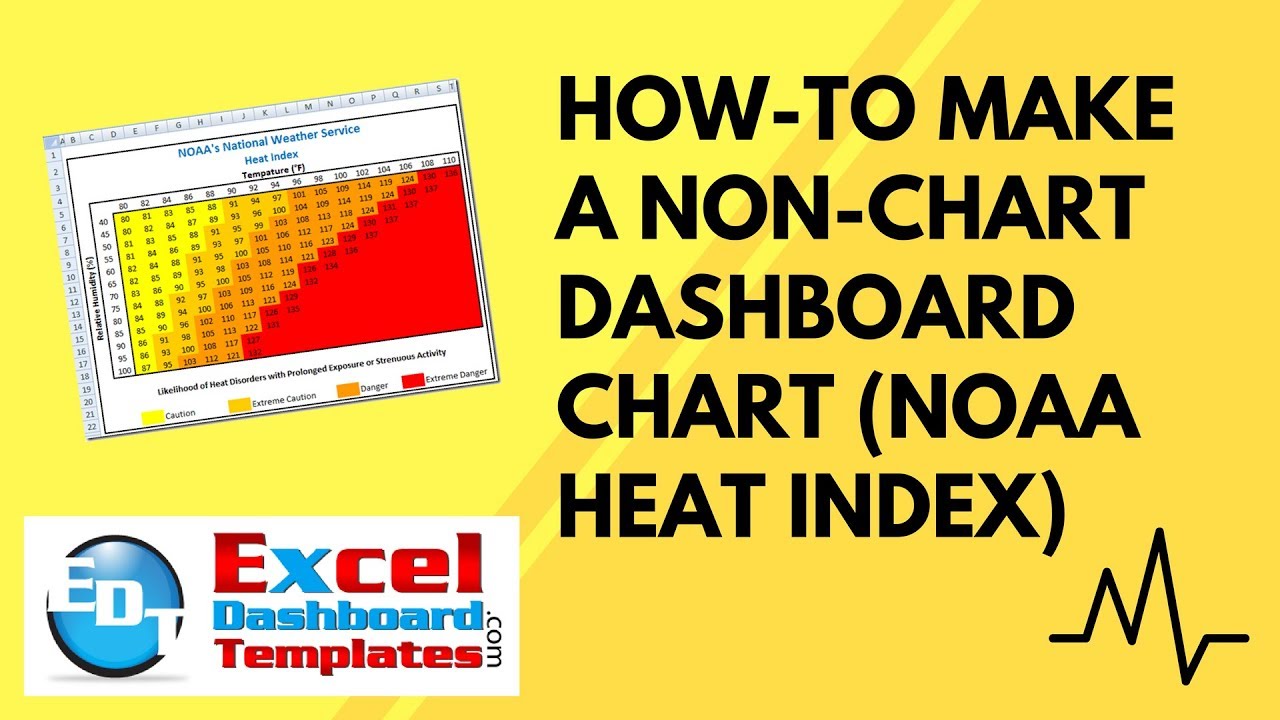
This Excel user wants to create a similar chart to this NOAA’s National Weather Service Heat Index. Now the user thought that it might be advisable to use an Excel Area Chart. And as I look at it, it would have to be an Excel Stacked Area Chart. But, Excel area graphs are normally smooth and not pointy. Also, they typically move from one point to the other and not vertically then to the next point.
What chart type did you pick?
The answer probably doesn’t surprise you based on this blog post ![]() but the easiest way to make this Excel dashboard chart is to not create a chart at all. There are many ways to make dynamic charts in Excel and now I will show you one way to make such. Here is my chart of the same NOAA’s National Weather Service Heat Index done in Excel:
but the easiest way to make this Excel dashboard chart is to not create a chart at all. There are many ways to make dynamic charts in Excel and now I will show you one way to make such. Here is my chart of the same NOAA’s National Weather Service Heat Index done in Excel:
Looks just like the sample and it is very dynamic based on the values. So how did I make this? Just in regular Excel spreadsheet cells. It was all done with Conditional Formatting. Here is how to do it yourself for your own dashboard charts.
The Breakdown
1) Create your Data and Borders and Legend
2) Highlight the Chart Range
3) Create Conditional Formatting Rules
4) Rearrange / Manage Conditional Formatting Rules
Step-by-Step Tutorial
1) Create your Data and Borders and Legend
First we just need to make our chart look like a chart by:
a) Creating your data values – This is simple enough. In my chart where ever you see a number, enter that number in a cell in your chart. See how the formula bar for cell E7 is just a number:
b) Creating titles and Axis Labels – This is simple in that we are using regular text and also the “Merge & Center” button on the Home Ribbon to make the chart title span across many rows. 
You may find it just a little more complex for the vertical axis label as the text is vertical. You can do this from the Orientation button on the Home Ribbon.
c) Creating a legend –  This is simply text next to a cell with a fill color equal to the color you want for each region of the chart.
d) Removing the Gridlines from the spreadsheet – You can do this by unchecking Gridlines from the View Ribbon. This gives you a clean background.
Your non-chart Heat Index chart should now look like this:
2) Highlight the Chart Range
So now you just need to create the chart colors. To do this you need to highlight the range of D6:S18
That was pretty easy ![]() but the next step is the trick to make the chart area look like a chart.
but the next step is the trick to make the chart area look like a chart.
3) Create Conditional Formatting Rules
Conditional charts and tables are great ways to highlight data in any spreadsheet range. These types of charts are made with the use of Conditional Formatting on a range of spreadsheet cells. They are very powerful, but can make some people crazy because of some quirks in Excel. I HIGHLY recommend that you check out this post if you are new to Excel Conditional Formatting:
The Tricks to Writing a Conditional Formatting Rule Formula
Now that we have the range we want to color highlighted, we need to create the following conditional formats. All but the last one of these Conditional Formatting Rules are created by the Greater Than… choice from the Highlight Cell Rules.
a) >79 with a custom format of yellow:

Your chart should now look like this:
b) >90 with a custom format of light orange:


Your chart should now look like this:
c) >100 with a custom format of dark orange:


Your Excel chart should now look like this:
d) >124 with a custom format of red:


Your chart should now look like this:
So this matches pretty close, but we need to fill in the white area that is to the right of the red area. To do this, we need to create a special formula for when a cell is blank. So keep the same highlight but instead of Greater Than, we need to choose new rule from the conditional formatting button:
Then choose Use a formula to determine which cells to format from the Select a Rule Type:
and then in the Edit the Rule Description section, you need to put the following formula in the “Format Values where this formula is true:” cell: =isblank(d6)
Now that you have set the rule, you need to click on the “Format…” button and choose a red color from the Fill tab:

Your chart should now look like this:
Now if your chart doesn’t look like this then you need to check the following as it may be your issue. Some times excel doesn’t set the reference right for the conditional formatting. At times and I am not sure why, but it will change your reference to some far off cell like I34344. You need to edit this cell reference in the last formula you created. Do this by going to the Manage Rules choice in the Conditional Formatting button: then change the “Show formatting rules for:” to “This Worksheet”
Your will now see a list like this and you need to choose the last rule you created (at the top) and then click on the Edit Rule button:
If you see a reference that is not D6 in the Format values where this formula is true”, then you need to change the reference back to D6:
When you change this reference, then your chart should be all set.
4) Rearrange / Manage Conditional Formatting Rules
Now if your chart looks nothing like what I showed you above, and if it looks something like this then you didn’t follow my order and you need to rearrange your formatting rules. 
You can do this by clicking on the Conditional Formatting button on the Home Ribbon and then choose Manage Rules:
Then choose “This Worksheet” from the Show formatting rules for pick list: 
Now from the Rule (applied in order shown) select a rule and then move it so that the red is on top down to the yellow in color order. If you are doing this for another dashboard project, and you chose greater than as your rule type, then you need to make sure that your top value has the largest number to check against. If it is less than then your top values should be the smallest number. For this example, you chart conditional rules should look like this:
If they do, then press on the Apply button to set the new rules into effect. Your chart should now look like this:
Video Tutorial
Here is a video demonstration of me creating this dashboard chart using conditional formatting:
Please make sure you sign up for my blog so that you get the latest posting delivered to your inbox. Also, if you liked the video demonstration, I always appreciate the comments and the likes ![]() . Finally, let me know in the comments below if you can see how you would use these types of Conditional Formatting charts in your next Excel Dashboard. Perhaps some sort of heat map for your sales tables or productivity KPI or metric?
. Finally, let me know in the comments below if you can see how you would use these types of Conditional Formatting charts in your next Excel Dashboard. Perhaps some sort of heat map for your sales tables or productivity KPI or metric?
Steve=True


