Friday Challenge Answers – Food Donation Excel Dashboard Chart
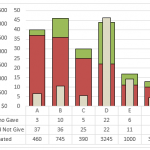
Last week we presented a chart challenge to see how you represent Food Donation data.
Don said that we should keep it simple and sent...
How-to Make an Excel Chart with 3 Different Column Widths (Bullet Chart Option 2)
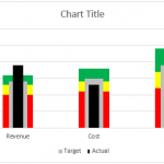
In are recent post, I showed you how to create a Bullet Chart in Excel. Pete, then sent me another way to create a...
How-to Make an Excel Bullet Chart
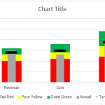
Executives and managers love to see gauge charts in their Excel Dashboards. However, gauge charts may confuse or mislead the dashboard readers. For instance,...
How-to Make an United States Flag Excel Chart (Happy 4th of July)
Happy July 4th (United States Independence Day).
I am home and not working too much this holiday, but wanted to send out a post on...
How-to Create a Sick Leave Excel Dashboard Chart
Okay, I got an email from a SUPER FAN of my sight. She even donated some money to help cover the costs of that...
USA Today Charts Part 2 – Excel Area Chart with Line and Area Highlights
Well, I have been working hard on my project and it has successfully launched. But that took time away from my other passion, EXCEL!!!
So...
How-to Create Sales Quota Threshold Horizontal Lines in an Excel Column Chart
Sales executives are always pushing their sales teams. They typically do this by setting sales quota’s for their salespeople. Quotas are thresholds or minimum...
Grouping Excel Column Charts with a Box
In a previous post, I showed you how to group a column chart with lines:
You can check out the posting here:
Group Column Chart...
Budget Analyst Question: My Answer
Last week I posted this:
Budget Analysts might be asked by their executive team, managers or co-workers.
Question Title: Bar Graph Below the Line
I need a...
How-to Create a New York Times Tiger Woods Chart in Excel
In a past article, I posted 2 different ways to make a chart that appeared in the New York Times. Here is the chart...

