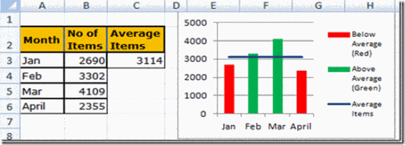
In a previous post, I showed you how to make a Conditional Column Chart for your Executive Dashboard Templates, but I had 3 steps to many in the tutorial. This post has a simpler conditional column chart than I showed you before. If you have any thoughts on how I can streamline charts, please let me know! That way we can all learn together.
Use Excel’s NA() Function for Your Conditional Excel Charts
Check out the previous post, “How-to Hide a Zero Pie Chart Slice or Stacked Column Chart Section, where you see how-to the Excel Function NA() works to hide chart data.
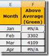
When you chart this data range and use the NA() function with a Column Chart:
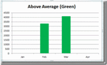
The #N/A values will not be plotted in the chart. That way you can make a different chart series for each color or conditional series that you want to display.
The Breakdown:
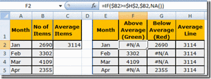
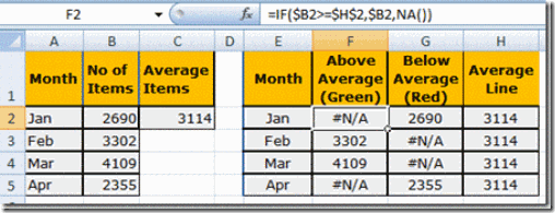
1) Make a chart area for the Conditional Column Chart to break the data up into 3 different series. 1 for the values below the average, 1 for the values that are greater than or equal to the average and 1 for the average line. Use the NA() Function in your formulas as shown in this setup:
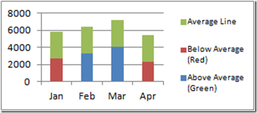
2) Chart the 3 series as a Stacked Column Chart. Notice that as you chart the 3 series, you do not see the data points that equal #N/A. This is how you can hide values so that you can color the graph the way you want to highlight it.
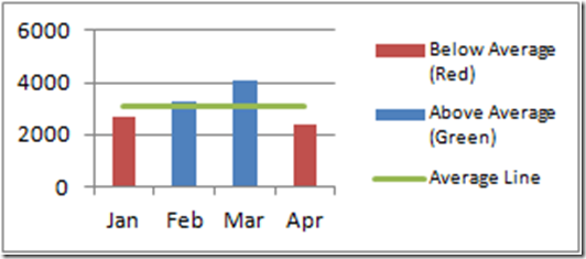
3) Change the average series to a line chart type:
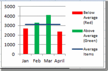
3) Change the color of the series to suit your purposes. Change the below average series to Red, the above average to Green.
4) Format the rest of the chart and series to clean up the presentation. Now you are done!
Step-by-Step
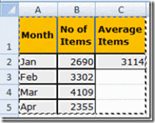
1) Here is how the sample data starts out:
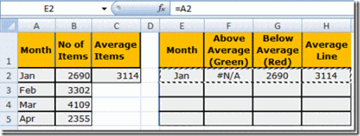
So you need to create a separate data chart area that will create the conditional chart. In E2, put in =A2 so that the Labels for the X-Axis will be copied down. In H2, enter =$C$2. Also, in F2, enter: =IF($B2>=$H$2,$B2,NA()) This formula compares the value in B2 to the monthly average. If B2 is greater than or equal to the average line, then the formula you entered will pull in the number from cell B2 and if it is less than the average line it will fill in #N/A in the worksheet. When you chart the series, the #N/A will make excel not show columns for these values.
2) Highlight and Copy cells E2:H2 then paste them to E2 through H5.
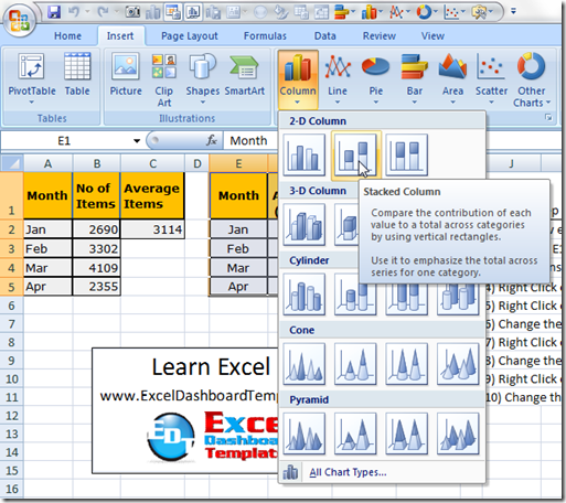
3) Now highlight the new chart data cell range from E1:H5 and then Left Click on Insert Ribbon and Select the 2-D Column Stacked Column Chart from the menu as you see below.
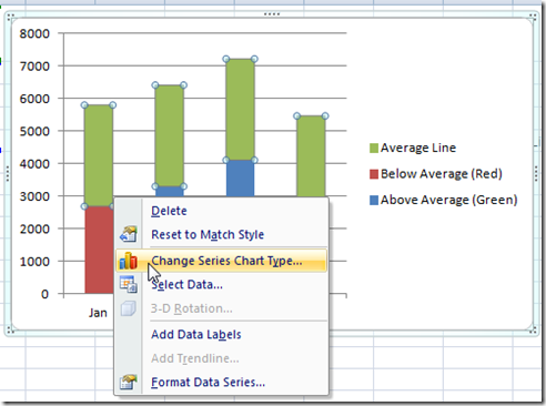
4) Right Click on the Average Line Series and Select the Change Series Chart Type… from the menu and change it to a Line Chart,
or Left click on the Average Line Series and then pick the Change Chart Type from the Design Ribbon.
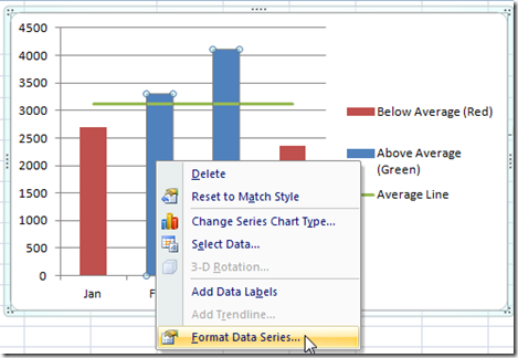
5) Right Click on the Above Average (Green) Series and then Select Format Data Series… from the menu.
or Left click on the Above Average (Green) Series and pick Format selection from the Design Ribbon.
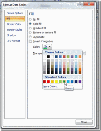
6) Select the Fill Sub Menu from the left side and then Change the Fill to a Solid Fill and choose Green
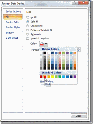
7) Now lets change the Below Average (Red) Series color to Red when you select the Below Average (Red) series from the chart without closing down the Format Data Series dialog box.
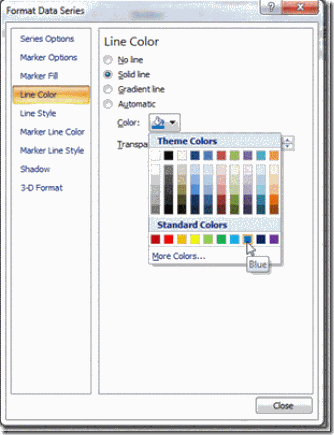
8) Now we will change the Average Line Series line color to Blue by selecting the series from the chart without closing down the Format Data Series dialog box.
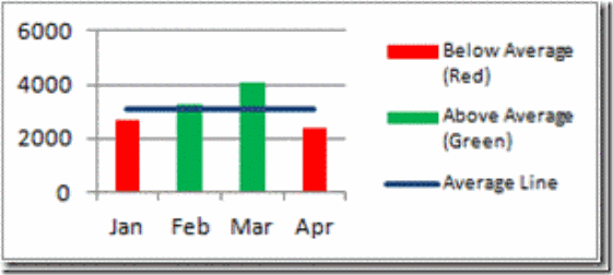
Now we are done and here is what the final chart looks like:
Video Tutorial
Free Sample Download Tutorial File
Here is your Free download sample tutorial file that contains detailed instructions and all the formulas so that you can try conditional column chart by yourself.
FREE SAMPLE TUTORIAL FILE LINK:
Excel-Conditional-Columns-Redo.xlsx
Thank you very much for visiting and please let me know if you found this tutorial helpful by posting a comment and signing up for my newsletter.
That way you are sure to get the most current Excel Dashboard Tutorials, Videos, Hints, Tips and Tricks.
Steve=True

