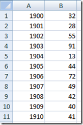
Recently in an Excel Forum, a user had data similar to this format:
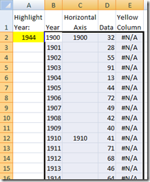
Here is what he wanted to do:
How do I set the Horizontal Axis to show only every 10 years and also,
how can I show one specific year on the Horizontal Axis that is not a multiple of 10?
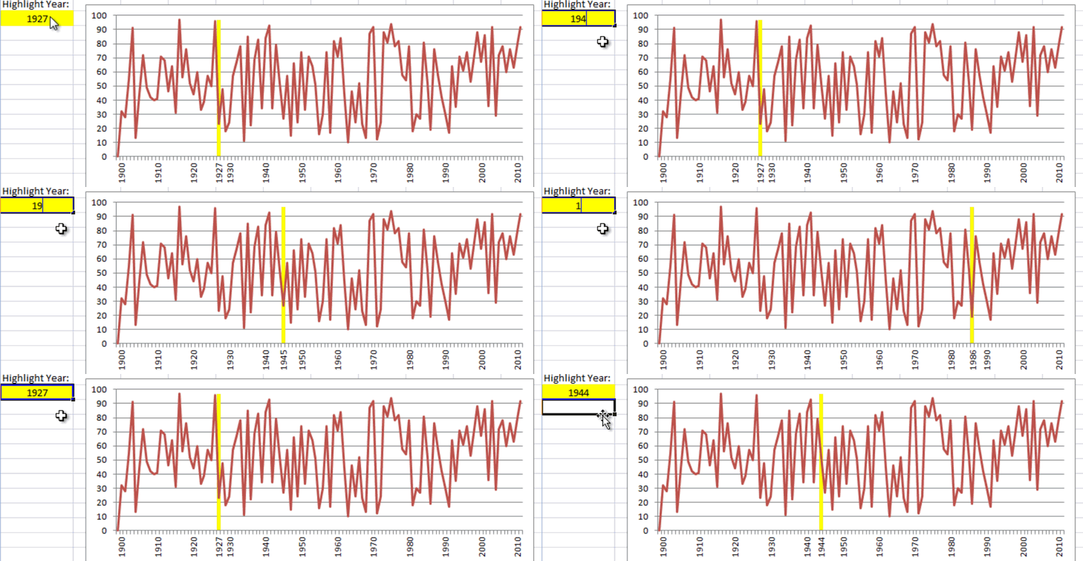
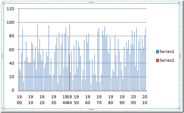
Here is the chart that I presented to him and he said it was perfect:
There are a few options of this chart that I wanted to point out:
1) We did not change the years data in the original list. The Years in the Axis are created by using a formula. This formula could be modified and combined with an Excel Combo Box to give you other Horizontal Axis choices like: every 5 years, or every 20 years or every 25 years, etc.
2) As you change the Highlighted Year in a worksheet cell, you will see that this specific year is added to the Horizontal Axis dynamically and a bar is added to Highlighted the Year in the Excel Chart.
So how can we recreate this concept in an Excel Chart? Below you will find the Breakdown of the concepts, the Step-by-Step Tutorial, Video Tutorial and a Sample Excel file so you can see it in action and try it yourself.
Breakdown:
1) Create a New Column of data that will be used for the Horizontal (Axis) Categories.
2) In that New Column, use the NA() function (you can learn more about the NA() function in this post – How-to Make a Conditional Column Chart in Excel – REDO) to determine what major categories will be shown in the Horizontal Axis.
3) Utilize the value in the Highlighted Year to add this value to the Horizontal Axis.
4) Add another New Column of data to create the yellow highlighted column in the chart that will show exactly where the data would be in the Highlighted Year within the Excel graph.
I will show you exactly what I did and you too can learn how to make this chart in Excel.
Step-by-Step Tutorial:
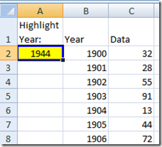
1) Put your data in Column B (Year) and Column C (Data Points).
2) Put the Year you want to highlight in Cell A2. In this example, I entered 1944 in cell A2.
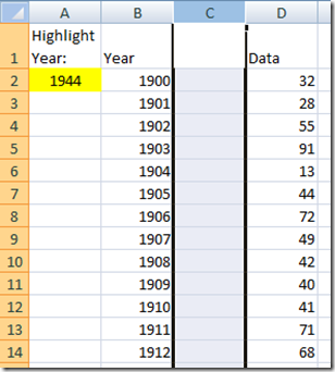
3) Insert a Column between Column B and Column C. Your data will now be in Column D. In the new blank Column C, we will put the Dynamic Horizontal Axis in this column and we are going to put it here to make the chart easier to plot. Therefore you can put it anywhere, this is just easier for what we want.
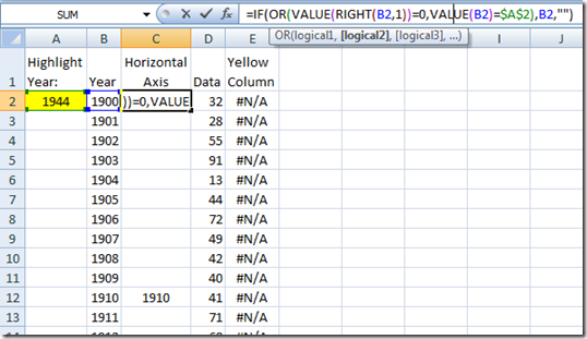
4) In the new Blank Column C, put in this formula in C2 and copy down to the end of the Years in column B:
=IF(OR(VALUE(RIGHT(B2,1))=0,VALUE(B2)=$A$2),B2,””)
What is this formula doing? It is looking at the Year column and if it ends in Zero (each decade), or if it equals the year we wanted to highlight in A2, then put the Year value in Column A in Column B. If it does not equal our highlighted year or it is not a decade, then leave it blank.
Well now we are all set to create our Dynamic Horizontal X-Axis. Lets work on how we will highlight the year in the graph with a yellow column chart combined with the line chart.
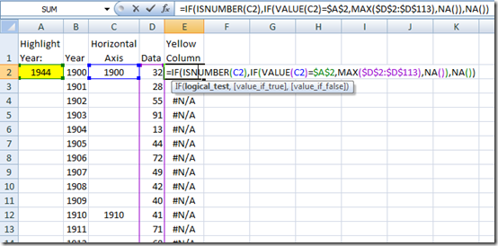
5) In Column E, put in this formula in E2 and copy it down to the end of the Data in Column D.
=IF(ISNUMBER(C2),IF(VALUE(C2)=$A$2,MAX($D$2:$D$113),NA()),NA())
What is this formula doing? It is looking at the new horizontal x-axis Year information in Column C and if it is a number, it then compares it to the value in our Highlighted Year cell (A2). If they are equal than Excel will calculate and put in the Maximum Data Value of Column D. If they are not equal, then it will put in #NA into the cell. #NA will not be plotted in the graph. Finally, an #NA is also put in the cell if the new horizontal x-axis year information is not a number.
Well we are all set to make our chart, so lets tackle that part of the solution.
6) To make the chart, lets start by Highlighting the New Year Information, the Data and the Highlight Year Column of Cells (from A2:E113).
7) In Excel 2007 or Excel 2010, click on the Insert Ribbon, then click on the Column Chart in the Charts Group and finally, select the 2-D Clustered Column. Your new chart will look something like this:
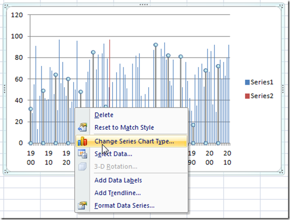
8) Now you will need to change the chart series chart type of Series 1. Easiest way to do this in Excel 2007 and above is to right click on the Series one columns in the chart and then choose Change Series Chart Type…
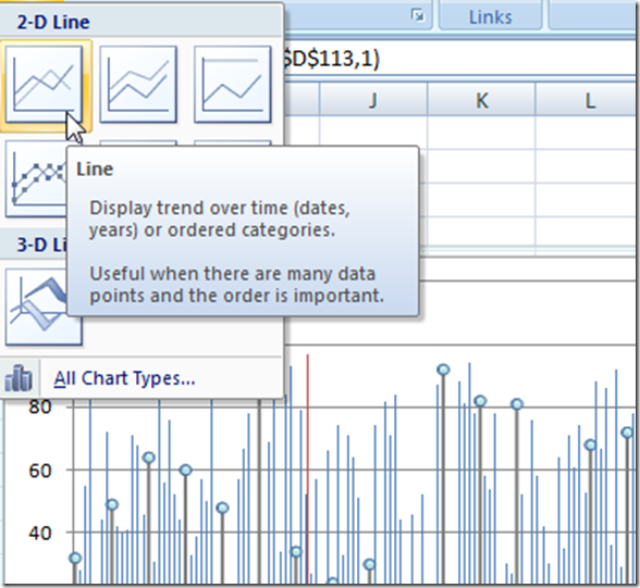
Or you can do this from the Design Ribbon and when you change the chart type, you should select the 2-D Line Chart.
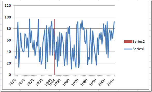
Then your new chart will look like this:
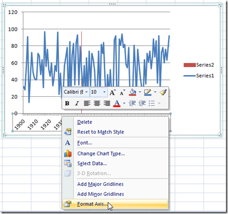
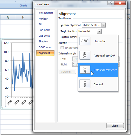
9) At this point in your chart design, I would recommend changing the Horizontal Axis so that the Year labels are vertical versus the titled dates. You can change your horizontal axis by right clicking on the axis, then choosing the Format Axis… menu item.
Then select the Alignment Menu (at the bottom left) from the Format Axis Dialog box. Then choose the Text Direction for the Excel Axis to Rotate All Text 270 degrees.
Your Excel Chart will now look like this. However, the highlight line for the year 1944 is kind of small so lets fix that.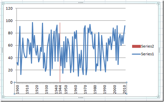
10) To make the Year Highlight larger, lets right click on Series 2 and then choose Format Data Series… from the menu.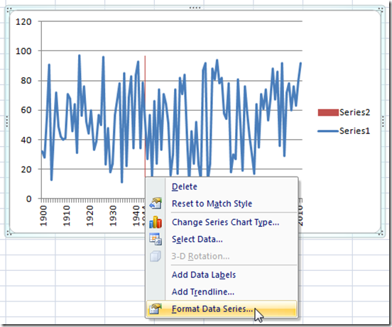
To make the column chart that highlights the year larger, you will need to change the Gap Width in the Series Options sub-menu to 0%. Now you should be able to see the highlighted year more easily.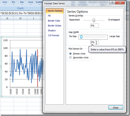
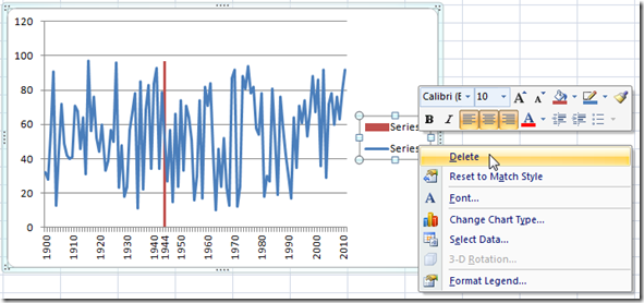
11) It is starting to look good. So lets clean up some of the chart junk. We don’t need the standard Excel Chart Legend because series 2 is really just a highlighted column and not a series of data for the reader,
To delete the Excel Chart Legend, all you need to do is click on the Legend and hit your delete key or you can also right click on the Chart Legend and select Delete from the pop-up menu. Here is the chart as it looks now: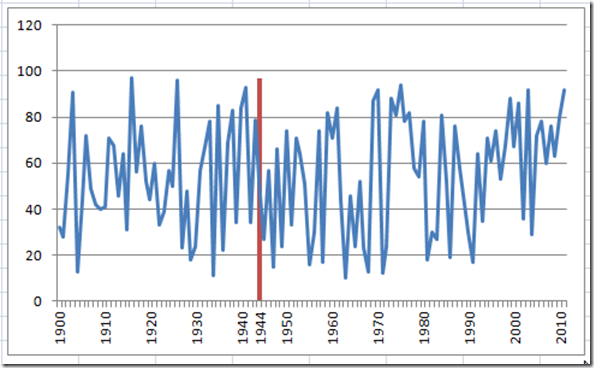
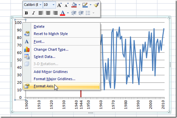
12) I would also suggest that you clean up the maximum of the Vertical Axis since Excel adds more room on the top of the tallest series. You can do this by right clicking on the Vertical Axis and then click on Format Axis… from the menu. Then change the Maximum unit to Fixed and a value of 100.
Here is the Final Excel Chart that Dynamically Highlights a specific Year and we have also replaced the standard Horizontal or X-Axis with our own major categories. Not only can you highlight a specific year, but you can dynamically choose which year to highlight by changing cell A2. Give it a shot and try it for yourself or just see how it works by downloading the file. The free sample file is linked below. Also, if you want to see a video tutorial of this process, you can see the process in action with the video below. Also, you also learned hot to create custom horizontal axis categories so that only every 10 years show. Each of these techniques can be used in your own Company Dashboards so that you can show trends or highlight specific data points.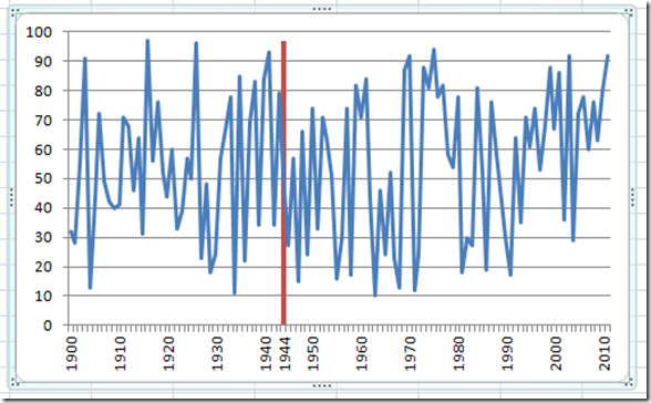
Sample File – Free Template File:
Download your free sample file here:
Change-Excel-Major-Horizontal-Axis-Categories-and-Highlight-a-Date.xlsx
Video Tutorial:
Thank you so much for all your support of my site. If you have a Dashboard chart or charting technique that you want to see how it can be done, please leave me a comment or send me an email. Also, please don’t forget to sign up for my newsletter subscriber list so that you are sure to get the newest Dashboard Template tutorials and products.
Your ContentSteve=True

