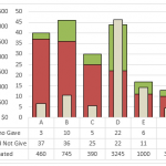
Friday Challenge – Create a Percentage (%) and Value Label within 100% Stacked Chart?
First I want to say I am sorry to those waiting to see the dynamic chart scroll bar tutorial. My project launched this week...
Case Study Solution – Mom Needing Help on Science Fair Graphs/Charts
Yesterday I presented a case study on assisting a mom in creating a chart for a science fair.
You can read more about it here:
Case...
How-to Make a Beer Mug Goal Chart as an Excel Dashboard Component
Time for some beer and Excel. Last month I saw that a User was wondering how to make Beer Mug Goal Chart for their...
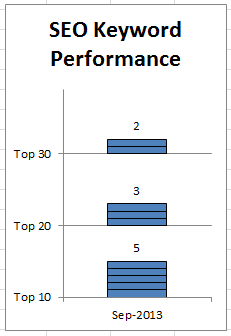
SEO Performance Charts – Don’s Solutions
Sorry it has been a few days since my last post, but I have a lot that has been going on with new projects...
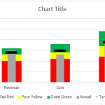
How-to Make an Excel Bullet Chart
Executives and managers love to see gauge charts in their Excel Dashboards. However, gauge charts may confuse or mislead the dashboard readers. For instance,...
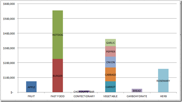
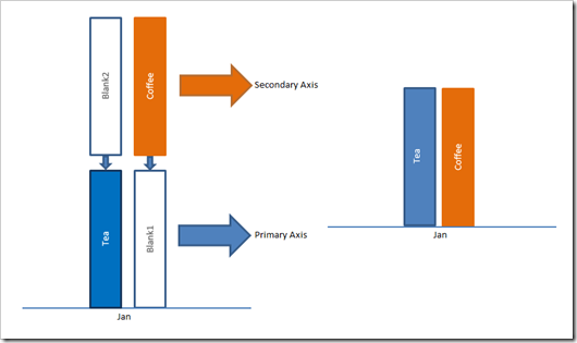
How-to Create a Stacked and Unstacked Column Chart in Excel
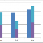
Stacked and Unstacked Column Chart in Excel
Excel is awesome because, even when a certain chart type is not a standard option, there may be...
How-to Make a Thermometer Goal Chart in Excel
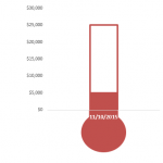
How-to Make a Thermometer Goal Chart in Excel
A friend and co-worker asked me if I had a tutorial on a building a Thermometer Goal...
How to Make a Clustered Stacked and Multiple Unstacked Chart in Excel
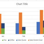
How to Make a Clustered Stacked and Multiple Unstacked Chart in Excel
On my post How-to Create a Stacked and Unstacked Column Chart I received...
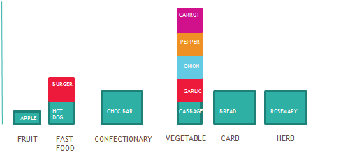
Friday Challenge Answers – Food Donation Excel Dashboard Chart
Last week we presented a chart challenge to see how you represent Food Donation data.
Don said that we should keep it simple and sent...
How-to Create a Dynamic Banding on an Excel Line Chart
This dynamic shading or banding chart is frequently used in science and in Company Dashboards. It allows the user to quickly see if their...

