In a popular post, I showed you how to easily create a Clustered Stacked Column chart in Excel using Multi-Level Category Axis options.
Here is what the original chart looked like:
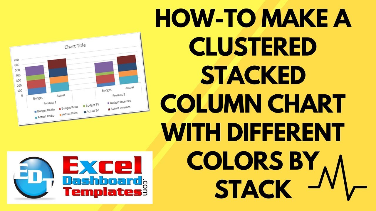
But our Excel chart enthusiasts out there wanted to know if it was possible to have 2 different colors for the Budget Stacked Column vs the Actual Stacked Column in the cluster.
Here is what that would look like:

You can do this by simply adjusting your data. I am not sure if it is a benefit for the chart end users. What do you think? Let me know in the comments below. Here is how to make this chart in Excel.
You can check out other Clustered Stacked Column Chart Tutorials here:
How-to Easily Create a Stacked Clustered Column Chart in Excel
How-to Close the Gaps Between Chart Series in an Excel Stacked Clustered Column Chart
How-to Create a Stacked Clustered Column Chart with 2 Axes
How-to Add Centered Labels Above an Excel Clustered Stacked Column Chart
The Breakdown
1) Create the Chart Data Range
2) Insert Stacked Column Chart or Stacked Bar Chart
3) Switch Row/Column for the Chart Series
4) Change Column Gap Width
Step-by-Step
1) Create the Chart Data Range
This is the critical step in making an EASY Stacked Clustered Column Chart with colors by stack.
This solution involves is using Multi-level Category Labels as your Horizontal Axis. 
Here is how we want to set up your data:
Also, in cell A5, there is a Space entered. We put a space in cell A5 so that the Multi-level Categories in Excel will put a tick line on the horizontal axis labels.
Here it is with a space and without a space


2) Insert Stacked Column Chart or Stacked Bar Chart
Now that you have set up your data, you can create your chart. Highlight the range from A2:G7 and then choose the Stacked Column chart from the Column button on the Insert ribbon.
Your chart should now look like this:

3) Switch Row/Column for the Chart Series
Our chart is not in the right format. We wanted the Product and Budget vs Actual labels on the horizontal axis, not the advertising groups. To fix this, select the chart and then click on the Switch Row/Column button from the Design ribbon.
If you want to know why Excel is doing this, please check this post:
Why Does Excel Switch Rows/Columns in My Chart?
Your chart should will look like this:
4) Change Column Gap Width
This is an optional step. To make the groupings appear more closely related, we can change the Gap Width from the Format Series Dialog Box. You can get to these options by clicking on any data series in the chart and then press CTRL+1
Then change the Gap Width from the Series Options to your desired size. In this case, I am going to change the gap width to 25%. 
This will move the series closer together so that the data can be compared more easily.
Your final chart will now look like this:
Below is the video demonstration and a free file download.
Video Demonstration
File Download
You can download the free sample Excel template file here:
Excel-Clustered-Stacked-Column-Chart-with-Different-Colors-by-Stack.xlsx
Steve=True


