
This dynamic shading or banding chart is frequently used in science and in Company Dashboards. It allows the user to quickly see if their data is within tolerance or a specified range. This can be easily done in Excel for a line chart and the principle holds true for many types of other Excel Charts. Here is how to do it.
The Breakdown
1) Add Fields for Minimum and Maximum Horizontal Band Range
2) Setup Your Data and Add 2 Series with Formulas
3) Create an Excel Stacked Column Chart or Excel Stacked Bar Chart
4) Change the Inventory Data Series to a Line Chart
5) Change the Fill Color of the No Fill Series
6) Chart Clean Up
Step-By-Step
1) Add Fields for Minimum and Maximum Horizontal Band Range
Since we are going to make a dynamic confidence band for our line chart, we need to be able to specify the band range in our Excel Graph. This is easy enough. Just designate to cells in your worksheet for this purpose. One is for the minimum of the shading range and one is for the maximum. Users will predetermine the confidence interval that they wish to shade using these two cells.
2) Setup Your Data and Add 2 Series with Formulas
Next, you need to set up your data and have two new series that will be used for the horizontal banding in your Excel Chart. The series should mimic the data series that you want on your horizontal axis.
As you can see in the picture of my chart data table above, I have created 2 new series that mimic the inventory line series.
One is titled NoFill and it should be set to Cell =$D$1 (the minimum for the horizontal band). What this will do is set the bottom of our shading area.
The other one is titled Band. This is equal to =$D$2-$D$1 so that we can get the size of the confidence band for the Excel Chart.
Alternately, I would also include this formula in cell E2 to check for errors if the Max is less than the Min:
E2 =IF(D2<D1,”ERROR – MAX < MIN”,””)
3) Create an Excel Stacked Column Chart or Excel Stacked Bar Chart
Now lets make the chart. Highlight your data range:
And then go to the Insert Ribbon and select the Column Button in the Charts Group and then choose Stacked Column Chart
Your chart should now look like this:
4) Change the Inventory Data Series to a Line Chart
Now select the Inventory series and right click on it and select Change Series Chart Type so that we can change this series to a line chart. You can also select the series and then choose the Change Chart Type button from the Design Ribbon:
Then choose a Line Chart from the Chart dialog box:
Your resulting chart should now look like this:
In a few easy steps, we are very close to a horizontal banding solution.
5) Change the Fill Color of the No Fill Series
All we really need to do is close the gaps and hide the NoFill series. So lets do that now. Right click on the NOFILL column and then select format data series. Alternately, you can select the NOFILL column and then press CTRL+1
Then from the Format Data Series dialog box in the Series Options area, simply change the Gap Width to NO GAP or 0%:
Then from the Fill area, change the setting to NO FILL and then click OK:
Your chart should now look like this:
Looks like what we want. Lets just make it prettier.
6) Chart Clean Up
Remove the Horizontal Major Gridlines.
Delete the Legend
Add a Chart Title = Inventory
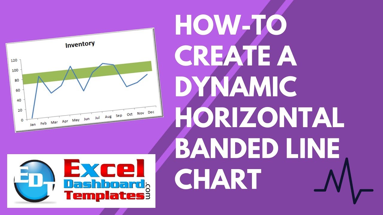
Your final chart should now look like this:
Looks awesome. Now you too know how to make a Horizontal Confidence Band or Horizontal Shading in your Excel charts and graphs. Now go spruce up those Company Dashboards.
Video Demonstration:
Let me know if this was helpful in the comments section. Also, don’t forget tot sign up for the RSS Email feed so you get the next post right in your email inbox.
Steve=True


