In this previous post:
Stopping Excel Pivot Chart Columns from Overlapping When Moving Data Series to the Second Axis
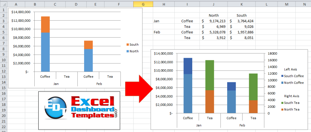
I had a fan question – How can you do this same type of Pivot Chart but instead for a Stacked Column Chart instead of a Clustered Column Chart? Can it be done in Excel? Yes it can, as Excel can do almost anything (almost).
Check out these posts if you don’t want to use a Pivot Table:
How-to Setup Your Excel Data for a Stacked Column Chart with a Secondary Axis
Stop Excel From Overlapping the Columns When Moving a Data Series to the Second Axis
The Breakdown
1) Create Data Table
2) Create Pivot Table
3) Add Calculated Items to the Pivot Table
4) Create Pivot Chart
5) Move Series to Secondary Axis
6) Change Series Fill Color
Step-by-Step
1) Create Data Table
First, you want to get your data into a layout that will work for a Pivot Table. A Pivot Table data layout will have column headers for all the metadata and values.
We want to change our data from this:
| North | South | ||
| Jan | Coffee | $ 9,174,213 | $ 3,764,424 |
| Tea | $ 6,949 | $ 9,026 | |
| Feb | Coffee | $ 5,328,078 | $ 1,957,886 |
| Tea | $ 3,912 | $ 8,051 |
To this format:
| Month | Product | Region | Amount |
| Jan | Coffee | North | $ 9,174,213 |
| Jan | Coffee | South | $ 3,764,424 |
| Jan | Tea | North | $ 6,949 |
| Jan | Tea | South | $ 9,026 |
| Feb | Coffee | North | $ 5,328,078 |
| Feb | Coffee | South | $ 1,957,886 |
| Feb | Tea | North | $ 3,912 |
| Feb | Tea | South | $ 8,051 |
Now for our Pivot Chart, we will need to add one additional column of data. We need to create a Concatenated column of text that combines the Region and the Product. In my case, I don’t use the Concatenate function, but instead I just use the & (Ampersand) between the cell references and other text.
So create a new column of data next to Amount. If Month is in A1 and Region-Product is in E1, then my formula in E2 =C2&”-“&B2 (or if you need to use Concatenate, then it would =CONCATENATE(C2,”-“,B2).
If you want to learn more about this, check out this post:
How NOT to use Concatenate Function to build Dynamic Text in your Excel Dashboard Templates
Your final data for the Pivot Table will look like this:
| Month | Product | Region | Amount | Region-Product |
| Jan | Coffee | North | $ 9,174,213 | North-Coffee |
| Jan | Coffee | South | $ 3,764,424 | South-Coffee |
| Jan | Tea | North | $ 6,949 | North-Tea |
| Jan | Tea | South | $ 9,026 | South-Tea |
| Feb | Coffee | North | $ 5,328,078 | North-Coffee |
| Feb | Coffee | South | $ 1,957,886 | South-Coffee |
| Feb | Tea | North | $ 3,912 | North-Tea |
| Feb | Tea | South | $ 8,051 | South-Tea |
2) Create Pivot Table
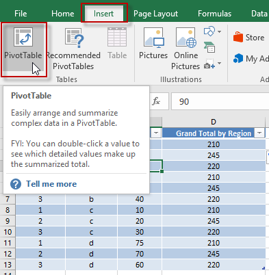
Now that our data is ready, lets create the Pivot Table. So highlight your range of data. In our case, A1:E9 and go to the Insert Ribbon and press the Pivot Table button.
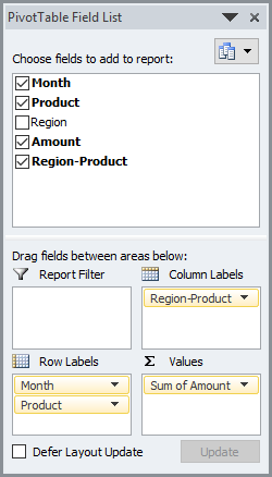
Then we want to setup the Pivot Fields with Month and Product in the Rows and Region-Product in the Columns and Amount in the Values as you see here:
Also, I changed the Number Format to currency of the Pivot Table Sum of Amount with the Value Field Settings options.
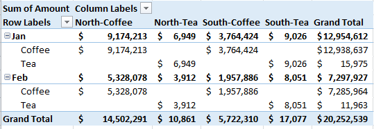
Your resulting Pivot Table will now look like this:
3) Add Calculated Items to the Pivot Table
We will use this step to group our Legend Entries. If you are not familiar with this process or want to learn how to do it on non-Pivot Charts, then check out this post and video.
How-to Group and Categorize Excel Chart Legend Entries
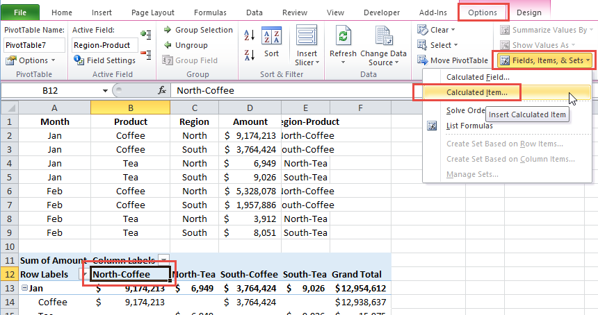
To group the legend, we will need to add 3 additional Calculated Items to our Pivot Table. To do this, first we need to select where the new items will appear. We want these under the Region-Product, so select one of those labels in the columns of the pivot table. In this case, I will select “North-Coffee” in my pivot table. Then goto the Pivot Table> Options Ribbon > Fields, Items, & Sets > Calculated Item…
Then type in item of Left Axis with a value of Zero (0).
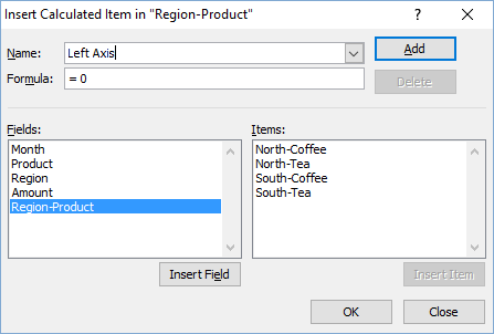
Repeat this step for a Right Axis item = (0) and a finally a ” ” (space) item = value of (0).
Your inserted items will look like this:

Your Pivot Table will now look like this:

4) Create Pivot Chart
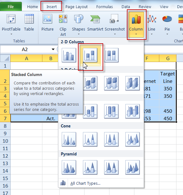
So you should now have everything you need to create you Stacked Column Pivot Chart. First, select your Pivot Table and then go to the Insert Ribbon. Then click on the Column Chart Button and choose the Stacked Column Chart Type.
Your chart should now look like this:
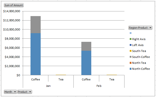
I typically hide the field buttons.
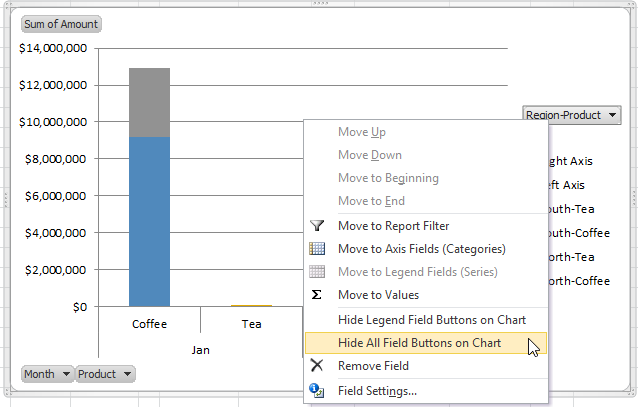
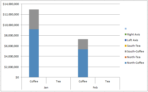
You can do this by right clicking on any of the field buttons on the chart and select “Hide All Field Buttons on Chart”.
Your chart will now look like this:
5) Move Series to Secondary Axis
Now you can move the series that you want on the Secondary Axis including our legend grouping series. For this chart, select the “South Tea” series and then press CTRL+1 and select Secondary Axis on the Format Data Series dialog box.
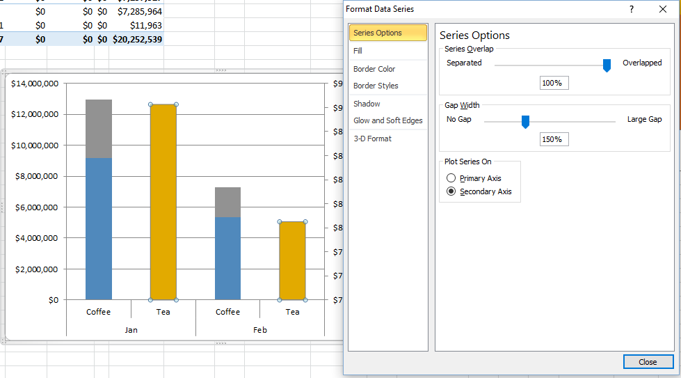
If you are having problems selecting the correct series, check out this post to help you out:
How-to Select Data Series in an Excel Chart when they are Un-selectable?
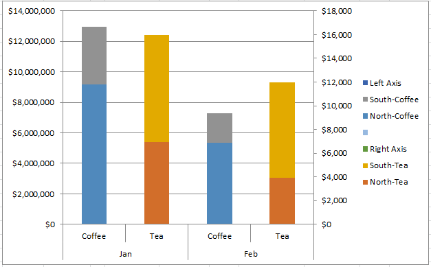
Repeat this step for the “North Tea” series as well as the “Space” series (the one that has a space for the name) and finally the “Right Axis”. Your chart should now look like this:
6) Change Series Fill Color
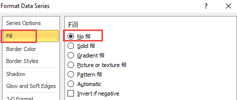
We are almost there. The only thing that is confusing on this Pivot Chart is that we see colors next to Left Axis and Right Axis. To fix this, select one of these series in the chart and press CTRL+1 and then change the fill to No Fill. If you want to see this technique on a regular chart, check out this post:
How-to Group and Categorize Excel Chart Legend Entries
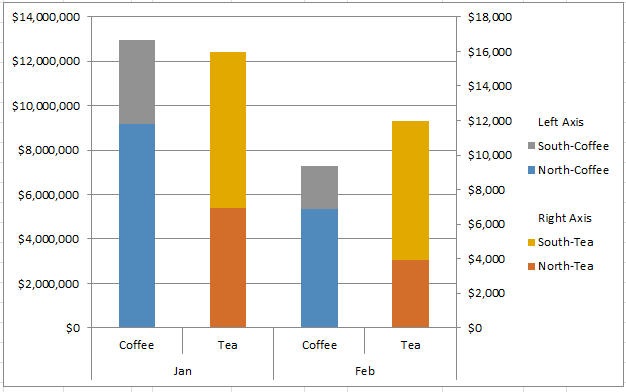
Your final chart should look like this:
Video Demonstration
Free Sample File Download
How-to-create-a-Stacked-Column-Pivot-Chart-with-a-secondary-axis.xlsx
Do you use Pivot Tables more or just a stream of data for your charts? Let me know in the comments below.
Steve=True


