Sorry it has been a few days since my last post, but I have a lot that has been going on with new projects and a lot of travel. Now it is time to get back to business.
In this post, I will show you a few charts on SEO Performance from a recent Friday Challenge that Don developed. Do had 3 different takes on the Friday Challenge. Thanks Don for you submissions. Great job!
The Problem:
Stacked Bar With Distribution Within a Given Range
“I am looking to create a stacked bar with distribution within a given range for SEO keyword performance reporting.
Say there are 10 keywords we are tracking.
5 are within the top 10 results
3 are within the top 20 results
2 are within the top 30 results
This would be one month – one plot on x axis.
The y axis should scale 0-30 at 10 point intervals, so 0, 10, 20, 30.”
– Excel User
Solution 1: Bar Chart
This is such a great solution. Simple, elegant and I think fits the bill the best.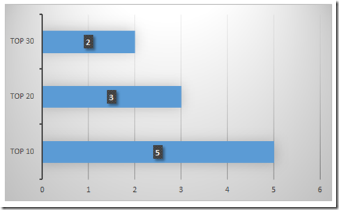
You can quickly create this chart by setting up your data in this fashion:
Then highlight the range of A1:B3 and then go to the Insert Ribbon. Then choose the Bar Chart from the Charts Group. From there you can remove the horizontal line by changing the line color on the horizontal axis. You can also add data labels from Layout Ribbon.
Solution 2: Bubble Chart
This solution from Don is not as easy to replicate, but it is not too hard if you set up your data right. However, this solution is very visual and another great take on the Friday Challenge.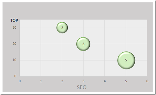
You can quickly create this chart by setting up your data in this fashion:
Then highlight the range of A1:C3 and then go to the Insert Ribbon. Then choose the Bubble Chart from the Other Charts button in the Charts Group. From there you can add vertical gridlines, and add horizontal and vertical axis titles. You can also add data labels from Layout Ribbon.
Solution 3: Stacked Column Chart
This solution is the trickiest to create, but it just takes a specific series of steps to make it look like this: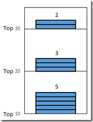
First we need to setup our data in this layout: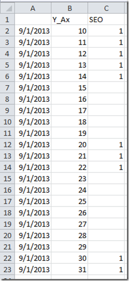
You will notice that the data for the X-axis is all the same “9/1/2013”. That is because we want Excel to use the data function for the X-Axis and since the date is all the same date, it will stack it on top of each other. Now you need pick a blank cell that is away from any data point and create a Stacked Column Chart from the Insert Ribbon. If you accidentally are next to any data points, you will have to delete all series from the Select Data dialog box. Now go into the Select Data dialog box by going to the Design Ribbon. From there you want to add a Legend Entry (Series).
The Y_Axis series should look like this: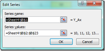
and your SEO series should look like this: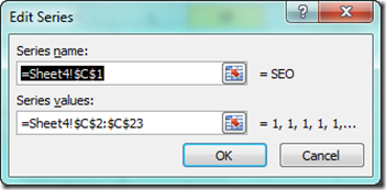
You should also make your Horizontal Axis look like this: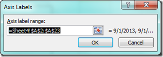
Now that you have done that, we just need to clean up the formatting of the chart.
Select the Y_Axis series and set the fill color to No Fill. We are using this series to set the Vertical Axis values. Then Select the SEO series to the fill color that you want (in this case blue) and the border color to Black.
Video Tutorial:
You can watch me recreate these 3 charts that Don created here:
Free Excel Chart Template Download:
You can download the free Excel file here: SEO-Keyword-Performance-2010.xlsx
Thanks Don for submitting your sample file for the Friday Challenge. Tomorrow I will post Pete’s solution, so come back then.
Steve=True


