In are recent post, I showed you how to create a Bullet Chart in Excel. Pete, then sent me another way to create a Bullet Chart in Excel. But the really incredible thing is that you can use this same technique to create more more than 2 sizes of column widths in your Excel Charts. Here is the bullet chart that Pete sent me: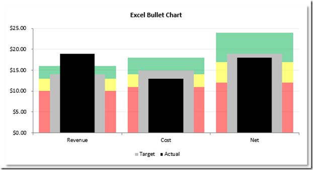
The Breakdown
1) Set Up Chart Data
2) Create Stacked Column Chart
3) Switch Rows/Columns for the Chart
4) Change Gauge Threshold Colors
5) Move Actual and Target Series to the Secondary Axis and Increase Gap Width
6) Change Actual and Target Series Chart Types
7) Create and Group Shapes
8) Replace Column with Custom Shape
9) Delete Legend Items and 2nd Vertical Axis
Step-by-Step
1) Set Up Bullet Chart Data
You first will need to setup the data for your chart. You will have values for each performance threshold (Red, Yellow and Green) as well as values for Actual performance and Target performance. Your data will look like this: 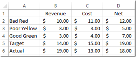
2) Create A Stacked Column Chart
Now we can create our chart. Select the range of A1:D6. Then on the Insert ribbon, select a Stacked Column Chart.
Your chart will now look like this: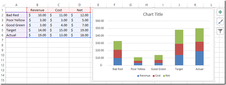
3) Switch Chart Rows/Columns
You may or may not have to do this step depending on your chart data. For this example, we need to Switch Rows/Columns in the chart. First, select your chart, and then select the Design ribbon. Then press the Switch Row/Column Button: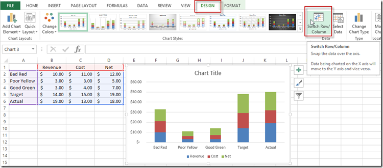
To learn more about this, check out this post: Why Does Excel Switch Rows/Columns in My Chart?
Your chart will now look like this: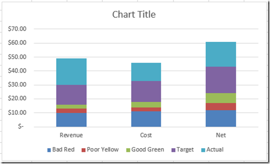
4) Change KPI Metric Threshold Colors
The chart is looking good, now we need to change the Bad, Poor and the Good series to their KPI Metric colors. First, right click on the Bad “Red” series and then select “Format Data Series…” from the menu: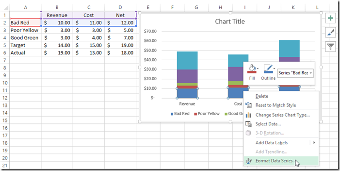
Now change the Fill Color to Solid Fill color of Red.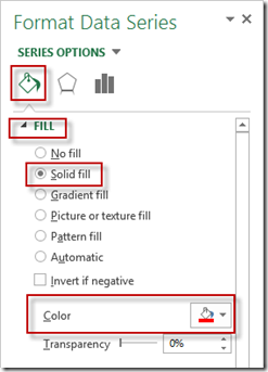
Repeat this process for the Poor “Yellow” series and for the Good “Green” series. Your chart will then look like this: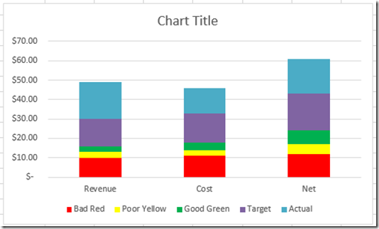
If you are having problems selecting the right data series, check out these posts:
The Quickest Way to Select an Data Series in an Excel Chart
How-to Select Data Series in an Excel Chart when they are Un-selectable?
5) Move Actual and Target Series to the Secondary Axis and Increase Gap Width
Next, move the Actual Series and the Target Series to the Secondary (2nd) axis so that it will overlap our KPI metric thresholds. First, right click on the Actual series in the chart and then select “Format Data Series…”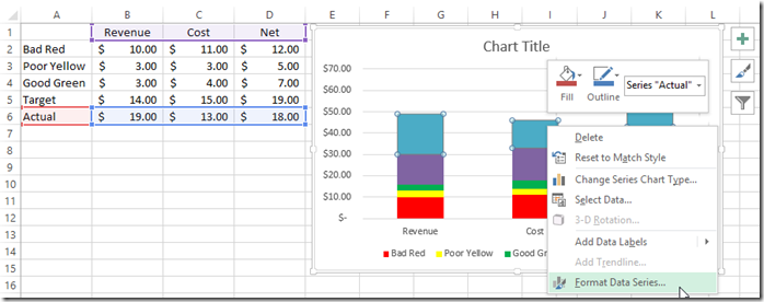
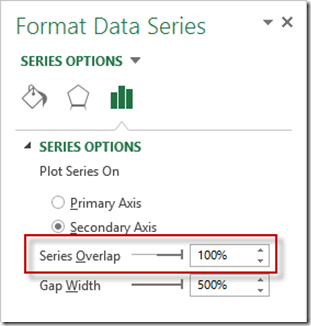
Now select the Series Options and choose the Secondary Axis radio button to move the series to the secondary axis. Also, with the dialog box still open, change the Gap Width to 500%.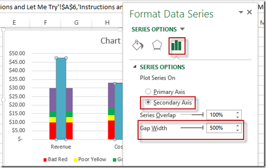
Repeat this step for the Target Series to move it to the 2nd Axis.
Interesting side note: I have gotten a lot of comments that this is a Microsoft bug when the series overlaps when moving to the Secondary Axis. But maybe it is a feature. ![]() It would be good if it were a choice instead of having to trick Excel. Check out what I mean here:
It would be good if it were a choice instead of having to trick Excel. Check out what I mean here:
Stop Excel From Overlapping the Columns When Moving a Data Series to the Second Axis
Your chart should now look like this: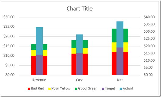
6) Change Actual and Target Series Chart Types and Series Overlap to 100%
We need to change the chart type of the Actual and Target series to a Clustered Column Chart for the next steps in the process. To do this, Right Click on the Actual Series and choose “Change Series Chart Type…”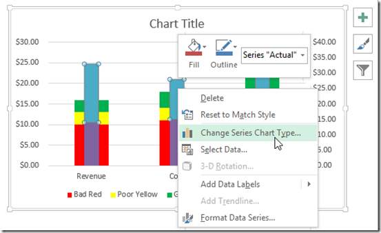
Then change the Actual and Target chart types to Clustered Column.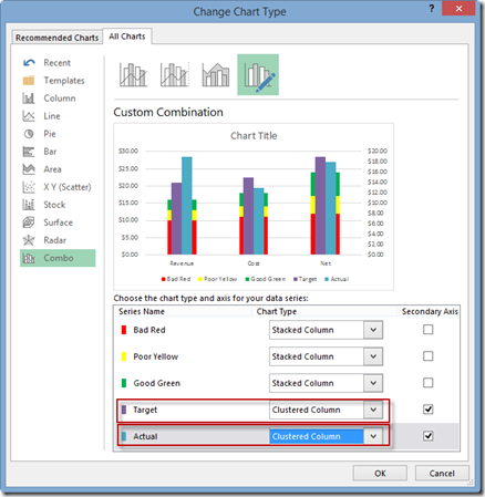
Your chart will now look like this: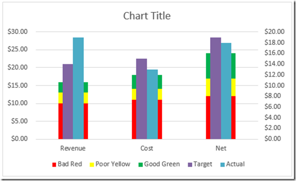
This is getting better, but we need to overlap the Target and Actual series. To do this, Click on the Target series and press CTRL+1 to bring up the Format Data Series dialog box. Then change the Series Overlap to 100%.
Your chart will now look like this: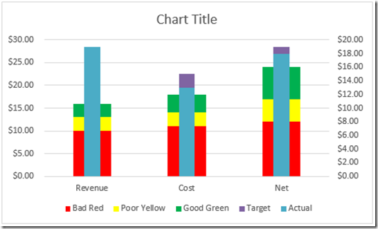
7) Create and Group Shapes
Here is the first part of the real trick. We need to create two shapes, overlap the shapes, change the shape in the back to no fill and then Group the two shapes together. To do this, go to the Insert Ribbon and choose the Shapes button and pick the Rectangle shape. 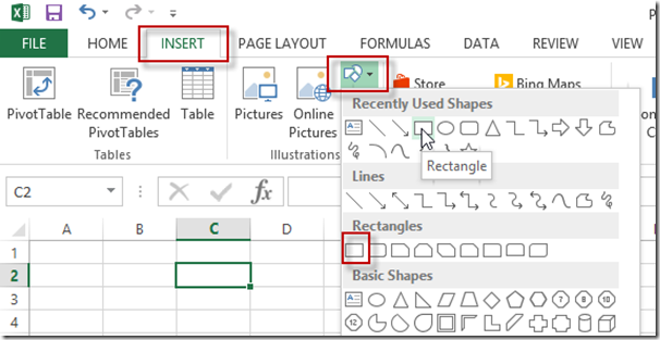
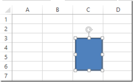
Then with your cursor in the Worksheet, drag and drop the shape of a Rectangle.
Next we want to change the Shape Outline to No Outline.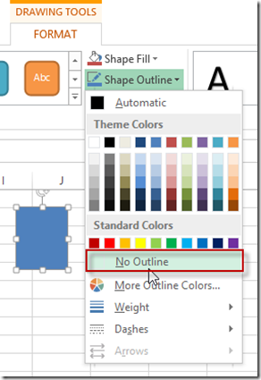
Also, we want change the Shape Fill to a Black: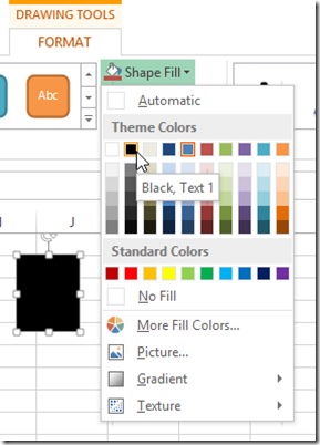
Now that we have our actual column setup, we need to make a copy of it. Select your shape, press CTRL+C ton copy it and then press CTRL+V to paste into the Excel worksheet.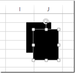
I suggest changing the color of the back one to a different color so that it will make a following step easier. So here I have changed the color of the back shape to blue.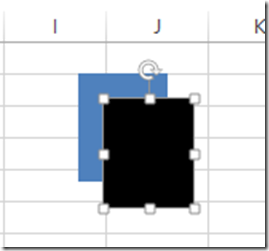
Now we need to make the black shape narrower than the blue shape and then move it on top of the blue shape.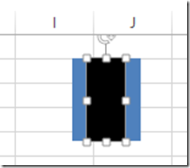 Then select both shapes by first selecting one shape and then hold down your shift key and then select the other shape.
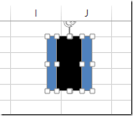
Now lets group them by right clicking in the shapes and then choose the group menu and then the Group option.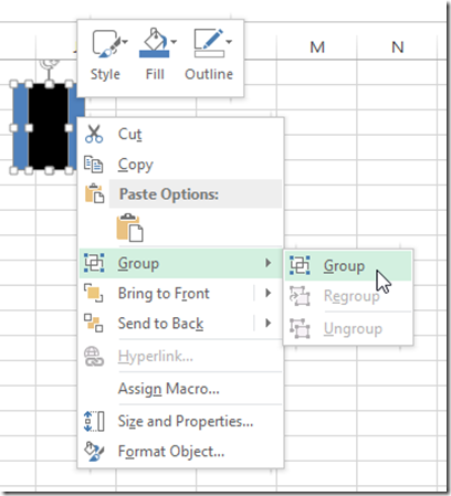
Almost done. But now we need to change the Shape fill of the Blue rectangle to No Fill. You may find it tricky, but select the grouped shape and then select the blue rectangle. 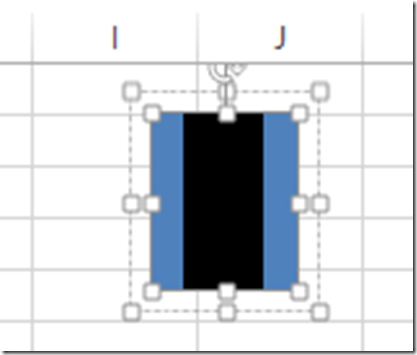
Once you have it selected, you need to change the Shape Fill to No Fill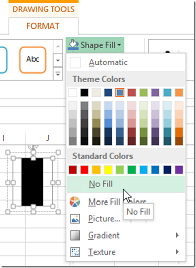
8) Replace Column with Custom Shape
Since we have made a custom shape with black in the front and no fill on the sides, we can use it to replace the regular Clustered Columns for the Actual series.
This post describes the process if you want to learn more:
How-to Make and Add Custom Markers in Excel Dashboard Charts
So lets get to it. You need to click on the grouped shape. Then press CTRL+C to copy the shape to your clipboard. Then select your chart and select the Actual series. Then Press CTRL+V to paste the shape as the new shape for the Actual Clustered Column Series.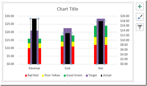
To make the chart look the same as Pete’s you may want to change the Target series to a Fill Color of grey. Your chart will now look like this: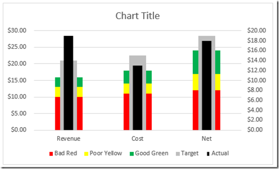
9) Delete Legend Items and 2nd Vertical Axis
Final steps would include deleting the legend items for the KPI Metrics. To do this, select the chart, then the legend and then the legend item and press the delete key.
Also, we want to align the 2 axes values to the same minimum and maximum bounds. This can easily be accomplished by selecting the chart, selecting the 2nd axis and pressing the delete key. Your final chart looks like this: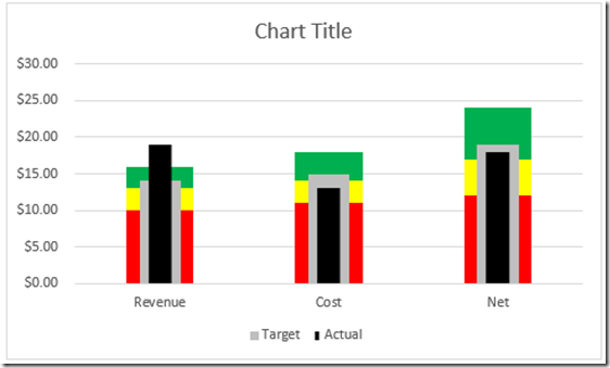
This is how you can trick Excel to allow you to use 3 different shape sizes for the columns (or more) instead of the normal 2 (one per axis). Pretty cool trick if you ask me. What do you think? Also, which Bullet Chart do you like better (this one or the one in the previous post)?
Video Demonstration
Check out this video demonstration of the charting technique described above.
File Download
Here is a free file download of this new Excel bullet chart:
Petes-Bullet-Chart-Challenge.xlsx
Thanks for a great trick Pete!
Steve=True

