Hello everyone! Thanks for being a fan. I am such a fan of Excel, that meeting MrExcel this week threw me off my schedule. So I didn’t have time to finish Part 2 of the Scroll Bar tutorial. I will post that early next week, so make sure and come back and check it out.
In the meantime, I wanted to get you this “How would you do it?” so that you can think about and try it over the weekend.
I saw this question in a forum recently and I thought my solution worked well. You may want to use this technique in your next company Excel dashboard chart. So try the following:
1) Read over the question and request.
2) Imagine this was a request from your executive team.
3) Copy the data to your own spreadsheet.
4) Fool around with creating your own chart replicating the request.
5) Post a comment below on how your solution
6) Come back on Monday and see the post and video on how I solved it and if it matches yours.
7) Leave a comment and tell me how you did or how I could have done it better.
We will all learn together. Enough chat, read on and get to it:
User question:
“I have data in this format
| A | B | C | |
|---|---|---|---|
| 1 | Project Name | Provider | Spend |
| 2 | APPLE | FRUIT | $ 73,460.68 |
| 3 | BURGER | FAST FOOD | $ 226,331.56 |
| 4 | HOTDOG | FAST FOOD | $ 328,968.64 |
| 5 | CHOCOLATE BAR | CONFECTIONARY | $ 11,611.08 |
| 6 | CARROT | VEGETABLE | $ 74,283.04 |
| 7 | CABBAGE | VEGETABLE | $ 93,143.96 |
| 8 | ONION | VEGETABLE | $ 74,283.04 |
| 9 | PEPPER | VEGETABLE | $ 70,799.56 |
| 10 | GARLIC | VEGETABLE | $ 48,601.80 |
| 11 | BREAD | CARBOHYDRATE | $ 23,220.60 |
| 12 | ROSEMARY | HERB | $ 159,088.80 |
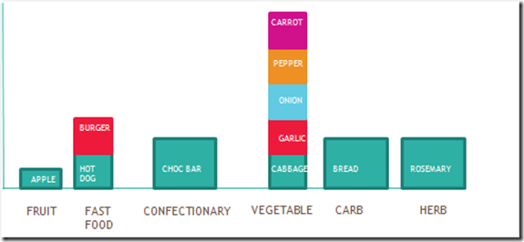
I want to present it so that it looks like this (although obviously in real life would be in proportion to the numbers!):
I’m really struggling – can anyone help? I would be very grateful.”
The requirements seem pretty straight forward to me, let me know in the comments if you have any questions, but have at it. Also, thanks for all your great comments and emails I am receiving. You are the best!
Steve=True


