Many users like to create a chart that Excel doesn’t have as a chart type. It is a combination of a clustered column and a stacked column. There are tutorials out that that are somewhat complicated, but you can check out an easier way on this article:
How-to Easily Create a Stacked Clustered Column Chart in Excel
The cool thing was when I actually saw a user need to use it and they wanted to know how to do this:
How-to Add Centered Labels Above an Excel Clustered Stacked Column Chart
Then I recently saw a question wanting one more tweak to the model and this was our last Excel challenge. In a nut shell, using this data set:
| A | B | C | D | E | |
|---|---|---|---|---|---|
| 1 | January | February | |||
| 2 | Actuals | Plan | Actuals | Plan | |
| 3 | group A | 250.48 | 300.58 | 187.15 | 155.96 |
| 4 | group B | 306.00 | 367.20 | 382.51 | 318.76 |
| 5 | group C | 315.00 | 378.00 | 425.38 | 354.48 |
| 6 | TOTAL | 871.48 | 1,045.78 | 995.04 | 829.20 |
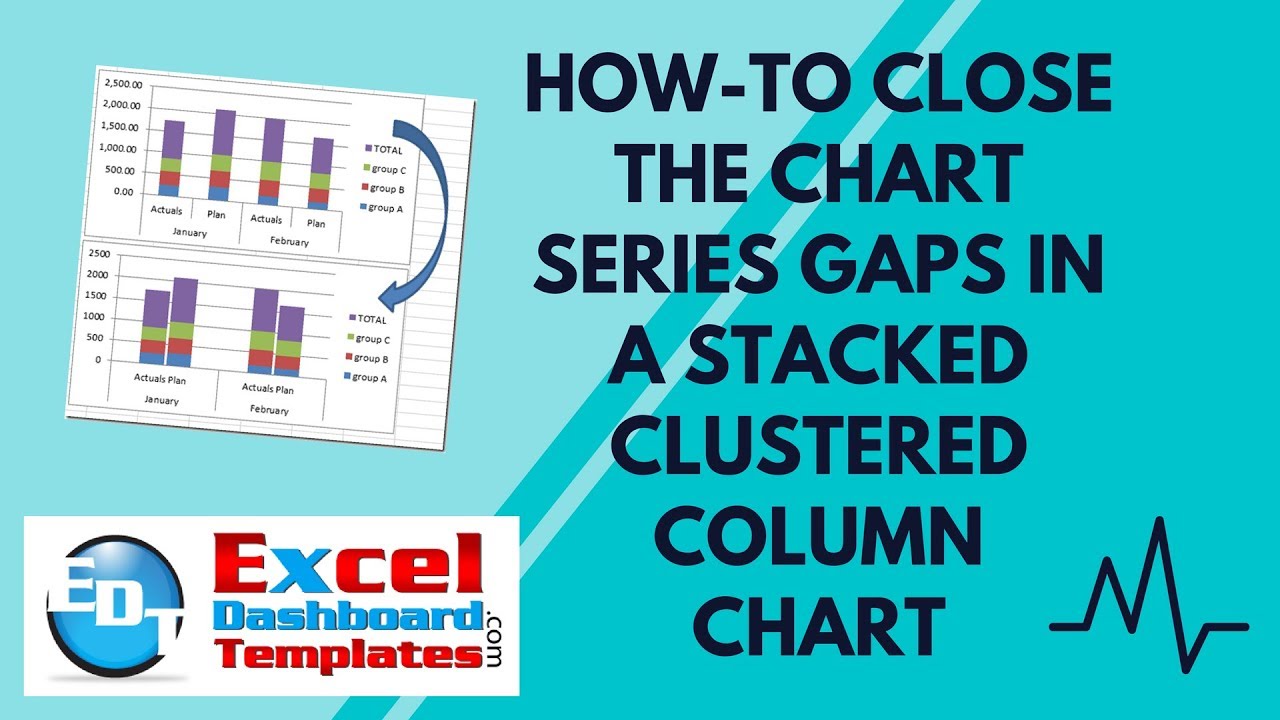
Instead of creating this chart, how can we shrink the gaps in the stacked columns like this![]() :
:
And this just won’t do:
We want this:
The Breakdown
1) Create Chart Data Range
2) Unmerge Cells January and February
3) Move January and February one cell left
4) Create Stacked Column Chart
5) Choose Gap Width of 10%
6) Add Space in Cell I3 to correct tick marks
Step-by-Step
1) Create Chart Data Range
This is our data set, but it won’t work for what we need.
| A | B | C | D | E | |
|---|---|---|---|---|---|
| 1 | January | February | |||
| 2 | Actuals | Plan | Actuals | Plan | |
| 3 | group A | 250.48 | 300.58 | 187.15 | 155.96 |
| 4 | group B | 306.00 | 367.20 | 382.51 | 318.76 |
| 5 | group C | 315.00 | 378.00 | 425.38 | 354.48 |
| 6 | TOTAL | 871.48 | 1,045.78 | 995.04 | 829.20 |
We need to add padding cells. One before January column, two before the February column.
Your data set will look like this:
| A | B | C | D | E | F | G | H | I | |
|---|---|---|---|---|---|---|---|---|---|
| 1 | January | February | |||||||
| 2 | Actuals | Plan | Actuals | Plan | |||||
| 3 | group A | 250.48 | 300.58 | 187.15 | 155.96 | ||||
| 4 | group B | 306.00 | 367.20 | 382.51 | 318.76 | ||||
| 5 | group C | 315.00 | 378.00 | 425.38 | 354.48 | ||||
| 6 | TOTAL | 871.48 | 1,045.78 | 995.04 | 829.20 |
2) Unmerge Cells January and February
We should unmerge the cells for January and February so that Excel will properly use them in the chart and so that we can move them in the next step.
Your data set will look like this:
| A | B | C | D | E | F | G | H | |
|---|---|---|---|---|---|---|---|---|
| 1 | January | February | ||||||
| 2 | Actuals | Plan | Actuals | Plan | ||||
| 3 | group A | 250.48 | 300.58 | 187.15 | 155.96 | |||
| 4 | group B | 306.00 | 367.20 | 382.51 | 318.76 | |||
| 5 | group C | 315.00 | 378.00 | 425.38 | 354.48 | |||
| 6 | TOTAL | 871.48 | 1,045.78 | 995.04 | 829.20 |
3) Move January and February one cell left
We need January and February moved over one cell to the left so that Excel can create the multi-level horizontal axis.
Your data set will look like this:
| A | B | C | D | E | F | G | H | I | |
|---|---|---|---|---|---|---|---|---|---|
| 1 | January | February | |||||||
| 2 | Actuals | Plan | Actuals | Plan | |||||
| 3 | group A | 250.48 | 300.58 | 187.15 | 155.96 | ||||
| 4 | group B | 306.00 | 367.20 | 382.51 | 318.76 | ||||
| 5 | group C | 315.00 | 378.00 | 425.38 | 354.48 | ||||
| 6 | TOTAL | 871.48 | 1,045.78 | 995.04 | 829.20 |
4) Create Stacked Column Chart
Now highlight A1:I6 and create a stacked column chart by going to your Insert Ribbon and choosing the Stacked Column Chart type. 
Your chart will now look like this:
5) Choose Gap Width of 10%
Now we can make it a little better by changing the gap width of the chart series to 10%. First select a data series and then press CTRL+1 to bring up the Chart Series Options and change the Gap Width to 10%

Your chart should now look like this (Note – I also moved the legend to the right but you should check out the video on why I did this and also another way to possibly solve this challenge):
6) Add Space in Cell I3 to correct tick marks
Did you notice in the previous graph on step 5 had an extra tick mark? You can see it here:
To get rid of this extra chart axis tick mark, you need to add a space in cell I3. Then Excel will think that the I column is part of the February series and not a new series. So it will get rid of the extra tick mark and your final chart will look like this:
Video Tutorial
You can see this and another possible solution in this video demonstration:
File Download
You can download the free sample template file here:
How-to-set-the-distance-between-chart-series-in-stacked-column-chart.xlsx
Thanks to Don and Peter who came up with the solutions. And THANKS to you all for being a fan and sharing it with your co-workers.
Steve=True


