How-to Make a Pass Fail Chart in Excel
Last week, I posed a Friday Challenge that was posted in a Q&A for Excel. Here it is:
*****************************************************************
Plotting a line graph to track build...
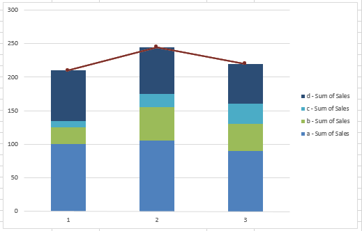
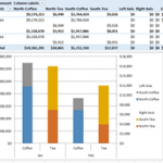
How-to Setup Your Excel Data for a Stacked Column Chart with a Secondary Axis
Many users have mixed reactions about this secondary axis overlap fix. You can see the post here:
Stop Excel From Overlapping the Columns When Moving...
Stop Excel From Overlapping the Columns When Moving a Data Series to the Second...
Don’t worry, Excel is not changing your chart to a Stacked Clustered Column Chart or Stacked Bar Chart when you move a data series...
How-to Make an Excel Stacked Column Pivot Chart with a Secondary Axis
In this previous post:
Stopping Excel Pivot Chart Columns from Overlapping When Moving Data Series to the Second Axis
I had a fan question - How...
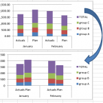
How-to Close the Gaps Between Chart Series in an Excel Stacked Clustered Column Chart
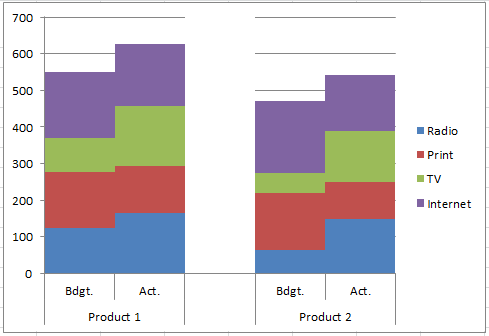
Many users like to create a chart that Excel doesn’t have as a chart type. It is a combination of a clustered column and...
How-to Create a Stacked and Unstacked Column Chart in Excel
Stacked and Unstacked Column Chart in Excel
Excel is awesome because, even when a certain chart type is not a standard option, there may be...
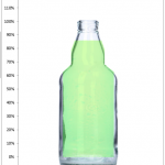
Excel Goal Chart Filling a Bottle of Soda
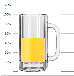
In a previous post, and one of my favorites, I showed you a unique company goal chart using a beer mug instead of a...
Add Vertical Line Between Columns in Excel Stacked Column Chart
Add Vertical Line Between Columns in Excel Stacked Column Chart
In this tutorial, you will learn how to QUICKLY add a vertical line between columns...
How-to Make an Excel Bullet Chart
Executives and managers love to see gauge charts in their Excel Dashboards. However, gauge charts may confuse or mislead the dashboard readers. For instance,...
Create a Vertical Line Between Columns in Excel Using Error Bars
Create a Vertical Line Between Columns in Excel Using Error Bars
Thanks to Leonid (a super fan) for advising me on another and possibly better...

