I recently posted a tutorial on how you can put a percentage at the top of a Stacked Column Chart. You can see the tutorial and video demonstration of this technique here:
How-to Put Percentage Labels on Top of a Stacked Column Chart
Then I got a request from an avid fan. They wanted to know if and if so, how could we put multiple percentages on top of a regular Column Chart. Here is what it would look like: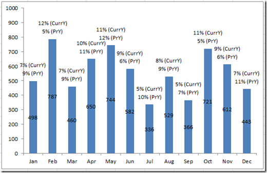
Well based on the picture above, it looks like we can do it. Wouldn’t you say so? Well here is how to do it.
Also, if you need to see it in a video demonstration, the link is at the bottom of the tutorial.
Breakdown
1) Setup Your Data
2) Create A Custom Number Format
3) Create a Stacked Column Chart
4) Add Data Labels to the Chart
5) Remove Unnecessary Data Labels, Horizontal Gridlines and Remove the Legend
6) Change Additional Series to to No Fill
Step-by-Step
1) Setup Your Data
First you must set up your data. This is one of the pivotal steps in creating our chart. Notice that we have added 2 additional series in between the sales and the first percentage and in between both of the percentages. These “Filler” series are used to make sure we have space in between the column chart and in between the percentage labels.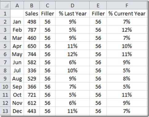
The “Filler” series are an arbitrary number that I made up. I used a formula to create a value that was large enough but not too large. Basically, I have put in 10% of the average sales for the year.
Here are the exact formulas:
Column C =ROUND(AVERAGE($B$2:$B$13)*0.1,0)
Column E =ROUND(AVERAGE($B$2:$B$13)*0.1,0)
2) Create A Custom Number Format
Well, we may have a problem that when we create the chart, the viewers will see 2 percentages, but won’t know what percentage means what. So, to make the chart easier to read, I suggest that we add more information into the numbers that we will show in the chart. We will do this with a custom number format.
You can see how I have used custom number formats in Excel Dashboard Templates with these tutorials:
Remove The Zero Point or Make a Hole in an Excel Radar Chart
How-to Make a Wall Street Journal Horizontal Panel Chart in Excel
Dashboard Chart of Tiger Wood’s Money Ranking List and Golf Earnings
How-to Format Chart Axis for Thousands or Millions
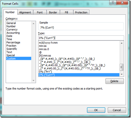
Here is what we need to do. First highlight Column D and press CTRL+1 to bring up the Format Cells dialog box.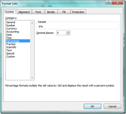
Then choose “Custom” from the “Category:” area.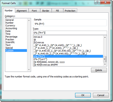
Then enter:
0% (“PrY”)
in the Type field and press Ok. Repeat this step by highlighting Column F and press CTRL+1 to bring up the Format Cells dialog box. From there, enter this in the Type field in the Custom area:
After you complete this step, your Chart Data Range should look like this: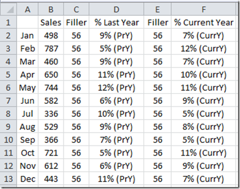
3) Create a Stacked Column Chart
Now I know that the original question was to see if we can put multiple percentages on top of a “Single Column Chart” not a “Stacked Column Chart” in Excel. Well stick with me. We are making this the easiest way possible and that is with a Stacked Column Chart, but it will ultimately look like a Single 2-D Clustered Column Chart. No worries.
Highlight your Chart Data Range from A1:F13 and then select the 2-D Stacked Column Chart from the Column button in the Chart Group from the Insert Ribbon: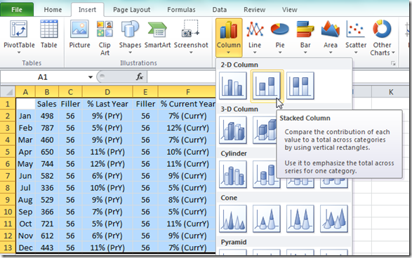
Your resulting Excel Chart should look like this: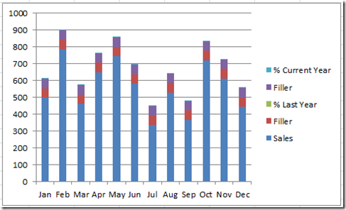
4) Add Data Labels to the Chart
Select your chart area (not a series) and then insert the data labels by selecting the Center menu item from the Data Labels Button in the Labels Group from the Layout Ribbon: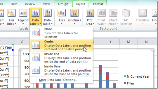
Your chart should now look like this: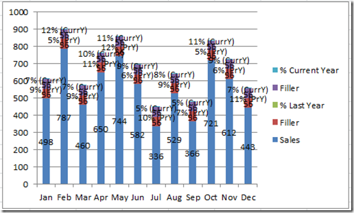
It looks a little busy, but don’t worry, we will fix that in the next step
5) Remove Unnecessary Data Labels, Horizontal Gridlines and Remove the Legend
Select the chart and then click on the data labels for either one of the filler series and press your delete key. Then repeat this step for the other filler series. If you are having troubles selecting these labels, check out this tutorial as it is also relevant for chart data labels:
This is also relevant for the next step (6)
How-to Select Data Series in an Excel Chart when they are Un-selectable?
Your chart should now look like this: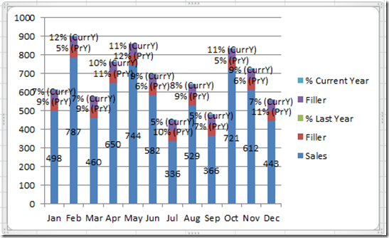
Now lets select the Horizontal Grid lines and Press the Delete Key.
Then lets get rid of the Legend by selecting the Chart Legend and press the delete key. Your chart will now look like this: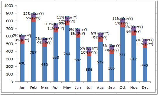
We are almost there. Just one last step to complete.
6) Change Additional Series to to No Fill
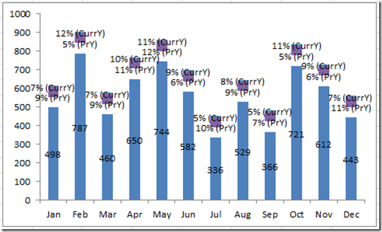
To make the percentage data labels to appear like they are floating, we need to change the series that are visible to not be visible. We will do this by changing all series (except the sales series) to No Fill. Do this by selecting any of the series that are not the Sales Series and then press CTRL+1 to bring up the Format Data Series Dialog box. Then select Fill from the left menu area and choose No Fill on the right like this: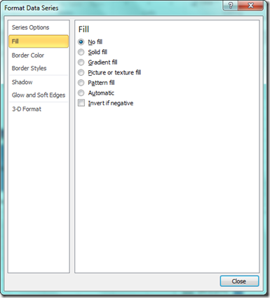
See how it looks like the labels are floating? Now all we need to do is repeat this step for all series that are not the Sales series. When you are done, here is your final chart: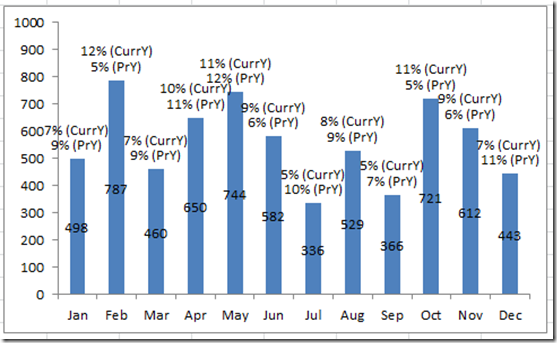 If you are having trouble selecting the really really small series that are used for the current and prior year labels, don’t forget that tutorial I linked to in step 5.
Video Tutorial:
You can view this video demonstration at this URL:
Let me know if you found this tutorial helpful by leaving me a comment. (Note, due to spam, I must approve all comments and will do so typically within a few hours)
Steve=True

