Here is a very simple solution to a common Excel Charting question when a user wants to graph “Three sets of data criteria on a chart”.
Here is the basis of the question at hand:
“I’m not sure how to plot my data. I have three items I want to factor in and chart on it. Vertical titles are in A3:A5 for types, Horizontal titles are B2:D2 for locations, numbers are B3:D5, this is for January. That looks great and I get the chart to look the way I want. Now I need to add additional months through to December. I don’t know how to do that without copy/paste the current data 12 times, and just add a monthly title. I want continuous data to show all three axis or data; not 12 separate blocks of data. Do you know of an easy way to accomplish this?”
Based on this description, here is how I envision the Excel user charting the data:
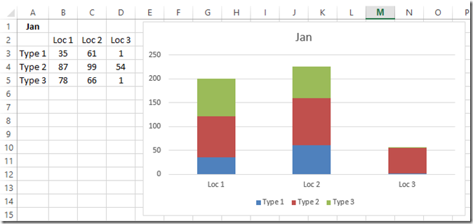 The Excel User has charted the data for January with Location in the horizontal axis as input in Columns B – D. Also they have broken down each location by type in rows 3 – 5.
But now because of their data setup, the are not sure how to add more months of data for February – December. They consider this a 3rd set of criteria for the chart and it causes much confusion.
Well there is an easy solution that Excel already provides but it will require you to change the way you layout your data. That easy solution is Multi-Level Category Labels for the horizontal axis.
So lets see how we need to rearrange our data to create this 3 Criteria Chart in Excel.
We will need to create our months and locations in columns A and B. In the chart data range below, you can see that I have January in Column A and then the 4 locations in column B starting at the January label. Next you will see February further down in Column A and also the same locations are repeated in Column B. This is repeated for March or as many months that you need. The cells A3:A5 are all blank so that the first 4 locations are then grouped under January. Likewise the cells below February and March are also blank so that the locations are grouped accordingly.
Then if we put our Types in columns C:E, are chart range is all set for our data.
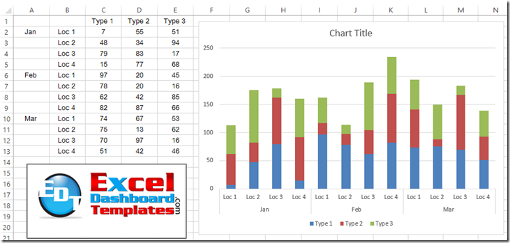 Now all you have to do is create your chart by highlighting the range of A1:E13 and Excel will do its magic.
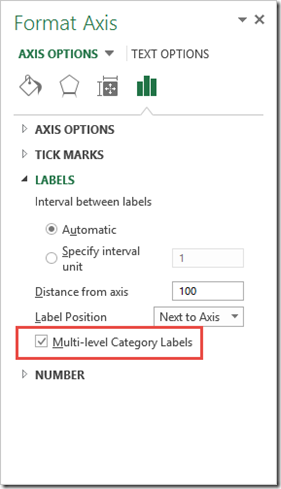
You can see the setting that Excel will check for you by double clicking on the Horizontal Axis and then checking out the Axis Options. In Excel 2013, they have buried it under the Labels grouping below the Axis Options.
Multi-level Category Labels are very powerful and you can stack more than 2. So that means when you are creating a Column or Bar Chart, Stacked or Not, you can chart more than 3 sets of criteria. You can keep stacking them and display 4 sets, 5 sets or more of your Criteria in your Excel Chart. I was able to chart 25 levels (way to many to actual display on a chart or graph) so I imagine that the limit is quite high.
Here is a sample chart based on 5 sets of criteria including the multi-level category and the location.
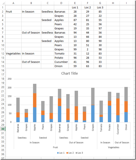 Hopefully this has helped you organize your data so that you can create a chart for multiple criteria breakdowns.
Check out these other posts that show you other examples of Multi-Level Categories on the Horizontal Axis.
case-study-solution-mom-needing-help-on-science-fair-graphscharts
fixing-your-excel-chart-when-the-multi-level-category-label-option-is-missing
Watch the Video Demonstration Here:
Download the Free Sample File Here:
How-to-Graph-Three-Sets-of-Data-Criteria-in-an-Excel-Clustered-Column-Chart.xlsx
Do you like Multi-Level Category Labels? Do you use them? Are they helpful or a hindrance? How many levels have you stacked in your Multi-Level Categories? Let us know in the comments below.
Steve=True

