Stacked and Unstacked Column Chart in Excel
Excel is awesome because, even when a certain chart type is not a standard option, there may be a way that you can create the type of chart that you really wanted to make. For instance, I received the following Excel chart question but this is not something that you can do normally in Excel without knowing this trick/technique.
Excel User Question
“Is there any way to compare a stacked column to a non-stacked column? Example, at work, I have to graph a sales quota bar next to actual sales which are made up of two types. Is there any way to have the left bar be a solid “quota number” and to the right of it have a stacked bar made up of the two types of sales. The horizontal axis should be in months. Can’t figure it out!” –Adam
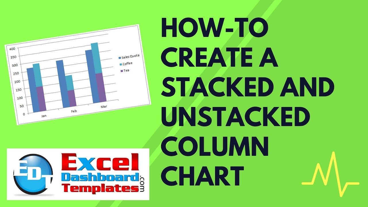
This is what the final chart would look like:

Excel Chart Standards
In Microsoft Excel, data plotted as a Stacked Column or Stacked Bar Chart Type on the same axis will be stacked into a single column. This means that you can only choose a stacked column chart OR clustered column chart for each axis. Any column type data (vs line data as you can combine line and column charts) will be plotted as part of the stack on the same axis. There is not an option for a stacked and clustered column chart on the same axis.
The Breakdown
In order to achieve an Excel Chart with both stacked and unstacked columns that are side-by-side, you will have to move some of the data to the secondary axis and also manipulate the chart data by adding some filler series.
1) Add Filler Series
2) Create Clustered Chart
3) Switch Row/Column Chart Data Setting
4) Move Stacked Column Data to Secondary axis
5) Change Chart Type of Secondary Axis Data
6) Change Chart Gap Width
7) Delete Filler Legend Entries
8) Delete Secondary Vertical axis
Step-by-Step
1) Add Filler Series
Here is a representation of the data that Adam describes in the problem statement
| A | B | C | D | |
|---|---|---|---|---|
| 1 | Sales Quota | Tea | Coffee | |
| 2 | Jan | 270 | 150 | 140 |
| 3 | Feb | 288 | 100 | 90 |
| 4 | Mar | 323 | 175 | 185 |
First, we need to modify the data and add in 2 filler series. We need to put two additional series between the sale quota column data and the actual sales stacked column data, as you see here.
| A | B | C | D | E | F | |
|---|---|---|---|---|---|---|
| 1 | Sales Quota | Filler 1 | Filler 2 | Tea | Coffee | |
| 2 | Jan | 270 | 150 | 140 | ||
| 3 | Feb | 288 | 100 | 90 | ||
| 4 | Mar | 323 | 175 | 185 |
You should now be all set to create your Stacked and Unstacked Column Chart.
2) Create Clustered Chart
The next step is to create our chart. So for our representative data, select the range of A1:F4. Then select the Insert Ribbon and chose a 2-D Column chart from the Columns button in the Charts group.
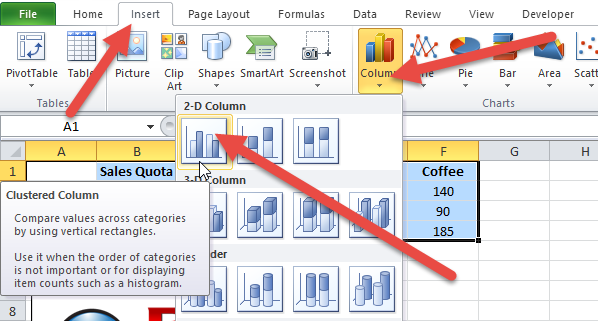
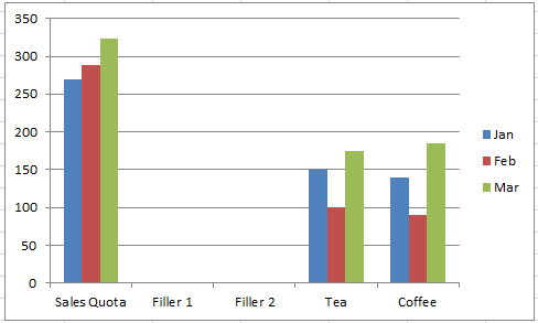
Your resulting chart should look like this:
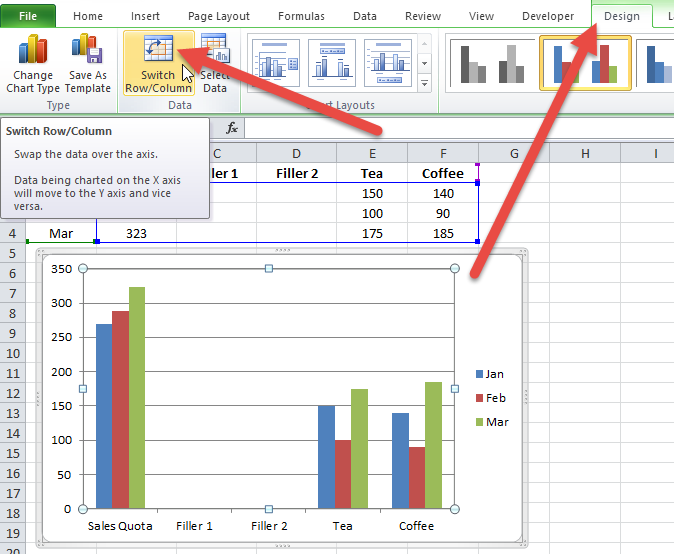
3) Switch Row/Column Chart Data Setting
Unfortunately, Excel will make a choice for you on how you want to setup your chart by choosing the rows and columns setting for you. If months are not the categories of the horizontal axis of the chart, you need to select your chart, then select the Design Ribbon and click on the Switch Row/Column button from the Data group.
If you want to know why Excel makes this choice for you, read this article:
Why Does Excel Switch Rows/Columns in My Chart?
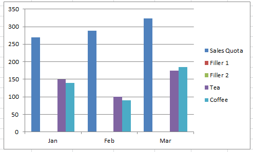
Your updated chart will now look like this:
4) Move Stacked Column Data to Secondary axis
As discussed above, you can only choose stacked or non-stacked columns on each axis. You can’t have both on the same axis. So to get the chart that we desire, we need to move the series for the stacked columns to the secondary axis. To do this, select your chart and then double-click on either the Tea or Coffee columns. Then change the Plot Series On radio button to Secondary Axis on the Format Data Series dialog box.
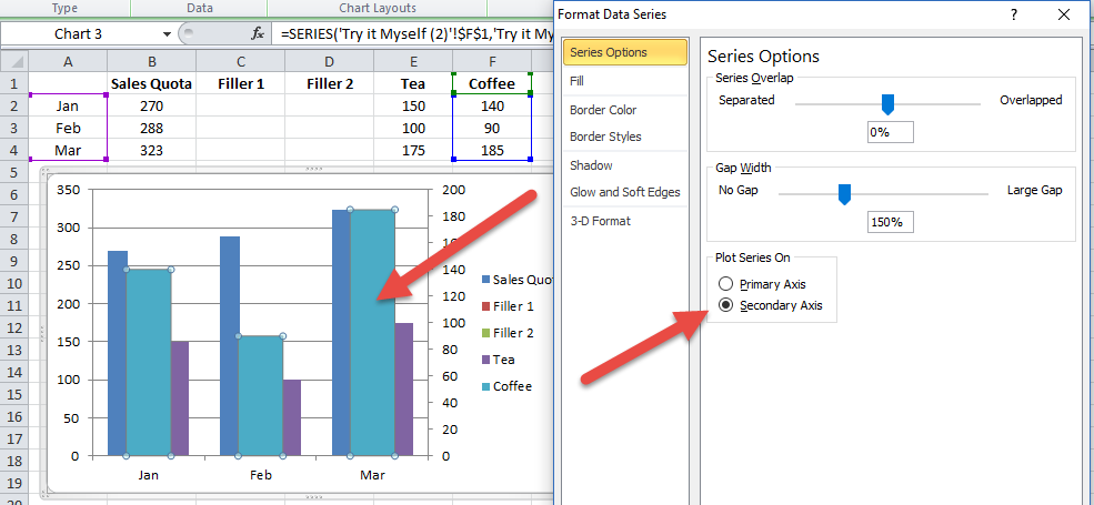
Repeat this step for all of the stacked column data series. After you move both, your chart will now look like this:
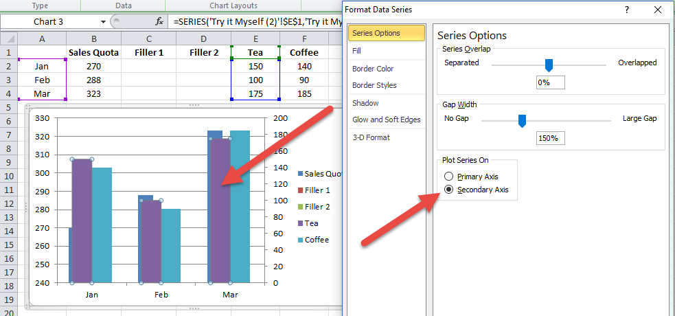
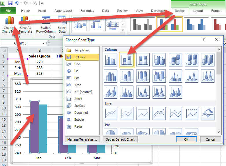
5) Change Chart Type of Secondary Axis Data
Now that we have the series on 2 different axes, we can change the chart type of the series on the secondary axis to a Stacked Column Chart. To do this, select your chart, then select either the Tea or Coffee series, then select the Design Ribbon and then select the Change Chart Type button in the Type group. Then from the Change Chart Type dialog box, select the Stacked Column option.
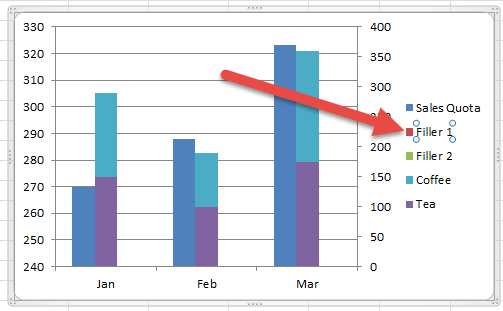
Your combined clustered column and stacked column chart will now look like this:
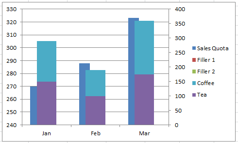
6) Change Chart Gap Width
Because we are tricking Excel, your chart may not look perfect as you see above that the stacked column chart on the secondary axis overlaps the clustered column series on the primary axis. In order to correct for this, you will need to adjust the Gap Width of the Stacked Column chart. To do this, double click on either stacked column data series (Tea or Coffee) and then change the Gap Width on the Series Options to 350% from the Format Data Series dialog box as you see here.
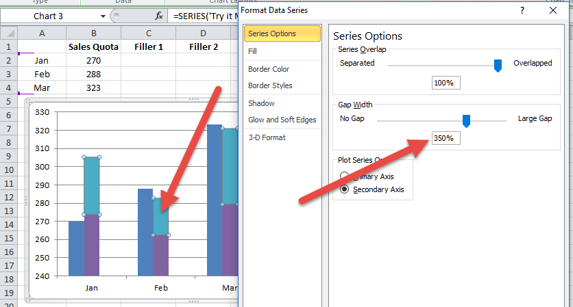
This will then align the non-stacked columns with the stacked column in the chart as though they were on the same axis.
7) Delete Filler Legend Entries
And now for the Excel Chart clean-up, we first need to clean up the legend of the 2 filler series. To remove the filler series from the legend, first, click on the chart, then click on the legend, and then click on the legend entry. Once you have selected the one you want to delete, press your delete key. Repeat this step for both filler series.
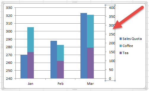
8) Delete Secondary Vertical axis
Our chart is almost completed. The last thing is to fix the vertical axis values. We can do this by either fixing the values to match or just delete the secondary axis. To delete secondary vertical axis, first click on the chart, then click on the secondary vertical axis. Once you have selected it, then press your delete key.
Here is what your final chart would look like:
Thoughts About This Chart Type
One minor flaw with this solution that you can see in the chart above is that the Stacked Column Chart is centered over the horizontal category axis while the non-stacked column chart will not appear that way. It is an annoyance in my mind, but not a critical issue. I would love to know your thoughts about this in the comments below.
Alternate Charts
If you are considering using this type of chart, here are a few alternate types of Excel Charts that might meet your needs. Click on the links to see a similar step-by-step tutorial with Videos and Sample File Downloads:
- How-to Make an Excel Bullet Chart
- How-to Make an Excel Chart with 3 Different Column Widths (Bullet Chart Option 2)
Sample File
You can download the sample file here so that you can try and recreate the same ‘Stacked and Unstacked Column Chart in Excel’: Stacked-and-Non-Stacked-Clustered-Excel-Chart.xlsx
Video Demonstration
Check out this quick tutorial to learn how you can quickly recreate this chart in Excel.
Let me know what you think about this chart tip/trick in the comments below.
Steve=True


