In my last post, I showed you how to create a Brace/Curly Bracket/Mustache InfoGraphic type grouping in an Excel Stacked Column Chart.
You can check out the step-by-step and video instructions here:
How-to Recreate a NYT InfoGraphic Mustache Grouping Chart in Excel
And in that posting, I promised to show how to create Stacked Column Chart Leader Lines/Spines in an Excel Spreadsheet.
The Breakdown:
1) Create a stacked column chart in Excel with multiple series:
a) One series for the Curly Bracket (see link above)
b) One series for stacked column chart (see link above)
c) One series for the label leader lines/Spines (this tutorial)
d) One series for the stacked columns labels/legend
2) Create a Stacked Column Chart
3) Add labels to the Label Series
4) Change Label Series Fill to No Fill
5) Change Leader Line/Spine Series Stacked Columns Fill to No Fill for every other series
6) Change Leader Line/Spine Series Stacked Columns Fill to match the stacked column series
Step-by-Step Tutorial:
1) Step up your data with the follow series and values:
Excel 2007
| A | B | C | D | E | F | |
|---|---|---|---|---|---|---|
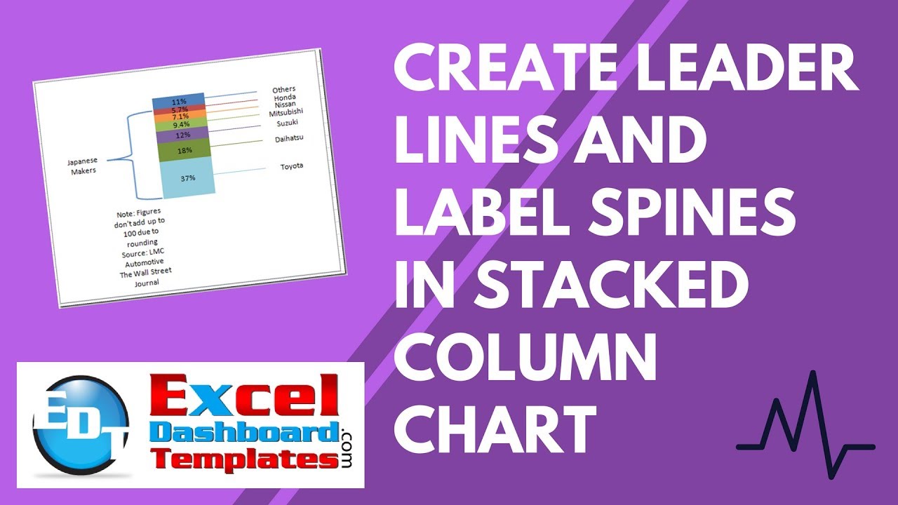
| 1 | Full Throttle Indonesia’s 2011 Auto Market, by Share of Sales Volume |
|||||
| 2 | Note: Figures don’t add up to 100 due to rounding Source: LMC Automotive The Wall Street Journal |
|||||
| 3 | Japanese Makers |
89.2% | ||||
| 4 | Toyota | 37% | ||||
| 5 | Daihatsu | 18% | ||||
| 6 | Suzuki | 12% | ||||
| 7 | Mitsubishi | 9.4% | ||||
| 8 | Nissan | 7.1% | ||||
| 9 | Honda | 5.7% | ||||
| 10 | Others | 11% | ||||
| 11 | 18.50% | |||||
| 12 | 0.00% | |||||
| 13 | 27.50% | |||||
| 14 | 0.00% | |||||
| 15 | 15.00% | |||||
| 16 | 0.00% | |||||
| 17 | 10.70% | |||||
| 18 | 0.00% | |||||
| 19 | 8.25% | |||||
| 20 | 0.00% | |||||
| 21 | 6.40% | |||||
| 22 | 0.00% | |||||
| 23 | 8.35% | |||||
| 24 | 0.00% | |||||
| 25 | Toyota | 37% | ||||
| 26 | Daihatsu | 18% | ||||
| 27 | Suzuki | 12% | ||||
| 28 | Mitsubishi | 9.4% | ||||
| 29 | Nissan | 7.1% | ||||
| 30 | Honda | 5.7% | ||||
| 31 | Others | 11% |
ExcelStackedChartLeaderLines
The data series in column E and F will be the ones stated in 1C and 1D of the Breakdown. They are the chart series that we will use to create the leader lines and labels.
The data series in column E is used to create a zero data point that will be our leader line/spine separated by 1/2 of the sum of the data starting from D3:D4. Then this formula advances by one every other row. This will create a stacked column series that will add a line in the middle of each of the stacked column chart so that the leader lines/spines will match up with the labels we will create from the column F data series.
Excel 2007
| E | |
|---|---|
| 11 | 18.50% |
| 12 | 0.00% |
| 13 | 27.50% |
| 14 | 0.00% |
| 15 | 15.00% |
| 16 | 0.00% |
| 17 | 10.70% |
| 18 | 0.00% |
| 19 | 8.25% |
| 20 | 0.00% |
| 21 | 6.40% |
| 22 | 0.00% |
| 23 | 8.35% |
| 24 | 0.00% |
ExcelStackedChartLeaderLines
Worksheet Formulas
|
2) Create a Stacked Column Chart
Highlight A2:F32 and create a stacked column chart.

Your resulting Excel chart will look like this:
You must switch the chart data by clicking on the Switch Row/Column button in the Data group of the Design Ribbon.
And your chart should now look like this:
Now is when you would transform the left most series to a Left Brace/Curly Bracket/Mustache Grouping. You can check out the step-by-step and video instructions here:
How-to Recreate a NYT InfoGraphic Mustache Grouping Chart in Excel
After you complete that step, your chart will now look like this:
3) Add labels to the Label Series
If you haven’t already added the data labels in the previous step, do so at this time.
Click on the Plot Area of your chart and then add Chart Data Labels by going to the Layout Ribbon and choose Center from the Data Labels button in the Labels group.
Your chart will now look like the graphic in the above step #2.
Then individually select each of the data labels on the series that is second to the right and press your delete key. Make sure that you only select the data label so that you do not accidentally delete a series that will affect the leader lines.
Your chart should now look like this:
Now lets change the data labels on the far right series to Series Name and uncheck the Value, like this:
Your chart should now look like this:
4) Now we want to change the Fill of the stacked column on the far right series to NO FILL.
You can accomplish this by right clicking on the stacked column boxes on the far right column and choose “Format Data Series”
Then from the Format Data Series dialog box, choose No Fill:
Repeat this step for all of the column boxes on the far right data series. Then your chart should now look like this:
5 & 6) Now for the final steps. It is easiest to do this all in one fell swoop.
We now want to change the Change Leader Line/Spine Series Stacked Columns Fill to No Fill for every other series
and also
Change Leader Line/Spine Series Stacked Columns Fill to match the stacked column series.
a) Right click on the lowest data point of the second to the right series and choose Format Data Series.
Then change the fill to No Fill.
Your Excel chart will look like this:
As you can see, we have now created the label leader lines/spines that match the legend labels.
Just one step left. We need to match the stacked column fill color to the leader lines/spine fill color.
a) Right click any of the stacked column series data points or on any of the leader lines/spines and choose Format Data Series.
Then change the fill color to a unique color that will represent that data point and leader line/spine in the Stacked Column Chart. You can do this by selecting the Fill Menu from the Left choices and then choose Solid Fill and then change the Color at the bottom. You will have to repeat this for each stacked column data series and each spine that it represents. 
If you are having problems selecting a leader line/spine then check out this post and video tutorial:
How-to Select Data Series in an Excel Chart when they are Un-selectable?

Video Tutorial:
You can view this demonstration at this URL:
Also, consider signing up for our Email Subscription so you get the next post delivered directly in your inbox.
Steve=True


