Last week I posted this:
Budget Analysts might be asked by their executive team, managers or co-workers.
Question Title: Bar Graph Below the Line
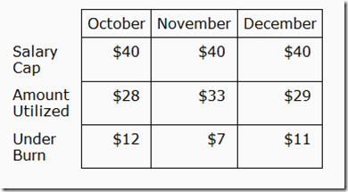
I need a stacked bar graph to show the amount we spent and how much we have left to spend (data below). Looking to show the bar chart below the line, in a different color for those times we over spent.
How can modify this table and data sources?
How can I show the “overage” bar in a different color?
How can I have the chart below the line without running over the text on the x axis?
Here is what I suggested:
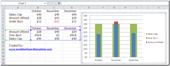
A Bullet Chart
I think it conveys everything that the user wanted. Budget, over budget and amount used. What do you think? Did we capture everything that was requested? The user was very happy.
What would you have suggested? Let me know in the comments.
Steve=True
I like this solution. I made my own version based on the picture of your answer, and I think I made it the same. My only question is…did you move the overburn and amount utilized to a secondary axis? I did, and it works great…as long as I make sure both of the axis are scaled the same. Do you know of any way to dynamically link the two axis so that they can automatically change scale as the values change, but stay the same relative to each other?
Thanks,
-Pete
I found a good way to do this with VBA.
I made two named ranges that are single formulas each. The first finds the maximum value in the data table range, and the second find the minimum. I named these two ranges “Axis_max” and “Axis_min”.
I then inserted the following code as a Worksheet event:
Private Sub Worksheet_Calculate()
If ActiveSheet.CodeName “Sheet14” Then Exit Sub
Dim pax As Axis, sax As Axis
Dim objCht2 As ChartObject
For Each objCht2 In ActiveSheet.ChartObjects
objCht2.Activate
Set pax = ActiveChart.Axes(xlValue)
On Error Resume Next
Set sax = ActiveChart.Axes(xlValue, xlSecondary)
On Error Resume Next
With pax
.MinimumScale = ActiveSheet.Range(“Axis_min”).Value
.MaximumScale = ActiveSheet.Range(“Axis_max”).Value
End With
With sax
.MinimumScale = ActiveSheet.Range(“Axis_min”).Value
.MaximumScale = ActiveSheet.Range(“Axis_max”).Value
End With
Next objCht2
ActiveSheet.Protect DrawingObjects:=True, Contents:=True, Scenarios:=True
ActiveSheet.Unprotect
End Sub
The above code set both the Primary and Secondary vertical axis of all the charts on the active worksheet (in the case of this code, only if the worksheet is Sheet14) and sets them to the Max and Min value of the data table that is being charted.
This works particularly well on a dashboard where I had a pivot table driving a chart, and a slicer that drove the selection of what the chart showed. Every time that the slicer is changed, the pivot recalculates, and the dynamic range of all of the charts automatically adjusts to the max and min that remains on the underlying data.
Thanks Pete. I need to learn more VBA 🙂