Replace Numbers with Text in Excel Radar Chart Axis Values
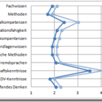
Replace Numbers with Text in Excel Radar Chart Axis Values
This is a cool Excel Trick that I just created based on a user request...
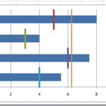
Step-by-Step Horizontal Bar Chart with Vertical Lines Tutorial
In a recent request for help in the MrExcel Forums, a user was having difficulties adding Vertical Line KPI Metrics to a Horizontal Bar...
How-to Make a Cool Looking 3-D Sales Funnel or 3D Sales Pipeline Chart in...
Some times these types of charts are called funnel charts or some times they are called pipeline charts. Regardless of what you call them,...
Advanced Excel Summation Skills Using SUMIFS and SUMPRODUCT
In this post, I will show you 2 other techniques that you can use to evaluate criteria and then create a sum of data...
How-to Make an Excel Vertical Likert Line Chart with Categories
In the Mr. Excel forums there was a question raised on how can you create a Likert Chart or Graph using Excel. The person...
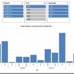
Petes Stumped Chart Challenge Answer – Pivot Chart with Slicers
In the last Friday Challenge, we were going to see if we could help a user create a chart from this data set. They...
How-to Create a Dynamic Excel Chart of Last 3 Months Data Without Offset
Chart of Last 3 Months
If you wanted to create a dynamic Excel chart of last 3 months of your data but didn't know how to...
Problems with an Excel Dashboard Goal Chart
A while ago, a user in an Excel help forum had a chart in his Excel Dashboard that was acting quite strange and he...
How-to Add a Grand Total Line on an Excel Stacked Column Pivot Chart
Today I answer a viewer question. "How do I add a cumulative grand total amount as a line above a stacked column pivot chart...
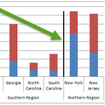
Add Vertical Line Between Columns in Excel Stacked Column Chart
Add Vertical Line Between Columns in Excel Stacked Column Chart
In this tutorial, you will learn how to QUICKLY add a vertical line between columns...

