Here is the long awaited demonstration of a recent Friday Challenge.
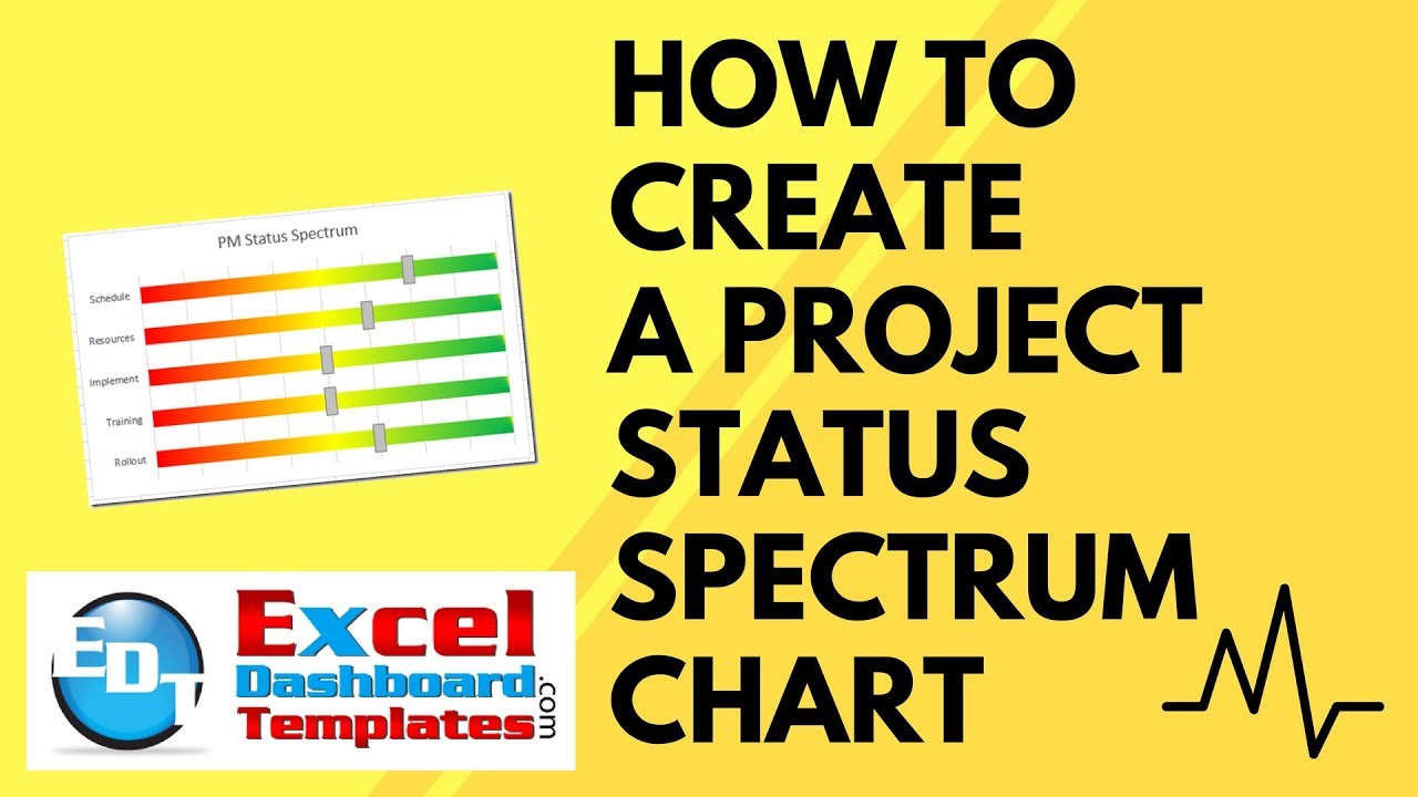
The challenge was to recreate a Project Management Status Chart that I saw on a recent project. The unique thing about this chart is that they used a spectrum from Red to Yellow to Green to represent the project status. Here is what the final chart will look like:
This was originally a graphic drawn in Microsoft PowerPoint. But as a Project Manager, you would then move each individual slider left or right, however, since it is a graphic, you can also move it up and down off of the status bar. In the Microsoft Excel Status Indicator chart, we will change a value and the status slider will move to the correct location. So lets get to it.
The Breakdown
1) Create Chart Data
2) Create Stacked Bar Chart
3) Delete Slider Position Data Series
4) Move Slider Fill and Slider Size to Secondary Axis
5) Show Secondary Vertical Axis
6) Check “Categories in Reverse Order” on Both Vertical Axes
7) Change Maximum Bound to 8 on Both Horizontal Axis’
8) Delete Both Secondary Axes
9) Change Slider Fill Series Color and Gap Width
10) Change Fill Color of Slider Size Series
11) Change Fill Color of Spectrum
12) Delete Legend and Primary Horizontal Axis
Step-by-Step
1) Create Chart Data
First we need to create our chart data.
a) Column A = Create Status Categories
b) Column B = Create Slider Position Data (Value between 1 and 8)
c) Column C = Create Spectrum Data (Value = 8)
d) Column D = Create Slider Fill Data (Formula: D2 = B2-E2/2 and copy down to D6)e) Column E = Create Slider Size Data (Value = 0.25)
Your final chart data will look like this:
2) Create Stacked Bar Chart
Now lets create the start of our Project Status Chart. Highlight cells A1:E6 and then click the Insert Ribbon. Then click on the Stacked 2-D Bar Chart button.
3) Delete Slider Position Data Series
One of our series in the data doesn’t need to be in the chart as it will be derived by other data series. So we need to delete the Slider Position data series from the chart. To do this, select your chart, then select the blue series on the left that represents the Slider Position data series.
Then press your delete key. Your chart will now look like this:
4) Move Slider Fill and Slider Size to Secondary Axis
We need to move the Slider Fill and Slider Size series to the secondary axis so that they will overlap the Spectrum series. To do this, select the grey Slider Fill series and press CTRL+1 or right click on it and select Format Data Series…
Then select the Secondary Axis radio button in the Series Options:
Then repeat these steps for the orange Slider Size data series and move it also to the secondary axis. Your Excel chart should now look like this:
5) Show Secondary Vertical Axis
Now one issue that I have with Excel is that when you move a data series to the secondary axis, it shows you one of the axis but not the other. I think they don’t want to confuse people. In this case, even though the secondary vertical axis isn’t shown, it is there but hidden. So we need to show the secondary vertical axis to perform future actions. To show the secondary vertical axis in an Excel Bar Chart, first select the chart. Then go to the Design Ribbon. Then select the Add a Chart Element button and then choose the Axis menu and then choose the Secondary Vertical option. Your chart will now look like this:
6) Check “Categories in Reverse Order” on Both Vertical Axes
Now that we are showing both vertical axis’, we need to flip them. To do that, select the chart, then select the the left vertical axis and press CTRL+1 or right click on the vertical axis and choose Format Axis…
Then from the Axis Options, click on the check box of “Categories in Reverse Order”
Repeat this step for the right (secondary) vertical axis. Then your chart should now look like this with both vertical axis categories matching each other:
7) Change Maximum Bound to 8 on both Horizontal Axis’
The next step is to make both horizontal axis’ a maximum bound = 8. To do that, select the chart, then select the the top horizontal axis and press CTRL+1 or right click on the vertical axis and choose Format Axis…
Then from the Axis Options menu, change the Maximum Bound to 8.0
Repeat this step for the bottom (secondary) horizontal axis. Then your chart should now look like this with both horizontal axis values matching each other:
8) Delete Both Secondary Axes
Now that we have done what we needed to do with the secondary axis’, we can delete them. To do this, select the chart, then select the secondary horizontal axis and press your delete key. Repeat this step for the secondary vertical axis. Your chart should now look like this:
9) Change Slider Fill Series to “No Fill” Color and Gap Width to 50%
We are getting closer. Now we need to hide the Slider Fill series and make it a little wider on the chart. To do this select your chart, then right click on the grey Slider Fill series and select Format Series… from the pop-up menu.
Then change the Gap Width in the Series Options to 50%
And then click on the Fill and Line menu and choose the No Fill radio button:
Your chart should now look like this:
10) Change Fill Color of Slider Size Series
In the example, the slider was grey with a black border. To do this select your chart, then right click on the orange Slider Size series and select Format Series… from the pop-up menu.
And then click on the Fill and Line menu and choose the Solid Fill radio button and choose a medium grey color and a black or dark border:
Your chart should now look like this:
11) Change Fill Color of Spectrum
Now we need to create the red, yellow and green spectrum that is behind the project status slider.
To do this select your chart, then right click on the orange Spectrum series and select Format Series… from the pop-up menu.
And then click on the Fill and Line menu and choose the Gradient Fill radio button and then add or delete the Gradient stops until you only have 3 stops. Then make the left stop a color of green and a position of 0%. Make the middle stop a color of yellow with a position of 50% and the right stop a position of 100% and a color of red.
Your chart should now look like this:
12) Delete Legend and Primary Horizontal Axis
The last thing to do to match the sample is to remove the legend and optionally the horizontal axis. You can easily do this by selecting the legend or horizontal axis and press your delete key. Your final chart should now look like this:
Video Demonstration
Free File Download
Download the sample Excel Project Status file:Excel-Project-Status-Spectrum-Chart.xlsx
Would you use this as a Project Status Indicator by Phase for your project status reports? Let me know in the comments below.
Steve=True
Nice Article. By the way, the plural of axis is axes (pronounced ackzees). There’s no apostrophe involved at all. 🙂
Hi Eddie, thanks for the comment, you are totally right. I looked it up after creating my next post and have been spelling it correctly ever since 🙂 lol but forgot to go back and update the previous post. Should be up and fixed shortly. Thanks for being a fan! Steve=True
Hello,
What adjustments would need to be made to create a 5 or 6 point scale rather than 8?
Thanks,
JD
Hi JD.
Good question. To do this, you would want to change your Spectrum Series to all 5 or all 6 values. Then your Slider position series would have to change to a maximum of 6.
Hope this helps.
Steve=True
Hi
Great article, love the color idea.
All I want is to now move the thumb with a mouseover. Do not want to click and drag.
How to do ? Thanks
Hi Charles, that would be cool. You may be able to do it with VBA code. Steve=True
This is exactly what I was looking for when I started my project, so thanks. However, now my boss wants to be able to add a second data point to each bar, even if it’s an arrow below. Help?
Hi Gabrielle, of course we could add another data point. What did you have in mind? Steve=True
Nice job! Once I figured out what you were doing, the concept is very creative.
I set my slider width to 0 for steps in a project plan that are in the future. That turns them off but displays the bar as “something we will measure when we get there”.
Thanks for the write up.
-jimt
Thanks for the comment Jim. That is also very creative to show text. Thanks for being a fan. Steve=True
Hello Steve=True, thank you for your elaborate article. Maybe
you’re interested in a VBA automation of the 12 steps it took to create a spectrum chart. Regards, Rene Vis, Netherlands
Option Explicit
Private Type typGradientSettings
RGB As MsoRGBType
Position As Single
End Type
Sub Create_spectrum_chart()
‘ source: https://www.exceldashboardtemplates.com/how-to-make-an-excel-project-status-spectrum-chart/
Dim r As Range
Dim sh As Worksheet
Dim lo As ListObject
Dim shp As Shape
Dim ch As Chart
Dim srSpectrum As Series
Dim srSliderPos As Series
Dim srSliderFill As Series
Dim srSliderSize As Series
Dim axC1 As Axis
Dim axC2 As Axis
Dim axV1 As Axis
Dim axV2 As Axis
Dim grp As ChartGroup
Dim gs As GradientStop
Dim i As Integer
Dim iCount As Integer
Dim iMaximumScale As Long
‘ 1) set raw data for chart, presumably from range A1; please change to your own needs
Set sh = ActiveSheet
Set r = sh.Range(“a1”)
r.Select
Set lo = r.ListObject
If lo Is Nothing Then
If VBA.MsgBox(“Create table from range ” & r.Address & “?”, vbYesNo) = vbYes Then
Set lo = sh.ListObjects.Add(xlSrcRange, r.CurrentRegion, , xlYes)
Else
GoTo Ex
End If
End If
‘ 2) create chart, type xlBarStacked
Set shp = sh.Shapes.AddChart
shp.Select
Set ch = shp.Chart
Set srSpectrum = ch.SeriesCollection(“Spectrum”)
Set srSliderPos = ch.SeriesCollection(“Slider Position”)
Set srSliderFill = ch.SeriesCollection(“Slider Fill”)
Set srSliderSize = ch.SeriesCollection(“Slider Size”)
iMaximumScale = srSpectrum.Values(1)
ch.ChartType = xlBarStacked
ch.SetSourceData Source:=lo.Range
‘ 3) delete Slider Position data serie
srSliderPos.Delete
‘ 4) Move ‘Slider Fill’ and ‘Slider Size’ to Secondary Axis
srSliderFill.AxisGroup = xlSecondary
srSliderSize.AxisGroup = xlSecondary
‘ 5) Show Secondary Vertical Axis
ch.SetElement Office.MsoChartElementType.msoElementSecondaryCategoryAxisShow
Set axC1 = ch.Axes(XlAxisType.xlCategory, XlAxisGroup.xlPrimary)
Set axC2 = ch.Axes(XlAxisType.xlCategory, XlAxisGroup.xlSecondary)
Set axV1 = ch.Axes(XlAxisType.xlValue, XlAxisGroup.xlPrimary)
Set axV2 = ch.Axes(XlAxisType.xlValue, XlAxisGroup.xlSecondary)
‘ 6) Check “Categories in Reverse Order” on Both Vertical Axes
axC1.ReversePlotOrder = True
axC2.ReversePlotOrder = True
‘ 7) Change Maximum Bound to iMaximumScale on both Horizontal Axis
axV1.MaximumScale = iMaximumScale
axV2.MaximumScale = iMaximumScale
‘ 8) Delete Both Secondary Axes
axC2.Delete
axV2.Delete
‘ 9) Change Slider Fill Series to “No Fill” Color and Gap Width to 50%
srSliderFill.Format.Fill.visible = msoFalse
Set grp = ch.ChartGroups(2) ‘ group of dataseries, plotted against secondary axis
grp.GapWidth = 50
‘ 10) Slider Size series: change Fill Color to medium grey and border to black
With srSliderSize.Format
With .Fill
.visible = msoTrue
.ForeColor.ObjectThemeColor = msoThemeColorBackground1
.ForeColor.TintAndShade = 0
.ForeColor.Brightness = -0.25 ‘ medium grey color
.Transparency = 0
.Solid
End With
With .Line
.visible = msoTrue
.ForeColor.ObjectThemeColor = msoThemeColorText1
.ForeColor.TintAndShade = 0
.ForeColor.Brightness = 0
.Transparency = 0
End With
End With
‘ 11) Spectrum serie: set GradientStops
srSpectrum.Select
With srSpectrum.Format.Fill
.TwoColorGradient msoGradientVertical, 1
Dim aGS(2) As typGradientSettings
aGS(0).Position = 0
aGS(0).RGB = vbGreen
aGS(1).Position = 0.5
aGS(1).RGB = vbYellow
aGS(2).Position = 1
aGS(2).RGB = vbRed
For i = 0 To UBound(aGS)
.GradientStops.Insert aGS(i).RGB, aGS(i).Position, 0
Next
‘ delete other GradientStops
iCount = UBound(aGS) + 1
For i = .GradientStops.Count – iCount To 1 Step -1
.GradientStops.Delete i
Next
End With
‘ 12) Delete legend and hide last visible Value Axis
ch.Legend.Delete
axV1.Delete
Ex:
Set gs = Nothing
Set grp = Nothing
Set axC1 = Nothing
Set axC2 = Nothing
Set axV1 = Nothing
Set axV2 = Nothing
Set srSpectrum = Nothing
Set srSliderPos = Nothing
Set srSliderFill = Nothing
Set srSliderSize = Nothing
Set ch = Nothing
Set shp = Nothing
Set lo = Nothing
Set sh = Nothing
Set r = Nothing
End Sub
Cool thanks Rene!
Hi, just found this, very useful thank you. Is it possible to have two sliders: one for this period, the other for last period?
Hi Dano, sure, there isn’t a limit. The sliders just affect a value in the spreadsheet that then can be used to control other things like index or vlookup formulas that affect what is displayed in the graph.
Hi Steve=True,
Is there a way to make the slider size on multiple charts with different bounds the same size with a formula, or is the only way to eyeball them manually?
Great write up!
Ben
Thanks Ben. If you need them all the same size, I would create a chart and make a copy of it and then modify the chart series. Hope this helps. Thanks for your great comment.
How do we activate the slider on the bar charter to move instead of editing the numbers from that data?
Hi Wyn, if you mean how can i change a slider other than the numbers, you can create a form control like a spinner and it can change the slider, but in reality, it is just changing a number on the spreadsheet that affects the chart.
Hi Steve,
This is great and better way to visualize project status. But when all statuses are green (has slider position to 8), slider size became half of length and is not properly interpreted. if one of the status were lower, it showing proper slider size. What could be reason for that and how we can achieve small slider size with all spectrum having same slider position.
Hi Dhiraj, it is that we are positioning the slider at 8 and it is centered, but we are fixing the axis at 8. So 1/2 doesn’t show. You can add an if statement to subtract 1/2 of the slider size if value of 8 and add 1/2 if value of 0 to show the whole slider. Alternately, you can move the slider to only 7.5 and the whole slider will show.
Great article, this amazes me! I tried to apply this creative graph to show RAG status of our business metrics. I’m not sure though how to control the gradient, like where the green would stop (and where the amber, or red would start) since we have different target values for each metric. For example, metric 1 green is only up to 20; metric 2 green is up to 5 only, >5 is already in amber. I only use one graph and the values (sliders) move as expected when I change metrics, but the gradients remained as is.
Is there a possible way to do this?
Thanks in advance, Steve=True!
Hi \Lai, not sure how I understand the gradient numbers you presented as you have 2 greens 🙂 . The gradient is applied across the entire bar, so edit the fill options on your gradient bar and add a few more to get the desired result. Here i have moved the yellow more left and added more red, green and yellow to get less gradient between sections. Hope this helps. https://www.exceldashboardtemplates.com/wp-content/uploads/2018/03/SampleMoreGradientFills-ProjectSpectrumChartorig.png
Hello Steve=True, I’m so sorry for the confusion. In my example, I made only one graph to show the status of, say, 5 metrics — but the graph would show only one metric at a time. For example, when I want to see the status of metric#1, I would select metric#1 in my drop-down menu and this referenced the value (say, 5) from a table somewhere. Metric#1’s status should be below 20 to be in green zone. So the graph will then show metric#1’s value of 5 still in green. Now when I select another metric from the drop-down, this has a different target for green. Metric#2’s target to be in green should be <3. So if the value of metric#2 is 7, the graph should then change the gradient to show that metric#2 is way beyond the green zone. I guess, what I'm trying to see if possible is if the colors would move as well depending on the values/target referenced.
Hi Lai, you could probably change the gradient position, but you would have to do that with a Macro or VBA to update these behind the scenes as there is no link from the color gradient to the spreadsheet cell available in Excel.
Beauty chart SteveEqualsTrue!
One thing I would like to note is that in your sample source data you have already accounted for 1/2 the slider fill size.
If someone is creating a set of data based on some other input, that difference should be accounted for to ensure the slider lines up properly centered on the correct number.
Thanks. Yeah the slider size being 1/2 size is to align it on the correct data point and I have reduced the same amount on the data point position so that it aligns.
Hello,
I used a similar approach to get these scales done. There is however a problem. How can I arrange my scale that if the value are higer than my scane it just stops a the very maximum? When its below zero it work, on the other side of the scale the pointer/arrow simply disappears…
Thank you
Best Matthias
Hi Mattias, I would have your chart based on a calculated field that is something like this: =if(UserValue>10,10,UserValue)
Hello Steve. This is really great.
If I have a measurement metric for different tasks with their individual requirement time of completion: For example; making coffee involves 2 tasks, Task 1 should be completed in 4mins and employees complete it in 3, task 2 should be completed in 4mins but employees complete it in 6, Is there a way I could create a gradient on the same chart that utilizes the individual required completion time of these tasks as the basis of gradient movement if I decide that it is red if completed two minutes more than required time.
Thanks
Hi Shams, yes you should be able to make that. Just add an additional RED gradient to the side of the original Red gradient point. Then move it until you get to around your 4 number.
Awesome – just what I was looking for and great, easy to follow, step-by-step directions. Thanks!
Thanks for the great comment. Glad to help.
Hi Steve, this is great, thanks for posting.
Not sure if you’re still reading notes here but if so I do have just one question – when i build this using only one row (i.e. effectively just for the “schedule” section) it doesn’t show properly. When i switch the slider fill and slider size to the secondary axis it doesn’t show as it should.
Am i doing something wrong or is this an excel quirk where there has to be more than one data set being charted?
Hi Mike,
Add your Horizontal Axis and set the minimum to 0
1) Select chart
2) Design Ribbon
3) Add Chart Element
4) Axis
5) Primary Horizontal Axis
6) Double Click Horizontal Axis
7) Change Axis Options – Bounds Min = 0
Steve, this is incredible and has taught me more about excel graphing than I was even aware of. Teaching a lot of these concepts to my coworkers.
One question for a finance project. Is it possible to have the charts scale to different “spectrums”?
Example, Google stock will make me money if it falls between stock price $25 and stock price $45 (effectively an absolute value of 20 between the two prices). And Apple stock will make me money if it falls between $100 and $150 (effectively 50 units between the two).
Can I plot these two on the same graph somehow? I was thinking the “spectrums” would be 20 and 50, but having that Maximum Bound of 8 is messing it a bit.
Spencer, thanks for your nice comment. Do you think that this type of chart would help for what you are looking for? https://www.exceldashboardtemplates.com/step-by-step-tutorial-how-to-make-a-company-and-industry-pe-price-to-earnings-line-chart/
Alternately, no reason you can’t make 2 different charts and put them above and below to compare.
THANK YOU!!
Hi,
When I change the slider position to 8 for all the 5 lines on the chart the slider breaks and the sliders don’t stay in their position. How can I fix this?
Hi Andy,
It is that we are positioning the slider at 8 and it is centered, but we are fixing the axis at 8. So 1/2 doesn’t show. If you want, you can add an IF statement to subtract 0.5 of the slider size if value of 8 and add 0.5 if value of 0 to show the whole slider. Alternately, you can change your slider value to 7.5 and the whole slider will show.
Steve-
Thank you for this outstanding walkthrough. I never would have achieved this without this incredibly user-friendly and simple tutorial.
Love it!
Thanks Tripp. I appreiciate the feedback.