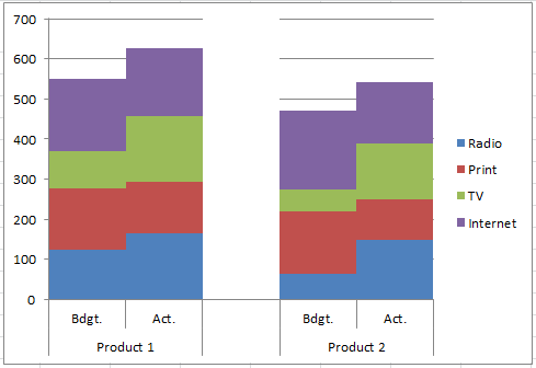
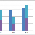
How-to Make an Excel Clustered Stacked Column Chart with Different Colors by Stack
In a popular post, I showed you how to easily create a Clustered Stacked Column chart in Excel using Multi-Level Category Axis options.
Here is...
How-To Copy an Excel Chart on Same Worksheet with a New Data Reference
Many users in Excel spend time creating an awesome chart on a specific data set, then they want to use that chart on another...
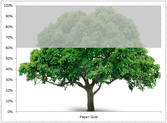
How-to Make a Pass Fail Chart in Excel
Last week, I posed a Friday Challenge that was posted in a Q&A for Excel. Here it is:
*****************************************************************
Plotting a line graph to track build...
How-to Highlight Specific Horizontal Axis Labels in Excel Line Charts
The Problem
Recently a fan contacted me and asked how she change the horizontal axis could do the as follows:
"I am trying to bold 5...
Quickest Way to Select and Align Charts for an Excel Dashboard
Select and Align Charts for an Excel Dashboard
Creating dashboards can take a lot of time. With this simple technique that I just learned, you...
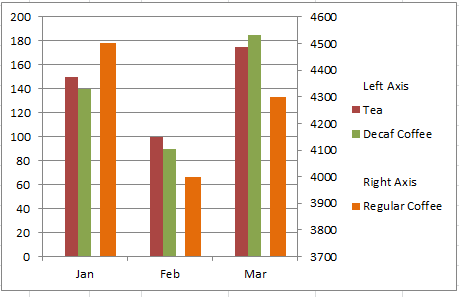
How-to Create a Stacked and Unstacked Column Chart in Excel
Stacked and Unstacked Column Chart in Excel
Excel is awesome because, even when a certain chart type is not a standard option, there may be...
How-to Concatenate Excel Column or Row Data Using Google Docs
Yesterday I demonstrated how to find and replace a hard return in an Excel spreadsheet. I presented the last topic before this one so...

