A while ago, a user in an Excel help forum had a chart in his Excel Dashboard that was acting quite strange and he wasn’t sure what the problem was.
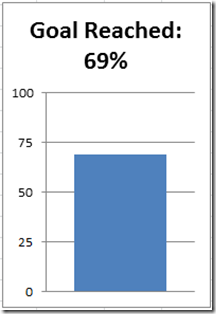
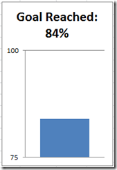
Here is what he described: The Excel Chart was a single column chart that was sort of like a thermometer chart that represented how far their company was to their goal. It probably looked something like this: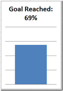
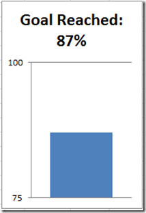
Doesn’t look too bad, but, when this Excel user changed the numbers, he found that Excel was not plotting it right. For instance, lets change the value to 87%, and see what he was seeing in his Excel chart. It would look like this: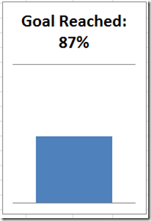
The Excel user was perplexed. Why was Excel not plotting the chart right? Shouldn’t the bar grow? Instead it looks like it shrunk to less than 50%. He thought it was very strange.
Here is what Excel is doing – “By default, Microsoft Office Excel determines the minimum and maximum scale values of the vertical (value) axis (axis: A line bordering the chart plot area used as a frame of reference for measurement. The y axis is usually the vertical axis and contains data. The x-axis is usually the horizontal axis and contains categories.), also known as the y axis, when you create a chart” – Excerpt from Microsoft Excel Help.
Now what I couldn’t find is the exact calculation that Excel uses to calculate the minimum and maximum scale for the vertical axis. I heard that when all the data points are within about 20% of all values, then Excel will modify your axis. Since we only have one data point, it will adjust the minimum and maximum scale values for the chart on its own.
Now lets add back the Excel company goal chart vertical axis so that we can better see what Excel is doing. But first, lets take a look at what the vertical axis settings look like. Since this is a company goal chart, the user fixed the Maximum value to 100 and changed the major units to 25. But the minimum is not fixed and is still set to Auto: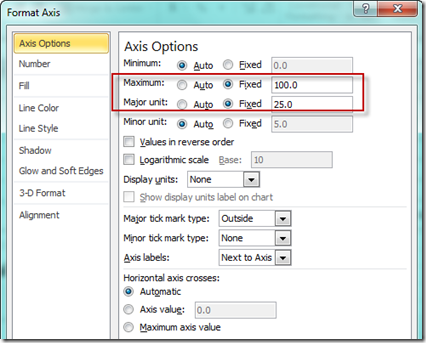
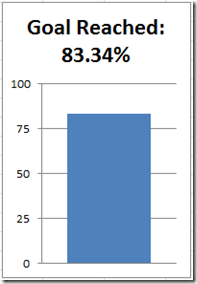
Now here you can see that I have added the vertical axis back to both the charts you saw above:
See how Excel changed the chart’s minimum vertical axis value since it was set to Auto?
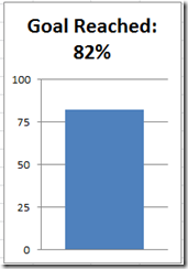
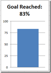
It works for the 69%, but let’s see when Excel changes minimum value. You can do this by changing the values up until Excel changes the vertical axis of the chart.
So somewhere between 83% and 84% Excel will modify the vertical axis minimum. If we keep changing the values by adding more decimals, you will see that Excel won’t change the minimum automatically until 83.34%: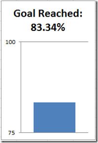
Now lets add more data points and see if that changes it at all.
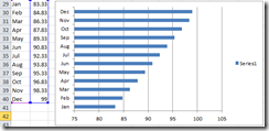
The vertical axis minimum and maximum in this Excel chart is set to Auto. Notice that Excel takes it upon itself to adjust the minimum for this column chart and that is not optimal in most charts as it can add a skewness to your graphic that you don’t want.
Now lets change the last data point to to 99.99 and the first data point to 83.33. 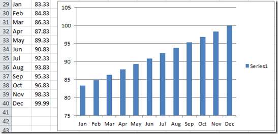
No change in the vertical axis as you can see.
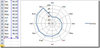
Now if we change the value in Dec to 100, look what happens: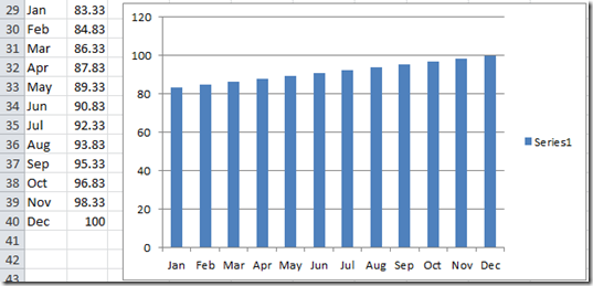
The auto function doesn’t affect the minimum vertical axis value anymore because the spread between the data points is more than 16.67%.
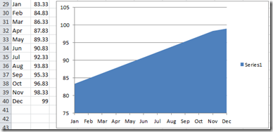
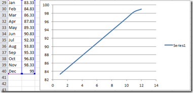
This auto formatting will also happen with line charts: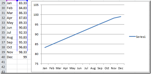
And yep, Bubble Charts in Excel: 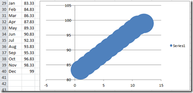
THE FIX
So what was the fix for my friend’s company goal dashboard chart?
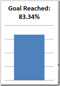
It was an easy fix in this case. All he had to do was to also fix the Vertical Axis Minimum to equal Zero. 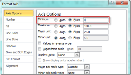 Once you do that, the scale not change and your columns (goal) will always show correctly to the human eye. Here is the chart with and without the vertical axis showing and you will see that the bar displays the way we want to see it.
Check out the video to watch it in action so that you can fix your Excel charts for your company dashboards.
Video Tutorial:
Do you have other chart oddities that Excel creates when making your executive dashboard? Let me know in the comments.
Also, don’t forget to subscribe to my blog so that you are sure to get the next post delivered directly to your email inbox.
Steve=True

