1) Insert an Excel Table
2) Add an Additional Grand Total Column to the Excel Table
3) Insert a Pivot Table
4) Create Pivot Chart
5) Change Chart Type
6) Remove Legend Entries
Step-by-Step
1) Insert an Excel Table
I am liking Excel Tables more and more every day [Pete changed my mind!]. So this tutorial will involve Tables.
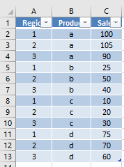
If your data looks like this:
| Region | Product | Sales |
| 1 | a | 100 |
| 2 | a | 105 |
| 3 | a | 90 |
| 1 | b | 25 |
| 2 | b | 50 |
| 3 | b | 40 |
| 1 | c | 10 |
| 2 | c | 20 |
| 3 | c | 30 |
| 1 | d | 75 |
| 2 | d | 70 |
| 3 | d | 60 |
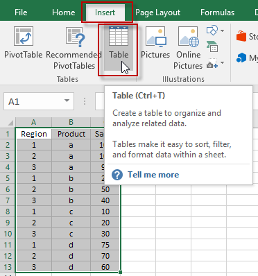
We need to transform it into an Excel Table by highlighting the data range and then selecting the Insert Ribbon. Then click on the Table button or simply press CTRL+T.
Your table will now look like this:
2) Add an Additional Grand Total Column to the Excel Table
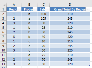
The first trick of this tutorial is that we need to add a new column of data to the Excel Table that we will then add to the Pivot Table to create our line.
To create a new column of data, type in a new header label next to the Sales Values. In our case, we will call it “Grand Total by Region”.
Then in the first cell below the new label for the column, type in this formula that will sum the amount of all Sales for the given region:
=SUMIF([[Region]],[@Region],[[Sales]])
Check out this post and also watch the video below to understand why you need the extra brackets around the first Region and the Sales fields.
copy-paste-vs-fill-handle-copy-with-tables-references-in-an-excel-formula
Your Excel Table of data will now look like this:
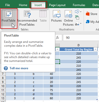
3) Insert a Pivot Table
Now we have laid the foundation for the Pivot Chart, but first we need to create a Pivot Table. To do this, simply click anywhere in the Excel Table and click on the Insert Menu and then click on the Pivot Table button.
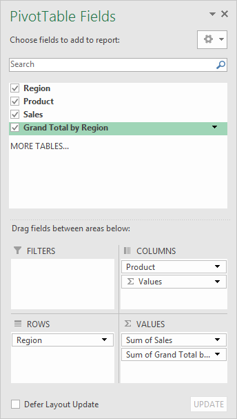
Then you want to set up your fields like this in the pivot table:
Watch the video below if you don’t know exactly how to create this pivot table.
Your pivot table will now look like this:

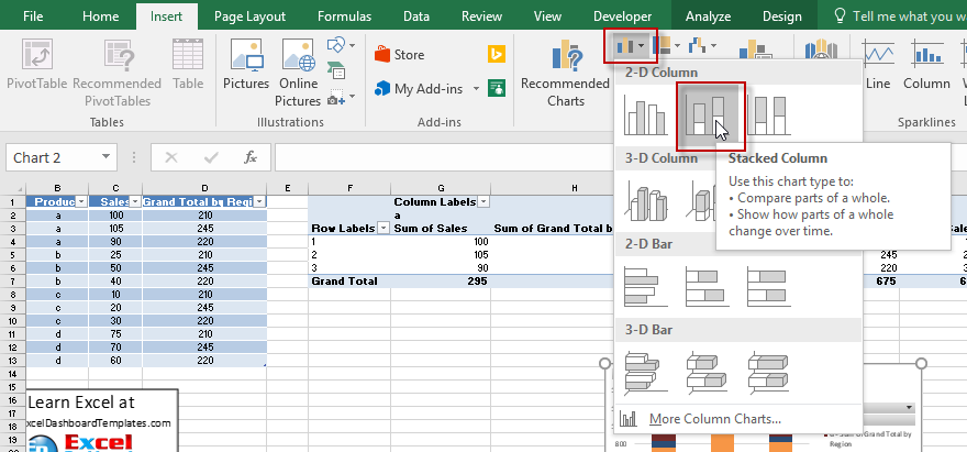
4) Create Pivot Chart
Now that you have created the Pivot Table, we can create a Pivot Chart simply by clicking anywhere in the final pivot table and then click on the Insert Ribbon and then click on the Stacked Column Chart in the 2-D Column Chart button in the Chart group.
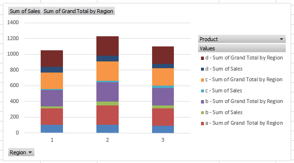
Your chart will now look like this:
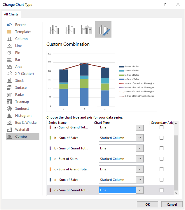
5) Change Chart Type
Now all we need to do is select one of the “Sum of Grand Total by Region” series and “Change Chart Type” from the Design Ribbon to a Line Chart.
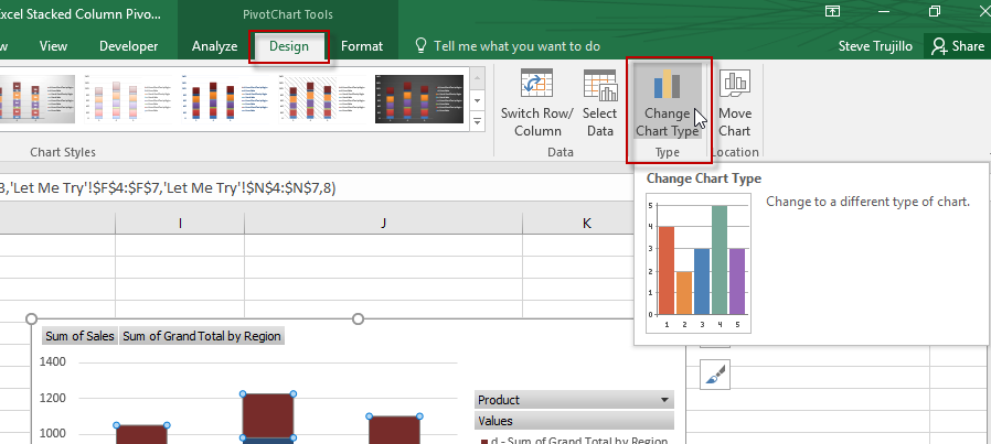
In Excel 2013 and Excel 2016, you will get a real nice dialog box where you can change them all at once. In Excel 2007 and Excel 2010, you may have to select each series and change each series individually. If you are having problems selecting the right series or even seeing the right series, check out this post:
how-to-select-data-series-in-an-excel-chart-when-they-are-un-selectable
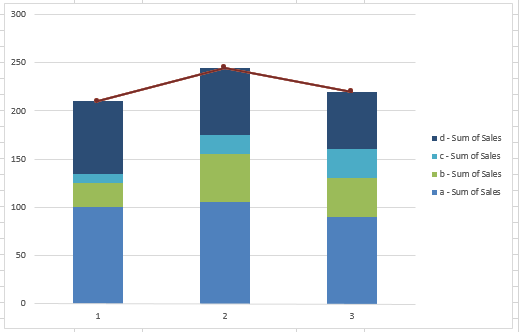
Your chart is almost done and will now look like this:
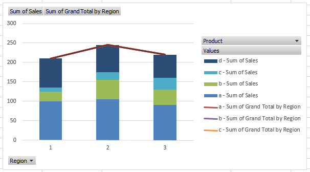
Even thought you have 3 overlapping lines, you can’t see them when viewing the chart, but if you must, you can hide them by selecting 2 of the 3 lines and changing the line color to No Line.
6) Remove Legend Entries
One thing left to do is a matter of preference. I prefer to Hide All Field Button on the Chart. You can do this by right clicking on the grey buttons in the chart.
The other thing to complete is to remove the Grand Total by Region legend entries. To do that, simply select the chart, then select the Legend Entry you want to remove and press your delete key. Repeat for all of the legend entries you wish to remove.
Your final chart now looks like this:
Video Tutorial:
Check out this short video demonstration that will show you how quick and easy this Excel Pivot Table trick can be accomplished.

Free Sample File:
Download the sample and try-it-yourself demonstration Excel Pivot Chart file here:
How-to-Add-a-Grand-Total-Line-on-an-Excel-Stacked-Column-Pivot-Chart.xlsx
Do you like Pivot Charts or do you prefer to make a chart a regular chart with calculated formulas that summarize the data instead of having the pivot table do it for you? Let me know in the comments below what you prefer.
Steve=True


