Problems Creating an Excel Open-High-Low-Close (Candle Stick) Stock Chart
Every time and I mean EVERY TIME that I go to create a Candle Stick Stock Chart in Excel (otherwise known as an Open-High-Low-Close...
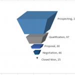
How-to Make a Cool Looking 3-D Sales Funnel or 3D Sales Pipeline Chart in...
Some times these types of charts are called funnel charts or some times they are called pipeline charts. Regardless of what you call them,...
Friday Challenge – Find Unique Class List in Excel ANSWER
On Friday, I posted this challenge:
https://www.exceldashboardtemplates.com/friday-challenge-find-unique-list-in-excel/
You can download the sample data set here: Challenge Sample Data
Check out the post and download / try it yourself before you...
How-to Easily Paste a Defined Name in Chart Dialog Box
As you are learning to use Excel to develop your Executive Dashboard Templates, you will quickly learn that Defining Names are your friend.
Defined names...
How-to Add Resource Names to Excel Gantt Chart Tasks
How-to Add Resource Names to Excel Gantt Chart Tasks
I recently received a request from a fan that asked how he could add resource names...
How-to Split Up Email Address Text with Excel Formulas – Part 2
In my previous Friday Challenge, Tracey wanted to know how to split up email address text in Excel. The sample text that Tracey wanted...
Customizing the Standard Excel Chart Titles
Titles on charts are not always necessary but when you use them, you will have many, many choices on formatting of which you may...
How-to Make a Tenant Timeline Excel Dashboard Chart
So last week, I posted this question that I responded to in an Excel forum. I also asked you how you would solve this...
How-to Make a Dynamic Excel Pie Chart with 4 steps in less than 4...
This is an awesome guest post from our great friend Pete. He came up with this awesome technique to make a dynamic pie chart...
How-to Setup Your Excel Data for a Stacked Column Chart with a Secondary Axis
Many users have mixed reactions about this secondary axis overlap fix. You can see the post here:
Stop Excel From Overlapping the Columns When Moving...

