In our recent Friday challenge, we were asked by Anna how can we make our popular Excel Step Chart work for data that is not date based, but time based. The use case is a medical study on sleeping.
You can read all about it here: Friday Challenge – Time Data Series Step Chart
Here is what the data looked like:
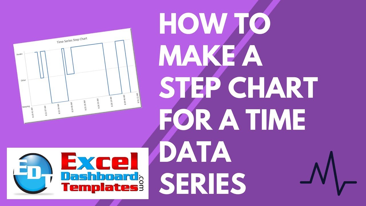
Here is what the final chart will look like: 
The Breakdown
1) Add Column of Data to Convert Text Values to Numbers
2) Create Step Chart Horizontal Data
3) Create Step Chart Vertical Data
4) Create XY Scatter Line Chart from Chart Data
5) Change Horizontal Axis Alignment to Vertical
6) Change Number format of Vertical Axis to Custom Number Format
7) Adjust Chart Plot Area
8) Delete Chart Junk
Step-by-Step
1) Add Column of Data to Convert Text Values to Numbers
First, we need to modify the Awake, Other and Sleeping data to numbers instead of text since Excel doesn’t know how to graph text.
Here is a similar tutorial were we fake Excel to chart text:
How-to-make-categories-for-vertical-and-horizontal-axis-in-an-excel-chart
In order to do this, we need to add a column of data that converts the W, O and S into numbers. So in Column C, I used this formula:
C3 =IF(A3=”w”,2,IF(A3=”o”,1,0))
Essentially, this formula converts W’s to a value of 2, and converts O’s to values of 1 and all other values to 0.
 We will use this data for our Vertical Axis values.
2) Create Step Chart Horizontal Data
Now we need to create the following formula in column D and copy it down:
D3 =SMALL(Table1[Start Time],TRUNC(ROW()/2,0))
What this does is copy the start time data and duplicates each value except the first value as you see here:  Just copy it down until you see all #Num values.
3) Create Step Chart Vertical Data
Now we need to create the following formula in column E and copy it down:
E3 =IF(ISNUMBER(D2),IF(D3<>D2,E2,VLOOKUP(D3,Table2[[Start Time]:[Chart Y Axis Position]],2,FALSE)),VLOOKUP(D3,Table2[[Start Time]:[Chart Y Axis Position]],2,FALSE))
What this does is copy the chart y axis position data for the matching time and then duplicates each value one time for the next horizontal point.

4) Create XY Scatter Line Chart from Chart Data
Now that we have our data setup, we can create our chart. Here is where we need to adjust our step chart to use a different chart type. Normally, we can just use a line chart, but Excel doesn’t plot time data the same that it does with dates. So a line chart won’t work. Here is what it looks like if we chart the data as a line chart: So we need to pick a different type chart. In order for Excel to treat our data correctly, we need to pick an XY Scatter with Straight Lines:
If you pick that chart type, Excel will create your desired chart in a step format like you see here:
5) Change Horizontal Axis Alignment to Vertical
Now there is a few things we need to fix in order to get the final Excel chart. First, we need to make it so that we can see the horizontal axis values as they are overlapping each other. To do this, double click on the horizontal axis time numbers.
 Then change the alignment axis options to Rotate all text 270 degrees. Your chart will now look like this:
 Don’t worry about the numbers just yet, we will fix that in a later step.
6) Change Number format of Vertical Axis to Custom Number Format
Now our desired chart was to have text values show up in the vertical axis instead of numbers. In order to do this, we need to trick Excel number formats. To do this, double click on the vertical axis and add this custom number format
[>1]”Awake”;[=1]”Other”;”Sleeping” (Note: sometimes copying this from the web to Excel, you may need to delete and replace the quotation marks)
here: This is very similar to this post: How-to Format Chart Axis for Thousands and Millions
Your chart will now look like this:
7) Adjust Chart Plot Area
Okay, lets fix the horizontal axis numbers so that we can see them. In order to do this, we need to shrink the plot area of the chart. First select your chart and then select the plot area as you see here: Then drag and drop the bottom control box up so that the plot area gets smaller from the bottom of the chart. Your chart will now look like this:
8) Delete Chart Junk
Your chart may have vertical gridlines that you may not want. If you don’t want them, simply click on the vertical gridlines and press your delete key. Here is what your final chart will look like:
Video Tutorial
Check out a video tutorial on making this chart here:
Free File Download
You can download the free sample file here:
Friday Challenge Answer – Time Data Series Excel Step Chart.xlsx
If Anna’s paper is accepted, I may get an honorable mention in helping her with this graph. How neat is that? 🙂
I believe that you can also use Excel Scatter Charts for the date step charts, but you definitely have to use them for Time Series charts. I wonder why Excel moved away from Time Series charts? I saw images online where this was an option in Excel 97. If you have a copy of Excel 97, I would love to see how one of those charts converts to Excel 2013. I only have 2003 as my oldest copy. I would imagine that it would throw an error and not work. Good luck with the paper submission Anna!
Steve=True


