Create a Excel Gantt Chart to Display a Music Festival Band Schedule
Here is Pete's answer to the recent Music Festival Schedule Challenge.
In this video, see how he used Index/Match functions as well as a helper...
How-to Setup Your Excel Data for a Stacked Column Chart with a Secondary Axis
Many users have mixed reactions about this secondary axis overlap fix. You can see the post here:
Stop Excel From Overlapping the Columns When Moving...
How-to Make a Pass Fail Chart in Excel
Last week, I posed a Friday Challenge that was posted in a Q&A for Excel. Here it is:
*****************************************************************
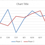
Plotting a line graph to track build...
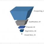
How-to Make a Cool Looking 3-D Sales Funnel or 3D Sales Pipeline Chart in...
Some times these types of charts are called funnel charts or some times they are called pipeline charts. Regardless of what you call them,...
How-to Make an Excel Chart Go Up with Negative Values
In a follow-up to my recent Terrible Chart Tuesday, I wanted to show you 2 different techniques that you can use to create a...
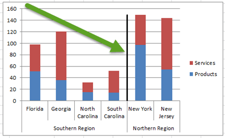
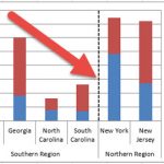
Create a Vertical Line Between Columns in Excel Using Error Bars
Create a Vertical Line Between Columns in Excel Using Error Bars
Thanks to Leonid (a super fan) for advising me on another and possibly better...
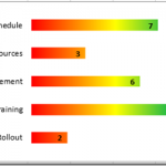
New Take on the Excel Project Status Spectrum Chart
Leonid, a wonderful reader of our website, sent in a new take on my Excel Project Status Spectrum Chart. Here is what his looks...
Friday Challenge Answers – Cumulative Events Over Time
In our recent Friday Challenge,
Friday Challenge – Creating an Excel Graph of Cumulative Events Over Time
where a user wanted the following:
Creating a graph of...
How-to Add a Grand Total Line on an Excel Stacked Column Pivot Chart
Today I answer a viewer question. "How do I add a cumulative grand total amount as a line above a stacked column pivot chart...
Friday Challenge – Data Transformation
This weekend starts the ModelOff competition.
"ModelOff is the world’s largest professional competition for Microsoft Excel, Financial Analysis, Investment Analysis and Financial Modelling." -Modeloff Site
If...


