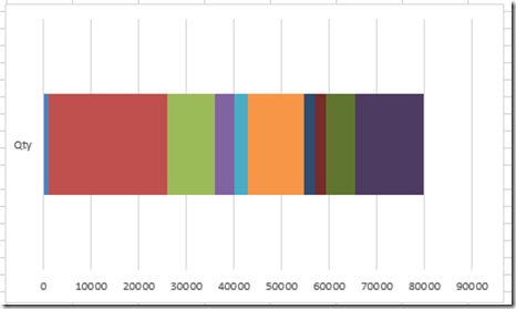
In our recent Friday Challenge, we were tasked with creating a Stacked Bar Chart where the colors matched the products. You can check out the challenge here:
Original Challenge: friday-challenge-pipeline-usage-chart
We had a number of great solutions submitted:
Pete’s VBA Solution: match-product-chart-colors-to-excel-spreadsheet-cells-petes-vba-solution
Don’s Cumulative Solution: pipeline-usage-chart-dons-answer
Leonid’s Clustered Column Chart: leonids-friday-challenge-answer-pipeline-usage-stacked-bar-chart
So here is my take on it.
As you may already know, I am not that good at VBA and some offices don’t allow it to be used due to some security issues. So I created a chart without VBA and a formula to set up the chart data series.
The main issue that we have with a stacked bar chart is that Excel puts a new color for every data point and it doesn’t know that a data point later in the series should have the same color as a previous data point. 
And even if you modify the layout, the Excel Stacked Bar Chart just doesn’t know how to handle it.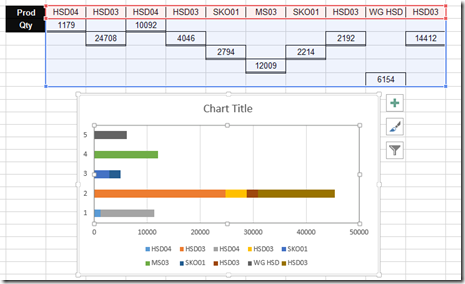
So we need a new concept. Like Leonid’s solution where he a Clustered Column Chart, we need to fake the eye and use a different chart type that when you finish tricking Excel, your final chart will look like a Stacked Bar Chart.
My Choice is an Area Chart type.
Now and area chart in Excel has two parts of the chart data information. 1) The height and 2) the width
First the Height. If we look at the sample chart, all the segments of the stacked bar chart are the same height. It doesn’t really matter the height we choose as long as they are all the same. So, since it doesn’t matter, I chose a height of 1.
Now the width. If we look at each segment of the stacked bar chart, each width is different and is representative of the pipeline amount. If we further dive into the horizontal axis of an Area Chart type in Excel you will see that you can have 2 types of Axes. Your horizontal axis type can be either Text or Date. 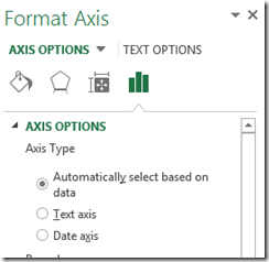 This is just like a line or column chart. If you choose the Text Type, each segment will be placed at exactly the same distance from one another and all look like they have the same width. So the Text Type of Horizontal Axis will not work for our needs as we need each bar chart stacked segment to be representative of the actual data in terms of width. Therefore, we will need to use the Date Axis type in our Area Chart Horizontal Axis Options.
In other words, we will set the horizontal categories to the right width by using dates and our height values of the area chart will all be set to 1. In order to get the relative values for the horizontal axis, we will need to create a new column of data next to the original data that is a cumulative summation of the pipeline usage as you see here: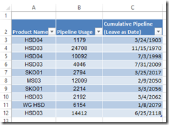 I have added a column of data that is in a data format and sums up the cumulative values of the pipeline data. Here is what it looks like as a number and not a data format:
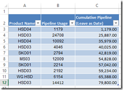 It is not critical at this stage to represent the data as a date, but it will be in our final chart data range.
The final step of the set up is that each Product needs its own column of data so that as the pipeline colors will match for each individual product. Here is how I set up the chart data table.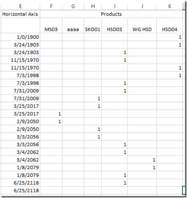 Using the step chart functions that I created in this post:
how-to-create-an-excel-step-chart-formula-using-the-small-function
The horizontal axis formula is very similar to the one I used in the Step Chart posting.
=IFERROR(SMALL(Table1[Cumulative Pipeline (Leave as Date)],TRUNC(ROW(A1)/2,0)),IF(ISBLANK(E2),0,IF(E1=E2,””,E2)))
I modified the vlookup formula quite significantly to incorporate an Index and Match lookup to the product and the date. Here is what the final formula looks like:
=IF($E3=0,IF(INDEX(Table1[Product Name],MATCH($E4,Table1[Cumulative Pipeline (Leave as Date)],0))=F$2,1,””),IFERROR(IF(AND(F2=1,F1=1),””,IF(SUM($F1:$K2)=2,IF(IFERROR(INDEX(Table1[Product Name],MATCH($E4,Table1[Cumulative Pipeline (Leave as Date)],0))=F$2,FALSE),1,””),IF(IFERROR(INDEX(Table1[Product Name],MATCH($E3,Table1[Cumulative Pipeline (Leave as Date)],0))=F$2,FALSE),1,””))),IF(INDEX(Table1[Product Name],MATCH($E4,Table1[Cumulative Pipeline (Leave as Date)],0))=F$2,1,””)))
Both of these formulas can just be copied down if you data set grows.
You can learn more about using Index and Match in these posts:
excel-vlookupleft-or-right-and-hlookup-up-or-down
understanding-how-to-make-a-step-chart-in-excel-using-index-and-match-functions
Now you can simply chart the range as a Area Chart and you pipeline is set: 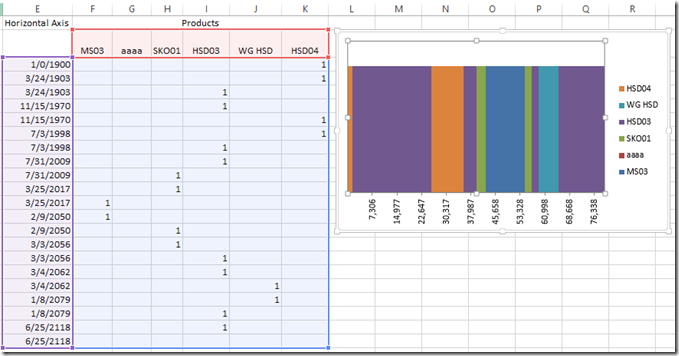
After creating your chart, you will want to make a few modifications:
1) Delete the Vertical Axis
2) Delete the Gridlines
3) Change the Alignment of the Horizontal Axis to 270 degrees (vertical)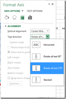
4) Change the Number format of the horizontal axis from Date to Number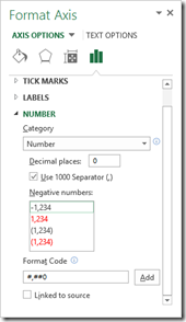
5) Set the Major Units and Base type: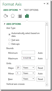
Then you have your pipeline chart: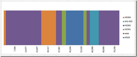
One final thing, if you change the horizontal data in your chart data range to a number instead of a date, here is what the chart in Excel would look like: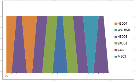
Notice how Excel connects the previous point to the next data point. So make sure you keep your chart data range as a date and just adjust the number format of the chart. However, if you do want to use the number format in your chart as well, this is not a deal breaker as you can still lock the horizontal axis as a Date type and your chart will look right once again.
Here is a video showing you how this technique works:
Here is the free sample Excel template download file: Pipeline-Usage-Chart-without-VBA.xlsx
Have you ever used a Date Axis type to Trick Excel?
Steve=True


