Select and Align Charts for an Excel Dashboard
Creating dashboards can take a lot of time. With this simple technique that I just learned, you can quickly select and align charts for your final Excel Dashboard presentation.
The Breakdown
1) Select Multiple Charts
2) Size Multiple Charts
3) Select Top Row and Align Top
4) Select Edge Charts and Align Left
Step-by-Step
1) Select Multiple Charts
Did you know that you can select all of your charts with a Keyboard Shortcut? This step combined with Step 2 is what will save you all the time in creating your Excel dashboard.
Why is this important? Because you can quickly select all of your charts and then resize them to create a sharp looking presentation.
So tell me the keyboard shortcut already!
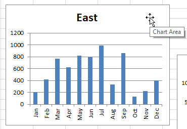
First, you must select a chart, any chart, in the Chart Area. This is typically found in the white space of the chart. Don’t select any data series, any axis, the title or legend of the chart as this will stop the technique from working.
Second, press CTRL+A to select all to select all of your charts on the active worksheet.
NOTE: This will not only select every chart, it will also select every picture on your worksheet.
Finally, if you have selected any chart or picture that do not want to have in the selection, simply hold down either the SHIFT or CTRL key and left click on the chart or picture you want to remove from the mass selection. For instance, I had an image on my worksheet that was selected, so I can keep the rest selected and un-select the image as you see here:
2) Size Multiple Charts
Now that the dashboard charts are selected on the worksheet, we need to get them all to look the same.
In order to do this, we can use the Ribbon and Size controls.
You will find these controls in the Drawing Tools > Format Ribbon.
NOTE: You will ONLY see these controls when you have at least one chart selected.
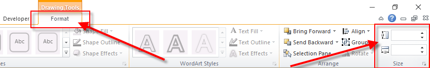
Just fill in the Height and press enter in the upper size control and then fill in the Width and press enter. For my sample chart, I am using 2.25 and3.25
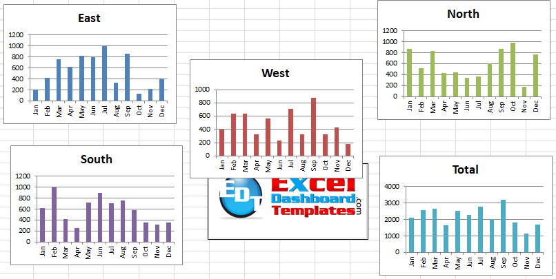
Your charts should now look like this:
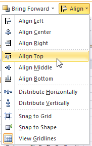
3) Select Top Row and Align Top
Now that the charts are all the same size, we need to get them into the right position. To do this, first, unselect the charts by clicking anywhere in the worksheet. Then select the charts you want on the top of the dashboard by holding down either the Shift or CTRL key and then use your mouse to left click on each graph.
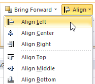
Now that you have the charts selected, click on the Drawing Tools > Format Ribbon and then click on the Align button.
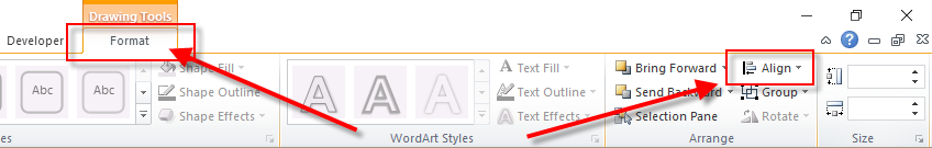
Complete the action by choosing Align Top from the Align Drop Down Menu.
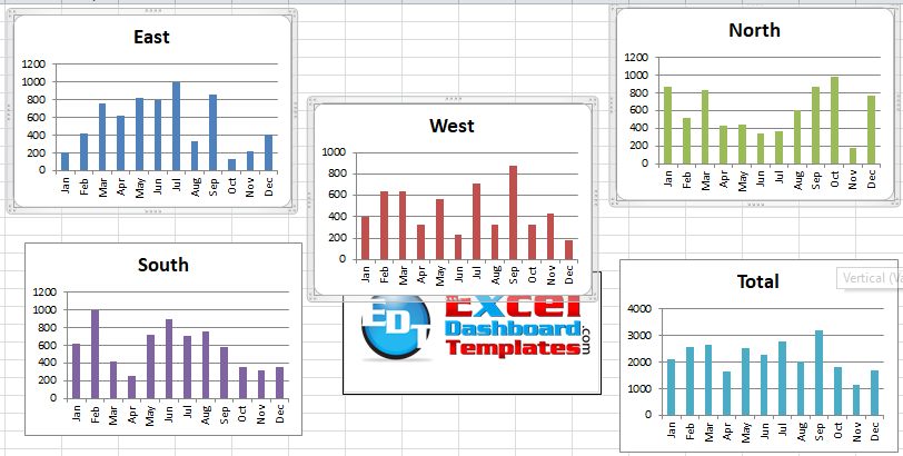
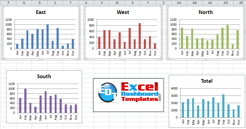
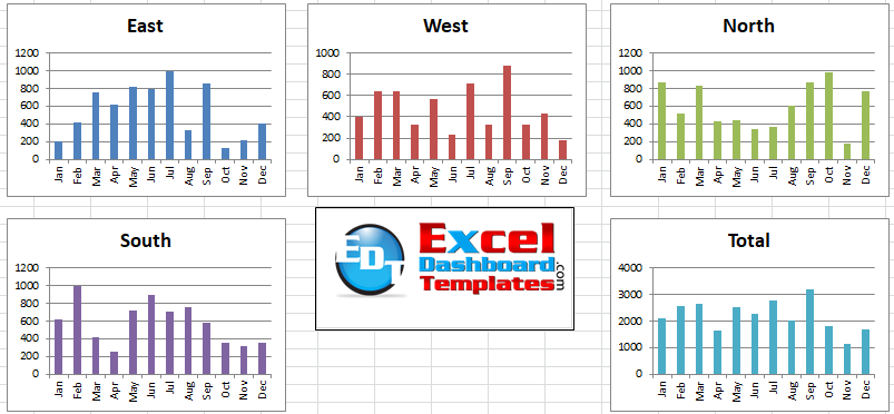
Your Excel dashboard chars should now look like this:
Final action would be with the charts selected to move them to the final location you want. I want my Excel Dashboard charts positioned around the logo, so it may look a little strange at this stage.
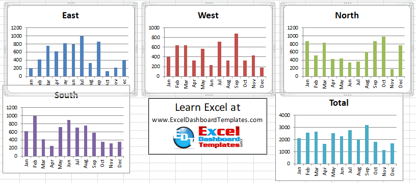
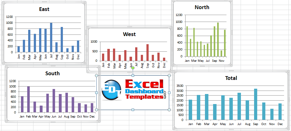
Repeat these same steps of selecting the bottom charts and Align Top. However, when I re-position the lower charts, I will put them slightly left of the upper row alignment. That way I can get these charts aligned properly with the next step. My Dashboard now looks like this:
4) Select Edge Charts and Align Left
This step is very similar to the previous one, but it only deals with the edges. So for this example, I mean aligning the 2 left charts and then the 2 rightmost charts.
For either the left of the right sides, first, select the charts using your left mouse button while holding down the SHIFT or CTRL button.
Then click on the Drawing Tools > Format Ribbon and then click on the Align button.
Complete the action by choosing Align Left from the Align Drop Down Menu.
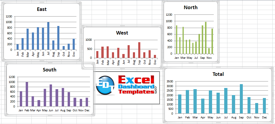
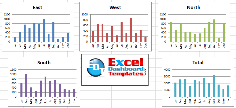
After doing the same action for both charts on the sides, your final Excel Dashboard Layout will look like this:
I feel that spending time on the dashboard aesthetics will help your readers focus on the charts and the data versus being distracted by improper sizes and alignments. If you learn these Excel Dashboard tips and tricks, you will not only save time, you will look like a rockstar to your executives.
Video Demonstration
Check out this Video tutorial on the techniques presented above.

Sample File Download
Click here to Download the Free Sample Excel Template File:
Quickest-Way-to-Select-and-Align-Charts-for-an-Excel-Dashboard.xlsx
Did you know about CTRL+A selecting charts only before? I hadn’t thought about it till just recently. What is your favorite keyboard shortcut or chart tip/trick? Let me know in the comments below!
Steve=True


