Learn how to make an accurate sales pipeline in Excel. In previous posts, I have showed you how to make a sales funnel chart using an Excel pyramid chart.
You can check out the previous Excel Sales Pipeline blog posts here:
How-to Make a Sales Pipeline Funnel Excel Chart Template
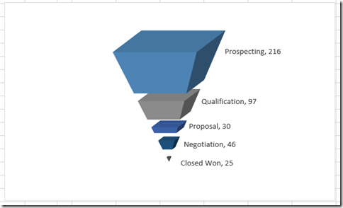
How-to Make a Cool Looking 3-D Sales Funnel or 3D Sales Pipeline Chart in Excel
Where Did My Excel 2013 Pyramid Charts Go? (Or How-to Make a Sales Pipeline Chart in Excel 2013)
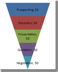
However, there are many problems with distorting the true picture of the Sales Pipeline with that type of chart. For instance, notice that all the phases of this Excel funnel chart makes it look like Negotiation is smaller than Prospecting, however, all phases have the same value so the funnel chart should be a column, not a upside down pyramid.
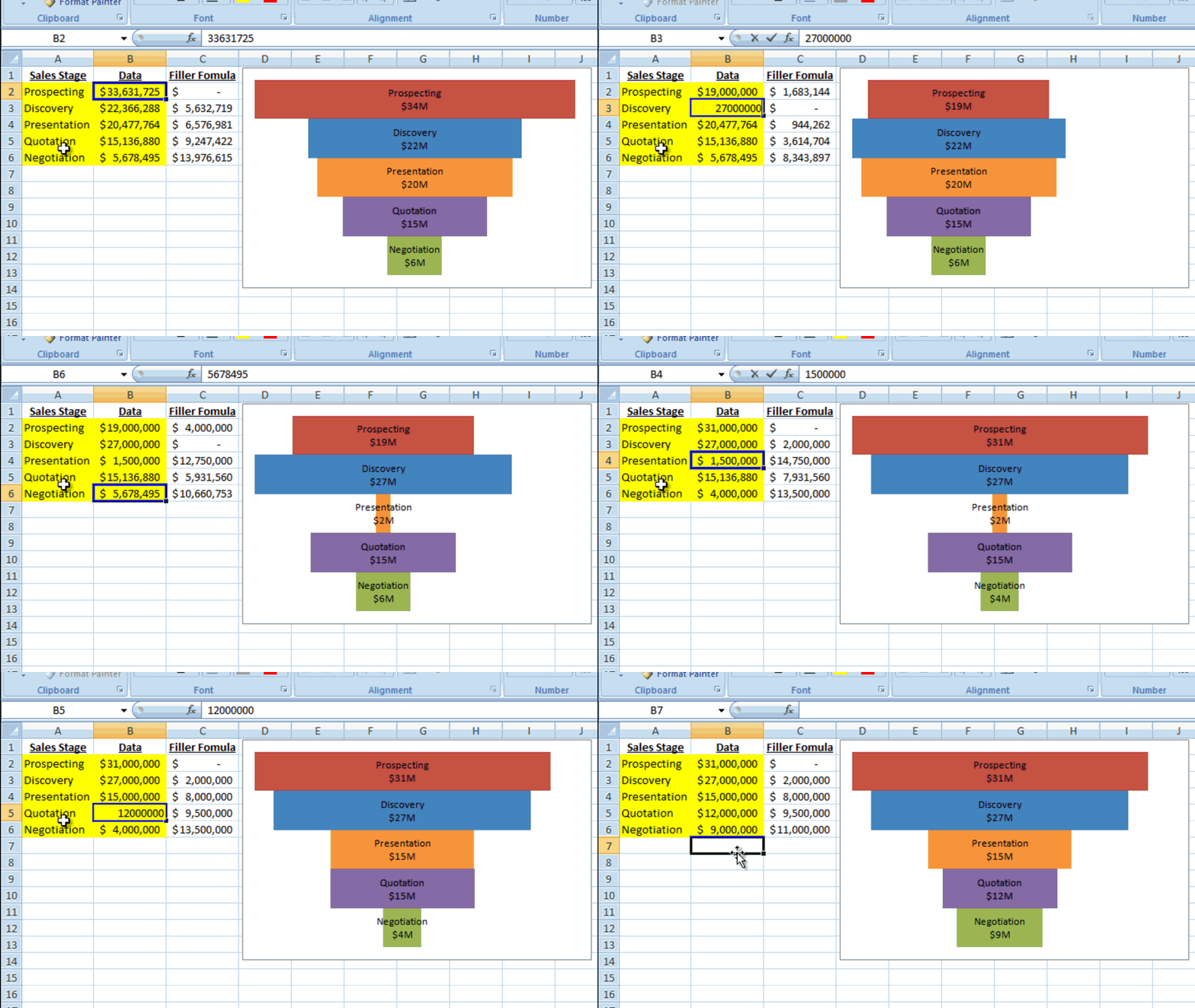
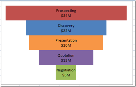
In the new Better Sales Funnel Excel Chart, notice how you can see discrete changes from one sales stage to the next. Below you will see that Discovery Stage is very close but slightly larger than the Presentation Stage. You would not have been able to easily see the difference in the previous chart.
Now let me show you how you can easily create this chart with the step-by-step and video tutorial below. There is also a Free Template Download File below.
The Breakdown
1) Create the Sales Pipeline Categories and Data
2) Insert Column Between A & B and Add Filler Series Formula
3) Create Stacked Bar Chart
4) Flip the Vertical Axis
5) Change Horizontal Axis Bounds
6) Delete Horizontal Axis and Vertical Axis and Vertical Gridlines and Legend
7) Change Fill Options and Gap Width of Filler Series
8) Change Color of Data Points
9) Add Data Labels10) Change to Custom Number Format
Step-by-Step
1) Create the Sales Pipeline Categories and Data
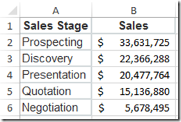
Normally, your sales data would look like this (with categories and a value):
This is fine to start, but we will need to make a slight adjustment in the next step.
2) Insert Column Between A & B and Add Filler Series Formula
In order to get our Excel sales funnel chart to line up and look like a funnel or pipeline, we need to add another data series that will push the sales data to the right location in the chart.
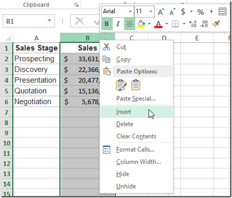
To do this, we need to add a column for the new data series between our original data. So right click on column B and click on Insert. This will add a column between column A and B in the spreadsheet.
Then in Cell B2, enter this formula =IF(MAX($C$2:$C$6)=C2,0,(MAX($C$2:$C$6)-C2)/2) and copy down to cells B2:B6. 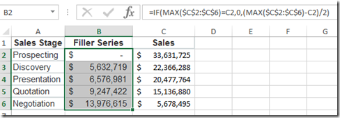
Here is a breakdown of the formula:
=IF(
this row contains the maximum value in our sales data MAX($C$2:$C$6)=C2 (if it is the maximum value, then we don’t need a filler bar since this will be our largest value in which to center all other values)
then enter in a zero in the current cell,0
else if it is not equal to the maximum sales value, then enter in this value which is equal to 1/2 of the maximum sales value minus the current row value,(MAX($C$2:$C$6)-C2)/2) (This will make the fill value center the sales data bar on the maximum value)
3) Create Stacked Bar Chart
Now that we have our data setup for the Excel Sales Funnel Chart, let’s create the graph. To do this, highlight the Range A1:C6, then go to your Insert Ribbon and Choose the a Stacked Bar Chart from the Chart group: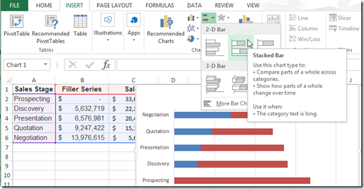
Your chart should now look like this: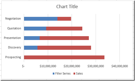
4) Flip the Vertical Axis
If you look at the right (red) sales series in the Sales Pipeline Chart we just created above, it looks like an upside down pipeline. So we need to flip the vertical axis so that Prospecting is on top and Negotiation is on bottom.
To do this, Right Click on the Vertical Category Axis and Select “Format Axis” from the context menu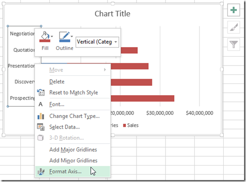
Then from the Series Options, Check the Box for “Categories in Reverse Order” in the Axis Options Dialog Box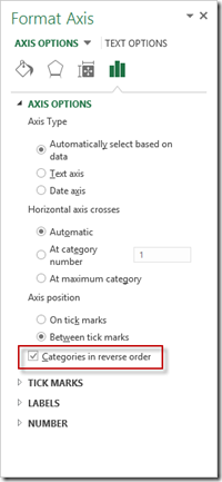
Your chart should now look like this: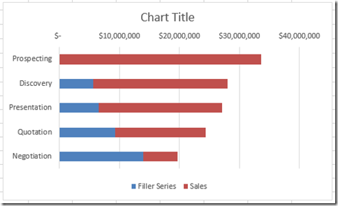
5) Change Horizontal Axis Bounds
You may have noticed that there is more white space than we need on the right side of the chart. Excel always adds in more space than is needed for the axis that contains values. So we need to set the horizontal axis maximum bound to the maximum value and the minimum bound to zero.
To do this, Right Click on the Horizontal Axis Select “Format Axis” from the context menu: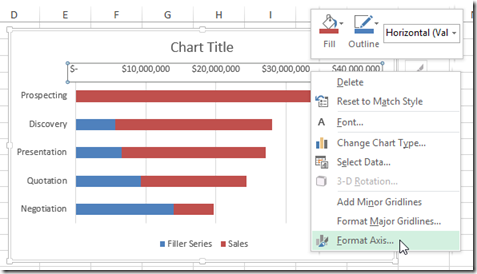
Change the Maximum bound equal to your maximum value, in our case 33631725 and then Change the Minimum bound to zero: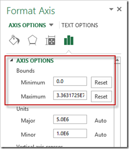
Your chart will then look like this: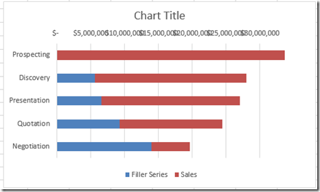
6) Delete Horizontal Axis and Vertical Axis and Vertical Gridlines and Legend
We can now delete all the things that aren’t needed. To do this, Click on the chart, then click on the following and Press the Delete Key:
a) Horizontal Axis
b) Vertical Axis
c) Legend
d) Vertical Gridlines
e) Optional – Delete the Title or add text to the chart title at your discretion. I changed mine to Sales Pipeline.
Your chart should now look like this: 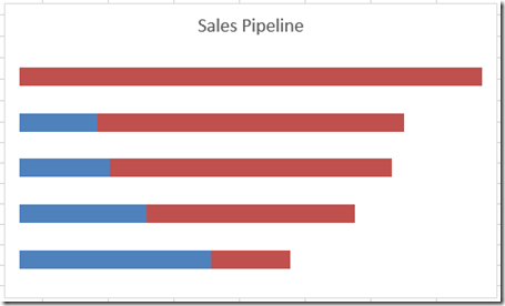
7) Change Fill Options and Gap Width of Filler Series
This step will bring the chart into shape. We need to hide the filler series and push the bars together.
To do this, Right Click on the “Filler Formula” series (left most blue series) and choose “Format Data Series” from the context Menu: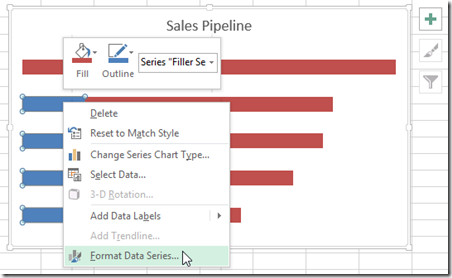
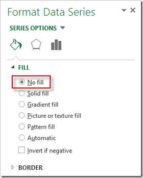
Then change the “Gap Width” to 0% from the Series Options: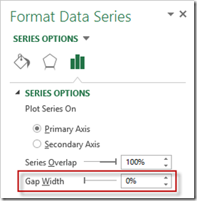 Then choose the Fill Options Menu then choose “No Fill” radio button:
Your chart should now look like this: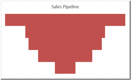
8) Change Color of Data Points
As you can see from the picture above, the pipeline is all one color. So I suggest changing the colors of each data point.
To do this, Select any Data Point in the Chart by clicking on a single bar 2 times (twice). You will then see that only one data point is selected instead of the entire series.
Your selection might look like this: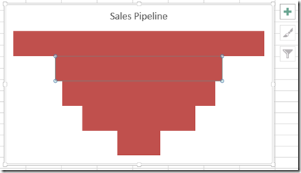
Then you can Right click on that single data point and choose the “Format Data Point…” menu option: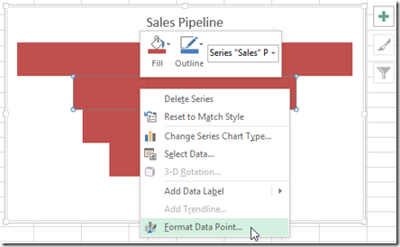
Then goto the Fill options and choose Solid Fill and pick a color. Then also choose a Border of Solid Line and a color of Black.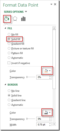
DO NOT CLOSE THE DIALOG BOX. Your chart should look like this: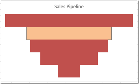
As I said above, you don’t have to close the dialog box and you can repeat this step for each data point by double clicking on the data point until only the data point is selected. Then
Repeat these fill and border steps for all the sales stages in the chart with a different color.
Your chart should now look like this: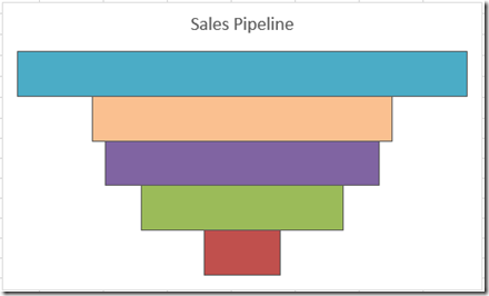
9) Add Data Labels
We are getting very close. Since we deleted the stages from the vertical axis, we should add them back as data labels and also include the sales value.
To do this, Select the chart in the white space, then from the Design Ribbon, choose Data Labels from the Add Chart Element button and then choose the More Data Label Options… menu option: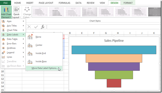
Your chart will now look like this. You should select the Filler Series Data Labels on the left and press your delete key: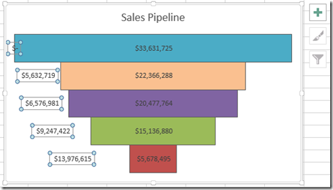
Then right click on the data labels in the Sales series and Right Click on any of the labels and choose “Format Data Labels” from the context menu.
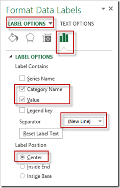
From the Dialog Box under the Label Options group, select label contains as “Category Name” and “Value” with “New Line” as the separator and “Center” as the Label Position to add these to the labels on the chart. DO NOT CLOSE THE DIALOG BOX as we will use it in the next step.
Your chart should now look like this:
10) Change to Custom Number Format
This is an optional step, but I don’t like so much detail in such a large number. My brain just can’t get grasp it quickly. So I like to format large numbers with a $#M (for millions) or $#K (for thousands). So my final step, is to add a custom format by selecting the data labels and going to the number format options and entering this custom formula.
If you want to learn more about this technique, check out this post:
How-to Format Chart Axis for Thousands or Millions
To do this, choose Custom as the Number Category and put this formula [>999999]$#,,”M”;[>999]$#,”K”;$# (note, if you are having problems copying and pasting this formula into Excel, you may have to delete and replace the “ ” quotation marks as the browser may not be truly copying a quotation mark) into the Format Code box and and then press the Add button.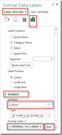
Your final chart will then look like this: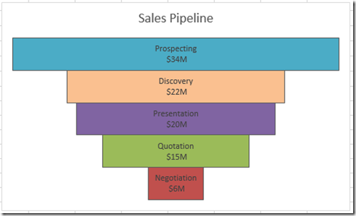
Video Demonstration
Free Excel Template File Download
Better-Excel-Sales-Funnel-Sales-Pipeline-Chart.xlsx
Even though this chart it doesn’t look as pretty as the 3-D pyramid sales pipeline Excel chart, it is more accurate to the human eye and to the data. Let me know what you think of the Better Excel Sales Funnel Chart in the comments below.
Steve=True

