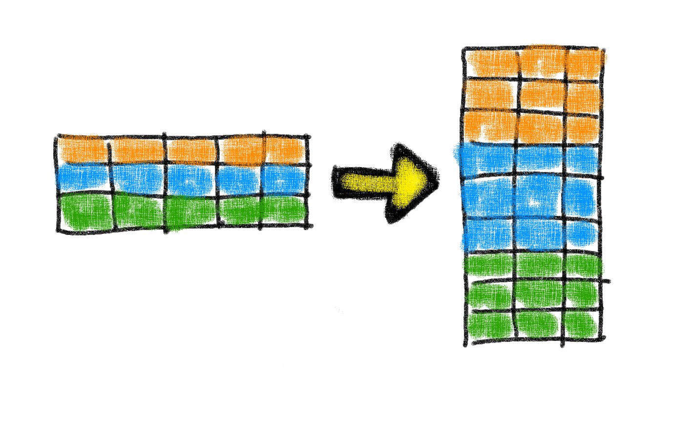
How-to AverageIf Excluding Zeros and Blanks for Non-Contiguous Ranges in Excel
In our last Friday Challenge, I asked you figure out a way to calculate an average for a non-contiguous (non-adjacent) range that will exclude...
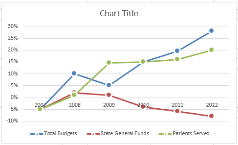
Friday Challenge – My Answer – Chart This Data in Excel
Challenge – Chart This Data in Excel - My Answer
A few Fridays ago, I posted this challenge:
Link here: friday-challenge-chart-this-data-in-excel
Where I asked you to send...
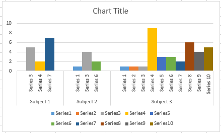
How-to Close the Gaps Between Chart Series in an Excel Stacked Clustered Column Chart
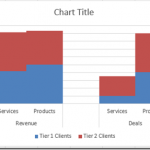
Many users like to create a chart that Excel doesn’t have as a chart type. It is a combination of a clustered column and...
How-to Create a Stacked Clustered Column Chart with 2 Axes
In response to another post of mine, EC wrote:
“My issue: This site has been really helpful so far! I have a follow up question....
Friday Challenge: Excel Step Chart Automation
Yesterday, I posted the a demonstration on how to make a Step Chart in Excel.
You can check out that post here:
How-to Easily Create a...
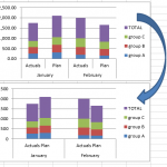
How-to Create a Stacked and Unstacked Column Chart in Excel
Stacked and Unstacked Column Chart in Excel
Excel is awesome because, even when a certain chart type is not a standard option, there may be...
How-to Make a Dynamic Excel Pie Chart with 4 steps in less than 4...
This is an awesome guest post from our great friend Pete. He came up with this awesome technique to make a dynamic pie chart...
Quickest Way to Select and Align Charts for an Excel Dashboard
Select and Align Charts for an Excel Dashboard
Creating dashboards can take a lot of time. With this simple technique that I just learned, you...
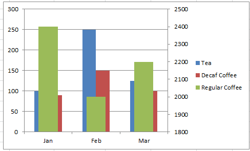
A Better Format For Excel Chart Secondary Axis Columns Overlap with 3 Series
Learn a better charting format when your Excel Chart Secondary Axis Columns Overlap with 3 data series.
The Problem
I didn’t love the last chart we...
How-to Make a BETTER Excel Sales Pipeline or Sales Funnel Chart
Learn how to make an accurate sales pipeline in Excel. In previous posts, I have showed you how to make a sales funnel chart...

