How-to Create a Dynamic Excel Chart that Only Displays Non-Blank Values
Below is a video that may help you as well.
How-to make a Dynamic Excel chart that doesn't show blank values so you don't have to...
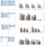
Friday Challenge Answer – Using Excel Slicers to Create Dynamic Charts
A big thanks to Don for submitting the first response to last week’s Friday Challenge.
You can check out the challenge here:
Friday Challenge – Excel...
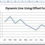
Case Study – Creating a Dynamic Chart in Excel Using Offset Formula
A YouTube video subscriber Mili, wanted to know more about creating a Dynamic Excel Column Chart using Offset function. So Mili sent me the...
Incredible Excel 2012 Olympic Medal Count Dynamic and Interactive Dashboard
People are awesome and so creative. We have been talking about building an Olympic Medal Count Dashboard using Excel and I asked for your...
Find the Last Row or Last Column for Dynamic Excel Dashboards
In a previous post “This is the Bomb: or How I came to love the Offset function” I showed you all about the Offset...
How-to Make a Dynamic Chart Using Offset Formula
In previous posts I have described how to make a Dynamic Chart in Excel for your Dashboard using Tables. This is a very easy...
How-to Create a Dynamic Banding on an Excel Line Chart
This dynamic shading or banding chart is frequently used in science and in Company Dashboards. It allows the user to quickly see if their...
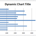
How-to Make an Excel Chart Title Change Dynamically
Have you ever wanted to change your chart title dynamically?
Perhaps you wanted to link it to a cell value?
Did you know that it...
How-to Eliminate Statistical Outliers in an Excel Line Chart
Okay, I posted this Excel Chart Challenge on Friday. How did you do? I am sure your solution is better than mine. This was...
How-to Show Decades and Highlight a Year in the Horizontal Axis
Recently in an Excel Forum, a user had data similar to this format:
Here is what he wanted to do:
How do I set the Horizontal...


