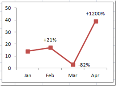
Have you ever wanted to have a different data point label in your Excel Chart than what is offered by the Standard Excel Dialog box choices?
Well you can do that in Excel and not only can you do that, you can make it dynamically update. Read on if you want to learn how-to do this in your next Excel Graph.
This might even be a trick that you employ in your next Excel Company Dashboard to highlight information that you wish to convey.
The Breakdown
1) Create your chart data
2) Add Data Labels
3) Link the Data Labels to Cells in the Spreadsheet
4) Sit back and impress your boss, company board, teachers, coworkers and friends.
Step-by-Step Instructions
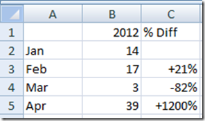
1) Create the data for your chart and for your custom labels.
In this case, we have the standard data table for our chart, but we also need to create the information for the data labels. In column C, you will see that I have created a calculation that is the percent difference between the prior month and the new month’s data. There is no data point for the first month because there is no comparison to a previous month.
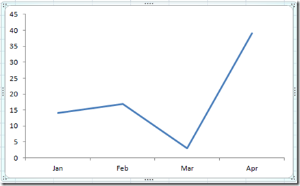
2) Create your chart just using your normal chart data. In our case, it is just A1 to B5. After cleaning up the chart a little bit, it will look like this:
Then after you have created your basic chart, you need to add data labels. You can do this by selecting the chart, then going to your Layout Ribbon and then selecting Data Labels and then choose Above.
Your chart will now look like this with Data Labels included: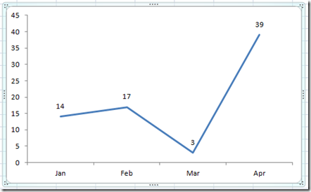
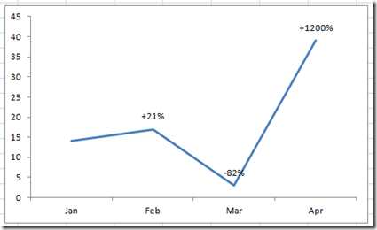
3) Click on the left most label 2 times and then hit your delete key to get rid of it. Next click on the next label (17) then press the Equals (“=”) sign and then choose Cell C3 and then press enter. Repeat this step for the next label =C4 and the next label should be =C5.
After completing this final step, your chart will look like this:
Now when you change your data points, the calculated fields will dynamically update the chart labels.
When you know awesome charting techniques like this, you will become the envy of all and will be able to secure your position as your Excel Company Dashboard Designer.
Video Tutorial
Here is a free video tutorial excel learning session about how-to make a dynamic custom data label.
Steve=True

