In my last post I showed the concepts of making a P/E (Price-to-Earnings) Excel Chart for your Dashboard Template. In this post I will walk you step-by-step how you can make your own P/E chart for Excel.
In an Excel forum, excelsishya posted that she would like to know how to create this type of chart:
ExcelSishya – “I am looking For Straight Line (Horizontal) to be used in P/E Trading COMPS.”
The chart depicts a line representing the Minimum and Maximum Price-to-Earnings Ratio (P/E) for a given industry with a marker to compare the company’s P/E Ratio. There are also points on the chart that represent a given company’s price-to-earnings ratio and the industry average.
Step-By-Step Walkthrough to making a P/E Chart using an Excel XY Line and Scatter Combo Chart for Executive Dashboard
Some people might try and use a line chart for this solution, but it might be slightly cumbersome so instead, we are going to use the XY Charts. I also feel that an XY chart for this solution is it is easier to understand and implement.
Here are the basics to this chart:
1. We will use an “XY Scatter with Straight Line” for the Straight Line chart.
2. Combine it with an “XY Scatter with only markers chart” for the Triangle and Box points as well as the data labels.
Here is how to do it (Step-By-Step Tutorial):
1. Setup Your Data Points to Create the Line and Markers
a. Setup the data so that we make a flat horizontal line using XY coordinates from the Min P/E to the Max P/E.
b. We do this by making the Y coordinates the same height for the Min and the Max. For the Company 1 Data, we will choose 1 as the height for the horizontal line, but you can pick any value as long as all your Y values are the same.
c. Enter your Start and Stop of your Line as the X coordinates to the values of the Min P/E to the Max P/E.
d. Enter your Data Points for the Company P/E and Industry P/E as the X coordinates to the values of the Min P/E to the Max P/E.
Here is how your data will look: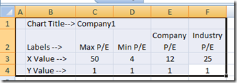
2. Next step is to insert a XY Scatter chart
a. Click on any empty or blank cell so that we can create the chart without any data points. This will save time in deleting lines and points that don’t match our data layout.
b. Now click on the insert ribbon bar in Excel 2007 and then choose Scatter in the Chart grouping and then choose Scatter with Straight Lines and Markers. I will make the 2003 version in another posting.
c. Your chart will look like this with nothing in the chart area at all:
3. Now insert your line:
a. For Excel 2007, select the chart, then select the Design Ribbon and choose Select Data from the Data grouping.
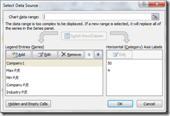
b. You will now see this dialog box:
c. Now click on the Add button in the Legend Entries (Series) area
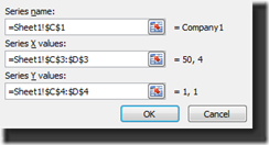
d. Choose the following:
i. Series Name = C1
ii. Series X Values = C3:D3
iii. Series Y Values = C4:D4
e. Click OK and ALSO click okay on the Select Series Dialog box. If hit cancel it will not save your changes from the previous Add. I have learned this the hard way in that I have added many different series and accidentally hit cancel and none of the series appeared.
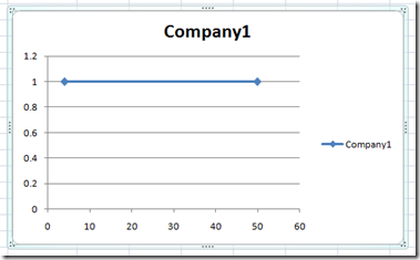
f. Your chart now looks like this:
What did we do?
We are making a horizontal line along the Y value of 1 stretching from X value of 4 to an x value of 50.
4. Next lets insert the Company and Industry Points
a. We are going to follow the exact steps above, except we will choose different cell values instead of the range of values
b. For Excel 2007, select the chart, then select the Design Ribbon and choose Select Data from the Data grouping.
c. You will now see this dialog box:
d. Now click on the Add button in the Legend Entries (Series) area
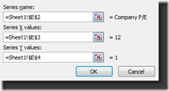
e. For the Company, Choose the following:
i. Series Name = E2
ii. Series X Values = E3
iii. Series Y Values = E4
f. Click OK and ALSO click okay on the Select Series Dialog box.
g. We have added the Company Data point and Your chart now looks like this
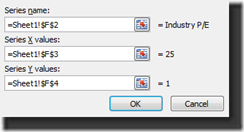
h. For the Industry, Choose the following:
i. Series Name = F2
ii. Series X Values = F3
iii. Series Y Values = F4
i. Click OK and ALSO click okay on the Select Series Dialog box.
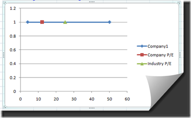
j. We have added the Company Data point and Your chart now looks like this:
What did we do? We are adding the individual data points for the Company P/E and Industry P/E to the Excel Chart horizontal line along the Y value of 1 and having the X value for the given P/E Ratio.
5. Add Min and Max Data Series for Labeling
a. We are going to follow the exact steps above, except we will choose different cell values instead of the range of values
b. For Excel 2007, select the chart, then select the Design Ribbon and choose Select Data from the Data grouping.
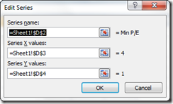
c. You will now see this dialog box:
d. Now click on the Add button in the Legend Entries (Series) area
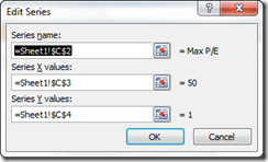
e. For the MAX P/E, Choose the following:
i. Series Name = C2
ii. Series X Values = C3
iii. Series Y Values = C4
f. Click OK and ALSO click okay on the Select Series Dialog box.
g. We have now added the Max Label Data point.
h. For the MIN P/E, Choose the following:
i. Series Name = D2
ii. Series X Values = D3
iii. Series Y Values = D4
i. Click OK and ALSO click okay on the Select Series Dialog box.
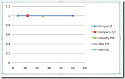
j. We have added the Min Label Data point and Your chart now looks like this:
What did we do? We are adding the individual data points for the Company P/E and Industry P/E to the Excel Chart horizontal line along the Y value of 1 and having the X value for the given P/E Ratio. Your chart should now look like this:
6. Now we need to add Data Labels
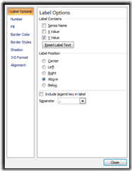
a. For Excel 2007, select the chart, then select the Layout Ribbon and choose Data Labels>Above from the Labels grouping:
b. Choose “Above” and you will now see the default Y Axis labels on the chart.
c. Now right click on each label and select Format Data Labels. Start with the left most label for Min P/E.
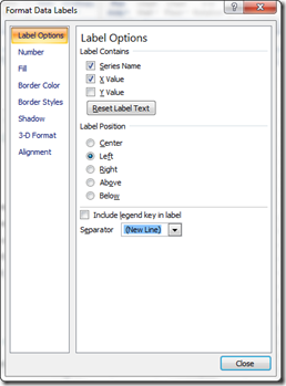
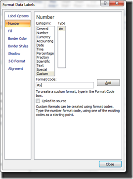
d. You will now see this dialog box:
e. Change the following for each of the labels with the following Label Options:
i. Min P/E:
Label Options
1. √ Series Name
2. √ X Value
3. □ Y Value
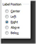
Label Position
4. Left
Seperator
5. (New Line)
It will look like this:
Number Format
6. Category = Custom
7. Format Code = #x
This will give us the Min P/E Label and It will look like this:
ii. Max P/E – now Click on the Right most Label and do the following:
Follow the same steps as the Min P/E Label and choose all the same Options except:
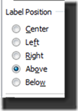
Label Position
iii. Industry P/E – Select the label above the triangle and choose all the same Options except:
Label Position
iv. Company P/E– Select the label above the rectangle and choose all the same Options as Industry.
v. Delete Remaining Line Labels
You will notice that we still have 2 labels “1” that we have not done anything with yet.
1. Select either one of the “1” labels that are associated with the line. We don’t need these.
2. After selecting the remaining “1” labels, hit your delete key and get rid of them.
Your chart will now look like this:
7. Next – Format Lines and Markers
a. Format Line
i. Line Color
1. For Excel 2007, select the chart, then select the Line.
2. Now select the Layout Ribbon and choose Format Selection from the Current Selection Group.
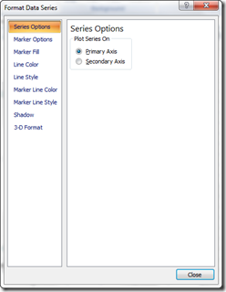
3. You will now see the Format Data Series Dialog Box.
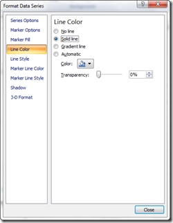
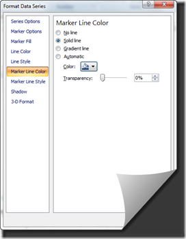
4. Choose “Line Color” From the left dialog box area
5. Then in the right dialog area, choose Solid Line and then choose the Color you want. In this case, blue.
ii. Line Markers
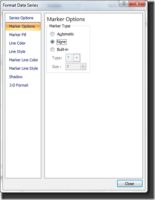
1. Since our example has no markers on the line for the end points, we need to make sure they don’t show up so it just looks like a line without points.
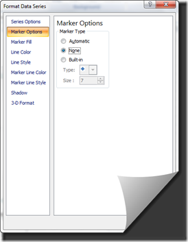
2. Choose Marker Options from the left dialog box area.
3. Then choose None for the Marker Type in the right dialog box area.
4. Keep the dialog box open as you can select the other data points directly from here.
b. Format Company Marker
i. Marker Icon
1. As stated above, once you have the Format Data Series dialog box open, you can now select other series to change their formats as well. So just move the dialog box over if it is in your way and click on the Company P/E Data Series.
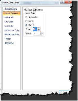
2. Choose Marker Options from the left dialog box area.
3. Then choose Built-In for the Marker Type in the right dialog box area then select the Triangle from the pick list and change the Size to 7.
ii. Marker Fill
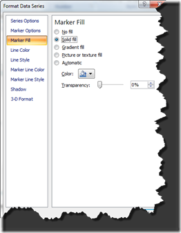
1. Choose Marker Fill from the left dialog box area.
2. Then choose Solid Fill for the Marker Fill in the right dialog box area then select the same blue you chose for the line.
iii. Marker Line Color
1. Choose “Line Color” From the left dialog box area
2. Then in the right dialog area, choose Solid Line and then choose the Color you want. In this case, you should go darker than the blue you chose for the marker.
c. Format Industry Marker
Follow the same steps as the Company Marker above except:
Select the Square as the Marker Option.
d. Format Min P/E and Max P/E Markers
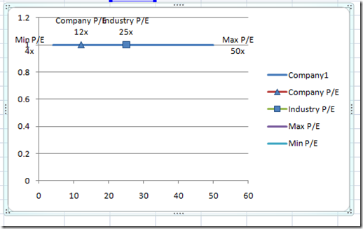
You will notice that we still have markers for the Min and Max Labels:
Select each marker from the chart and change the Marker Options to “None”
Your chart will now look like this and we are just about done:
8. Final Steps – Chart Clean Up
a. Chart Title
i. Select the Chart
ii. For 2007, from the Layout Ribbon, select “Above Chart” from the Chart Title menu from the Labels group
iii. Select the Chart Title in the Chart and type in your new chart name: “P/E Dashboard”
b. Delete X Axis – Click on the X Axis and then hit the delete key
c. Delete Y Axis – Click on the Y Axis and then hit the delete key
d. Delete Legend – Click on the Legend and then hit the delete key
e. Delete Gridlines – Click on the Gridlines and then hit the delete key
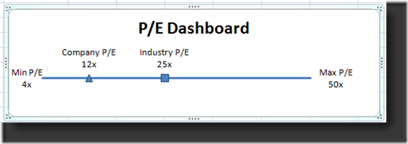
Here is how your final P/E (Price-to-Earnings) Dashboard chart Template should look using the combo XY Scatter line and marker only charts:
Click here to watch a YouTube video demonstration to build this Excel Dashboard Template Chart:
You can also download a FREE Excel Template for this Dashboard chart:
https://www.exceldashboardtemplates.com/PEChartDownload.xlsx
Don’t forget to sign up for my RSS feed and Email List so you will be the first to know when I have posted a new dashboard tutorial and also leave me a comment on other charts you would like to see.
Steve=True


