So last week I posted this question in the challenge:
Here the user story on what we are trying to do:
‘As an Excel user I want to leave all my data intact (i.e. not delete or hide any rows) and I want to conditionally show the data points in an Excel column chart by typing in “Yes” next to the data.’
Here is what I mean with picture: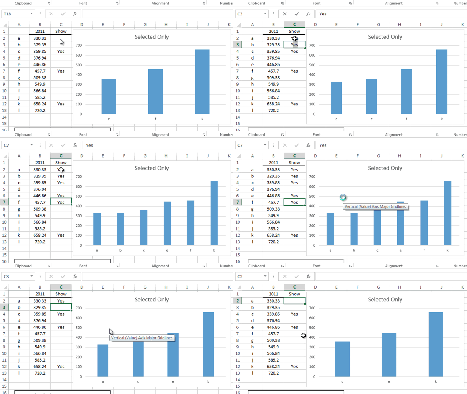
Here are the shout out’s to the people that submitted a response to the challenge. All are very similar and would work for our needs. And in no certain order, the winners:
Ron L.
Pete R.
Don P.
Maruf A.
Way to go Excel Fans! You are all TOPs in my Excel book
I like my solution best of course ![]() but mostly I like it because I thought it was very efficient, although some may not like the use of a Offset. Download and check out each solution. Then let me know in the comments which solution you like the best and why. And now lets get to it:
but mostly I like it because I thought it was very efficient, although some may not like the use of a Offset. Download and check out each solution. Then let me know in the comments which solution you like the best and why. And now lets get to it:
The Breakdown:
1) Setup Your Data and Select Data Points to Display
2) Determine the Row of a Selected Data Point
3) Use Index to Return the Smallest Row Category
4) Use Index to Return the Smallest Row Data Point
5) Define 2 Named Formula Using Offset for Categories and Data Points
6) Create Blank Chart
7) Add Named Formulas Legend Entry (Series) and Horizontal (Category) Axis Labels
Step-by-Step
1) Setup Your Data and Select Data Points to Display
Okay, we start out with a normal data series like this:
Excel 2012
| A | B | |
|---|---|---|
| 1 | 2011 | |
| 2 | a | 330.33 |
| 3 | b | 329.35 |
| 4 | c | 359.85 |
| 5 | d | 376.94 |
| 6 | e | 446.86 |
| 7 | f | 457.7 |
| 8 | g | 509.38 |
| 9 | h | 549.9 |
| 10 | i | 566.84 |
| 11 | j | 585.2 |
| 12 | k | 658.24 |
| 13 | l | 720.2 |
And we then need to add a column to the right where we will select our data points that we want to show in the Excel Column Chart. Here is what your initial data set will look like:
Excel 2012
| A | B | C | |
|---|---|---|---|
| 1 | 2011 | Show | |
| 2 | a | 330.33 | |
| 3 | b | 329.35 | |
| 4 | c | 359.85 | Yes |
| 5 | d | 376.94 | |
| 6 | e | 446.86 | Yes |
| 7 | f | 457.7 | |
| 8 | g | 509.38 | |
| 9 | h | 549.9 | |
| 10 | i | 566.84 | |
| 11 | j | 585.2 | |
| 12 | k | 658.24 | Yes |
| 13 | l | 720.2 |
And you would want to mark a few data points with “YES” so that we will know if our test works.
2) Determine the Row of a Selected Data Point
Now we have identified the data points we want to show in our Excel chart, but we need a unique identifier for each data point. Excel won’t move past the first “Yes” and will keep returning the same data point. Here is my solution to the determining a unique identifier as to if a data point should be included in the chart. In cell E2 put this formula:
=IF(C2=”Yes”,ROW(),””)
And then copy down to cell E13.
We will use these row values in our Index formula in the next steps. Your data range will now look like this:
Excel 2012
| A | B | C | D | E | |
|---|---|---|---|---|---|
| 1 | 2011 | Show | Row | ||
| 2 | a | 330.33 | |||
| 3 | b | 329.35 | |||
| 4 | c | 359.85 | Yes | 4 | |
| 5 | d | 376.94 | |||
| 6 | e | 446.86 | Yes | 6 | |
| 7 | f | 457.7 | |||
| 8 | g | 509.38 | |||
| 9 | h | 549.9 | |||
| 10 | i | 566.84 | |||
| 11 | j | 585.2 | |||
| 12 | k | 658.24 | Yes | 12 | |
| 13 | l | 720.2 |
3) Use Index to Return the Smallest Row Category
Now that we have a unique identifier for each selected data point, let’s use that in an index function to return the Horizontal Axis Categories. Now put this formula in cell F2:
=IFERROR(INDEX($A$1:$A$13,SMALL($E$2:$E$13,ROW(F1)),1),””)
Let’s break it down. Index is a great function in Excel as it will return a value from a list based on the intersection of a particular row and column.
So let’s just focus on the Index part of this formula:
INDEX($A$1:$A$13,SMALL($E$2:$E$13,ROW(F1)),1)
INDEX( Return the Row Categories A through L , of the Smallest Row Number in Column E First using a row formula as a counter , 1 since we only have one column of data in our list)
Then we need to wrap this entire Index formula in an IFERROR function. That is because we will most likely not show all the data points, so the Index formula will return a #NUM error when there is no Row number in Column E. So if we do get a #NUM error, then we don’t want to show the #NUM in the spreadsheet, we want to show a blank cell)
=IFERROR( INDEX Formula , “”)
Then you need to copy this from F2 down to F13. Your chart data range will now look like this:
Excel 2012
| A | B | C | D | E | F | |
|---|---|---|---|---|---|---|
| 1 | 2011 | Show | Row | Categories | ||
| 2 | a | 330.33 | c | |||
| 3 | b | 329.35 | e | |||
| 4 | c | 359.85 | Yes | 4 | k | |
| 5 | d | 376.94 | ||||
| 6 | e | 446.86 | Yes | 6 | ||
| 7 | f | 457.7 | ||||
| 8 | g | 509.38 | ||||
| 9 | h | 549.9 | ||||
| 10 | i | 566.84 | ||||
| 11 | j | 585.2 | ||||
| 12 | k | 658.24 | Yes | 12 | ||
| 13 | l | 720.2 |
4) Use Index to Return the Smallest Row Data Point
This is the same formula that we did in step 3, but we just need to change the list of data in our Index formula. So put this formula in cell G3 and change the array from A1:A13 to B1:B13 like this:
=IFERROR(INDEX(B$1:B$13,SMALL($E$2:$E$13,ROW(G1)),1),””)
Then copy it down from Cell G3 to Cell G13. Your chart data range should now look like this:
Excel 2012
| A | B | C | D | E | F | G | |
|---|---|---|---|---|---|---|---|
| 1 | 2011 | Show | Row | Categories | Chart Data | ||
| 2 | a | 330.33 | c | 359.85 | |||
| 3 | b | 329.35 | e | 446.86 | |||
| 4 | c | 359.85 | Yes | 4 | k | 658.24 | |
| 5 | d | 376.94 | |||||
| 6 | e | 446.86 | Yes | 6 | |||
| 7 | f | 457.7 | |||||
| 8 | g | 509.38 | |||||
| 9 | h | 549.9 | |||||
| 10 | i | 566.84 | |||||
| 11 | j | 585.2 | |||||
| 12 | k | 658.24 | Yes | 12 | |||
| 13 | l | 720.2 |
5) Define 2 Named Formula Using Offset for Categories and Data Points
You can now see that we have the data points that have a “YES” grouped for our chart. But we have a problem because we need to create a chart of only 3 data points (in our example). If we create a chart of all the data points, we will have lots of blanks in our data and the chart would look like this:
So one way that we can make a Dynamic Chart in Excel is with the Offset Function.
If you want to learn more about Creating an Dynamic Chart in Excel using the Offset Function, please check out these posts:
Case Study – Creating a Dynamic Chart in Excel Using Offset Formula
How-to Make a Dynamic Chart Using Offset Formula
Find the Last Row or Last Column for Dynamic Excel Dashboards
So we need to create named formulas for the Horizontal Axis Categories in Column F and for the Data Points in Column G.
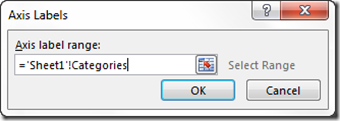
Categories =OFFSET($F$2,,,COUNT($G:$G),1)
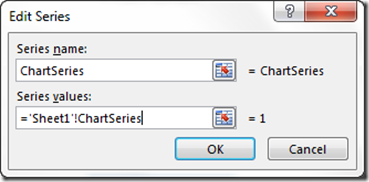
ChartSeries =OFFSET($G$2,,,COUNT($G:$G),1)
6) Create Blank Chart
If find that it is easiest to create a blank chart for this step. Alternately, you can create a chart from data and then either delete or repurpose the existing series and category. So the best way to create a blank chart is to select a single cell away from all the other data. If you are next to or on any numbers, Excel will try and chart it. So select a spreadsheet cell away from the data series. After you do that, your chart should be blank and look like this:th
7) Add Named Formulas Legend Entry (Series) and Horizontal (Category) Axis Labels
And now for the final step. Check out the links in step 5 above on the exact process for adding your dynamic chart category named formula and data series named formula. Essentially, you need to make sure you put in the sheet name before the named formulas. You can also see me do it in the video below.
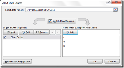
Select the blank chart, then go to the Design Ribbon and choose the Select Data button: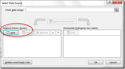
Then Select the Edit Horizontal Category Axis Labels and add that named formula: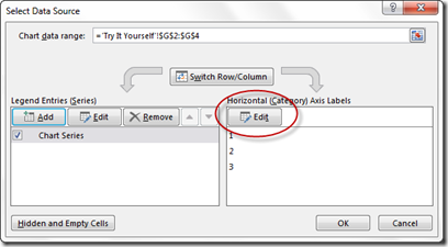
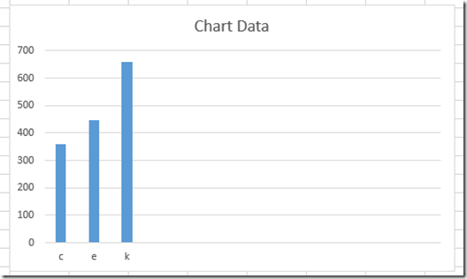
Once you do this, your chart is completed and will look like this: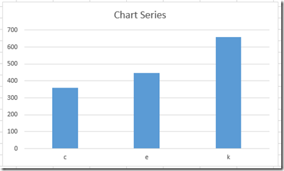
t You are all done. As you delete or add a “Yes” in column C, then your chart will dynamically change.
Video Demonstration:
Here is a detailed video tutorial on Dynamically Choosing which data points you want to show in the Excel Chart.
Sample Excel Download Files:
Here you can download and see all the sample charts for the submissions. They are similar, but all have slightly different techniques:
File sample from this post (Mine) – Only-Show-Selected-Data-Points.xlsx
Don’s (Uses Array Formulas with Indirect) – Challenge-1-16-14-Show-only-checked-data-Dons.xlsx
Pete’s (Uses Array Formulas with Index) –Friday-Challenge-on-Thursday-Only-Show-Selected-Data-points-in-an-Excel-Chart-Petes.xlsx
Ron’s (Uses Index and Match) – Challenge-Dynamic-Selected-Data-Points-Rons.xlsx
Maruf’s (Uses Index like mine but adds a helper column for the small function) – Show-Only-Selected-Data-Points_Challenge-Marufs.xlsx
Steve=True


